AERO2, Performance Nasal Strips
Color psychology research and a production-ready packaging system for a European performance-cycling nasal strip brand: five candidate palettes, tested with real cyclists and runners, narrowed down to a launch color and a roadmap of future SKUs. Five SKUs developed, with substrate and adhesive selection, and 1,000 sales in the first month.
Role
Product Designer (Freelance)
Duration
2025 – present
Type
Client Project · Branding, Research & Packaging
Tools
 Illustrator
 Photoshop
 Google Forms
 Excel
Excel
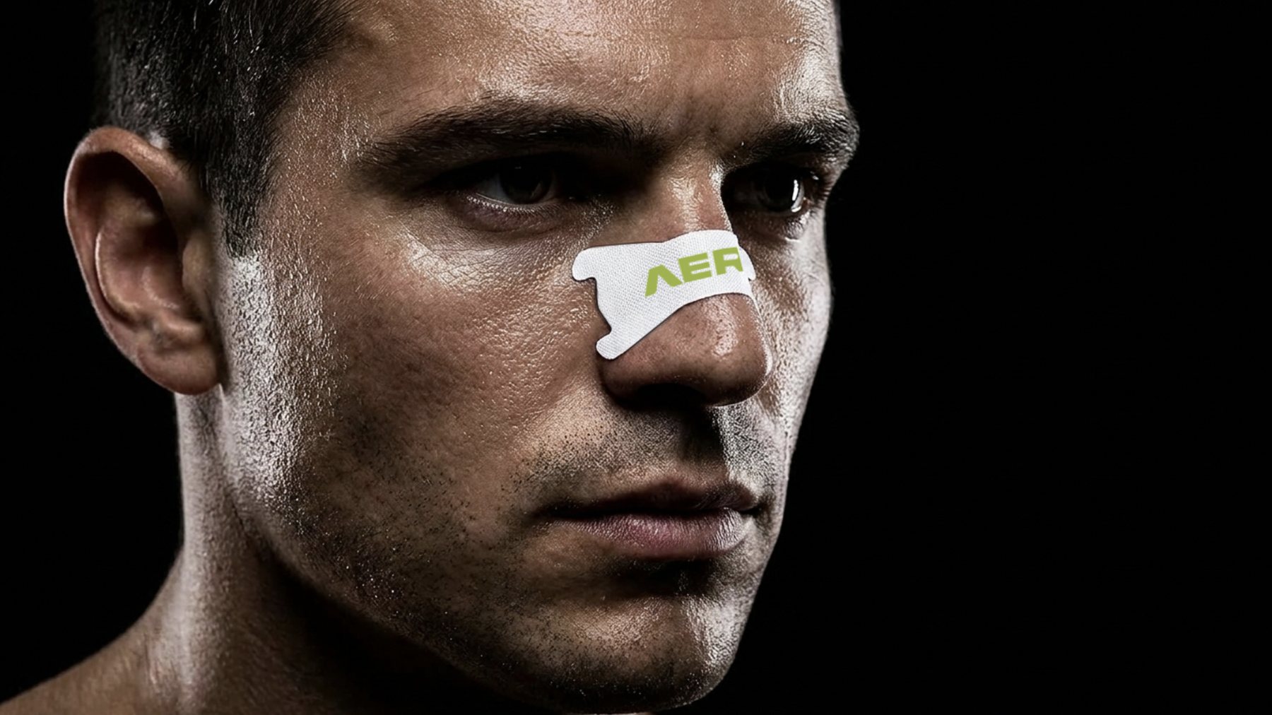
Overview
The Brief
Refine the existing AERO2 wordmark into a production-ready system, then find the brand's real color, not a guess, one tested against the audience it actually has to win over.
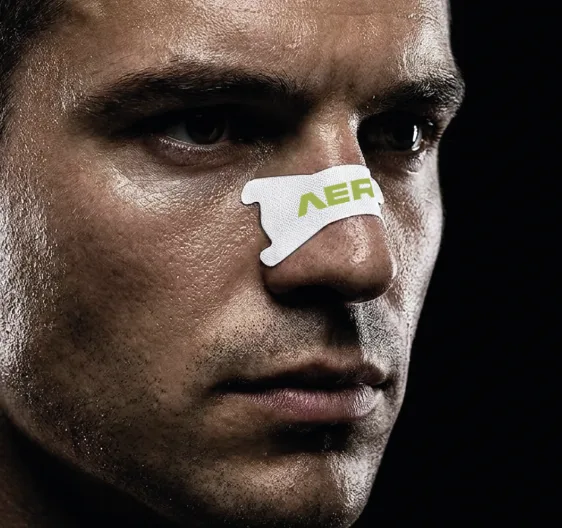
AERO2 is a performance nasal strip brand targeting high-intensity, high-performance cycling: the kind of rider who wants to be noticed attacking on the finishing straight of a race, not necessarily during a quiet Tuesday interval session. The brand arrived with an existing wordmark. My first job was a retouch and refinement pass, tightening the lockup, pairing it with the die-cut "bone" icon mark used across packaging, and rebuilding it as a clean, production-ready vector system.
The bigger question came next: what color should the brand actually own? Rather than pick a hero color from a moodboard, we ran a structured color psychology study, five candidate palettes, tested through printed mock comparisons, in-person interviews, and a written survey across different rider audiences, to decide the launch palette with evidence instead of taste alone.
Phase 01, Strategy
Positioning First, Color Second
Before testing a single swatch, we locked the positioning the color system would have to serve. AERO2 is not a mass-market, pharmacy-shelf product, it's built for a niche of high-performance cycling, and it needed to read as inspirational and premium, not clinical.
- Inspirational, not medical. The visual language had to avoid "generic pharmacy strip" territory and feel closer to performance apparel and cycling tech brands.
- Premium performance. Positioned above commodity nasal strips, engineered-for-performance framing, not a drugstore remedy.
- A niche of high-performance cycling. The primary audience is committed, data-driven riders, the Strava/Zwift, FTP-tracking core, not casual wellness buyers.
- Built to be seen racing, not training. The brand's job is to get noticed on the finishing straight of a race, in a start-line photo, or across a finish-line livestream, more than on a quiet weekday interval session.
Phase 02, Color Research
Five Palettes, Tested With Real Riders
We shortlisted five candidate color directions for the strip and packaging (R1–R5), each backed by color-psychology reasoning and cross-checked against cross-cultural color-preference research, then built printed comparison mockups and product-in-context photography to see how each one actually read on skin, in low light, and next to competitor kit.
Testing combined in-person interviews with printed color comparisons across different audience groups, cyclists, runners, and triathletes of varying ages, with a written survey collecting word associations, a 1–5 purchase-likelihood rating per palette, and open-ended reasoning for every answer.
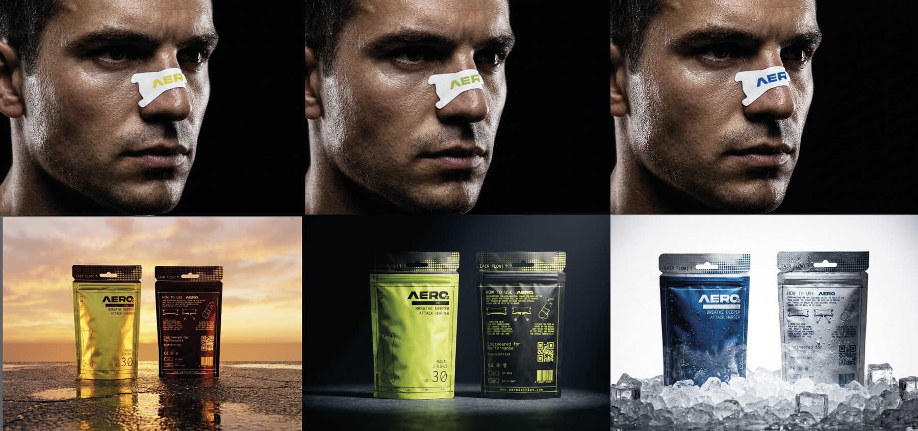
Comparison stimuli: same three colorways shown on-skin and in three different lighting contexts
32 Respondents
Mostly road, gravel and MTB cyclists plus runners, based in Spain. Average age 30, spanning 16 to 58 years old. Every response below is real and filterable.
Word Association
Every respondent wrote the first three words each colorway triggered, before rating purchase likelihood, so first impressions weren't anchored by the rating scale.
1–5 Purchase Likelihood
"If you were shopping for performance nasal strips, how likely would you be to buy this brand?", rated per colorway, plus a written "why".
Literature Cross-Check
Findings were checked against published cross-cultural color-preference research before being trusted, not taken as opinion alone.
Phase 02, Results
What the Data Said
Volt Green edged out the field, with the strongest word associations around "energy", "technological" and "performance", and it was also the only colorway in the whole palette that didn't collide visually with an existing World Tour team or wearables brand. Cobalt Blue tested as the safest, most trusted option, unsurprising given blue's well-documented cross-cultural preference, but multiple respondents flagged it as close to Movistar Team and Garmin's brand blue. Yellow read as premium and eye-catching to some, "expensive-looking" was a literal response, but polarized more than the other two.
"Aura, la tira es muy grande... me parece un buen producto para deportistas de alto rendimiento y tiene buena calidad precio." — male respondent, 21, road cyclist
Phase 02, Interactive
Filter the Panel Yourself
The 32 respondents behind these numbers are real, individually logged answers, not a pre-baked summary. Segment the panel by sport, gender, or prior nasal-strip experience below and the purchase-likelihood chart recomputes live from the raw data.
Avg. purchase likelihood by color
n = 32 respondents
No respondents match this combination of filters.
Who's in the panel · Gender
Who's in the panel · Sport
Sport counts don't sum to 32: respondents could select more than one discipline.
Phase 03, Color System
Five Directions, One Launch Color
Each direction was scored on differentiation, memorability and risk, then mapped to a role in the line-up rather than treated as five competing "favorites".
R1 · Volt Green / Black
Hero SKU. Highest word-association match on "engineered performance", zero collision with World Tour team colors.
R5 · Yellow / Oxblood
Limited edition. Highest memorability score of the set, referencing the Tour de France maillot jaune. Reserved for race-day drops.
R2 · Cobalt Blue / White
Safe, trusted, pharmacy-ready. Highest raw preference, lower distinctiveness, an everyday, wide-distribution SKU.
R3 · Periwinkle / White
Recovery framing. Strongest fit for a rest-and-recovery use case and for markets where purple reads as premium.
R4 · Navy / White
Premium tier. The most "quiet luxury" reading of the set, held back as a future boutique or collaboration colorway.
Phase 04, Packaging
One Dieline, Five Colorways
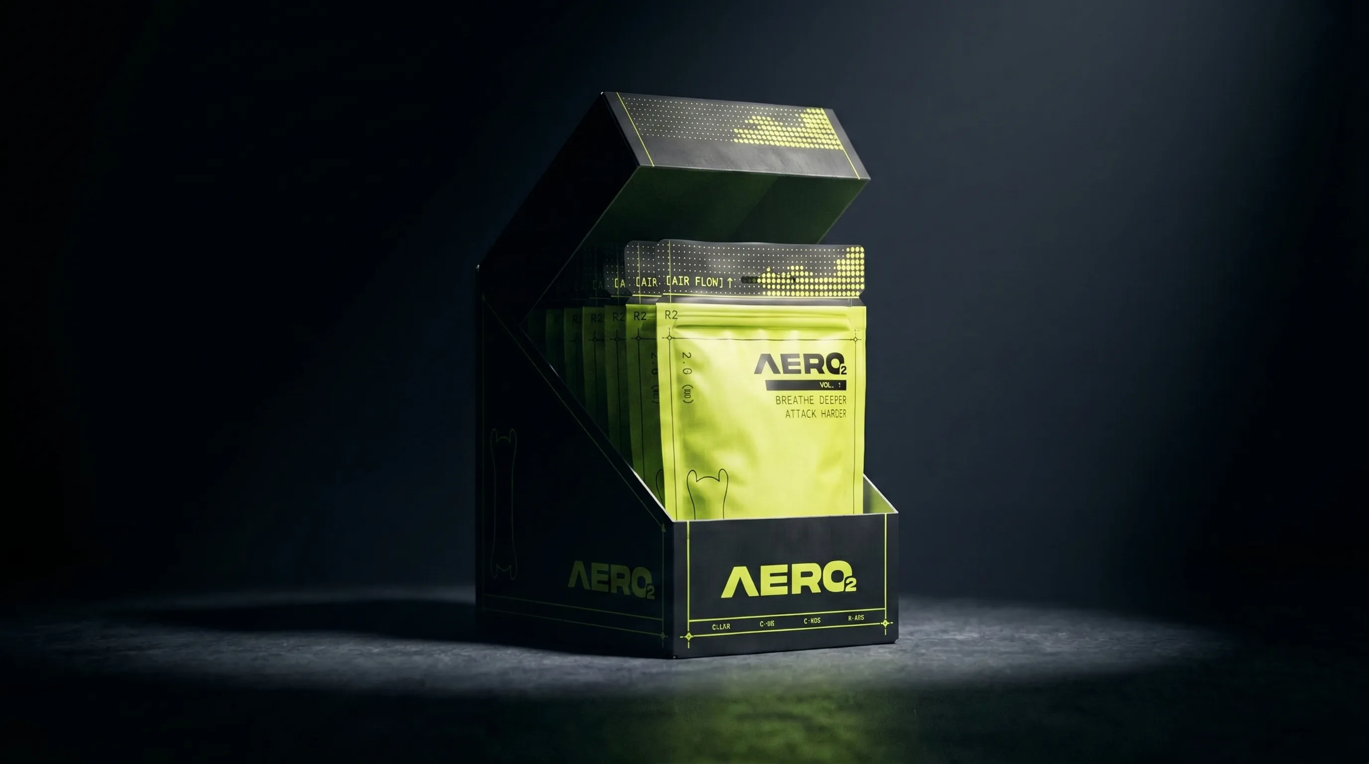
The packaging structure, a resealable stand-up pouch with a die-cut header, "AIR FLOW" indicator, and back-of-pack usage instructions, was designed once and built to carry any of the five tested colors without changing layout. That let the same production file scale from the volt green hero SKU to a full seasonal or regional color range.
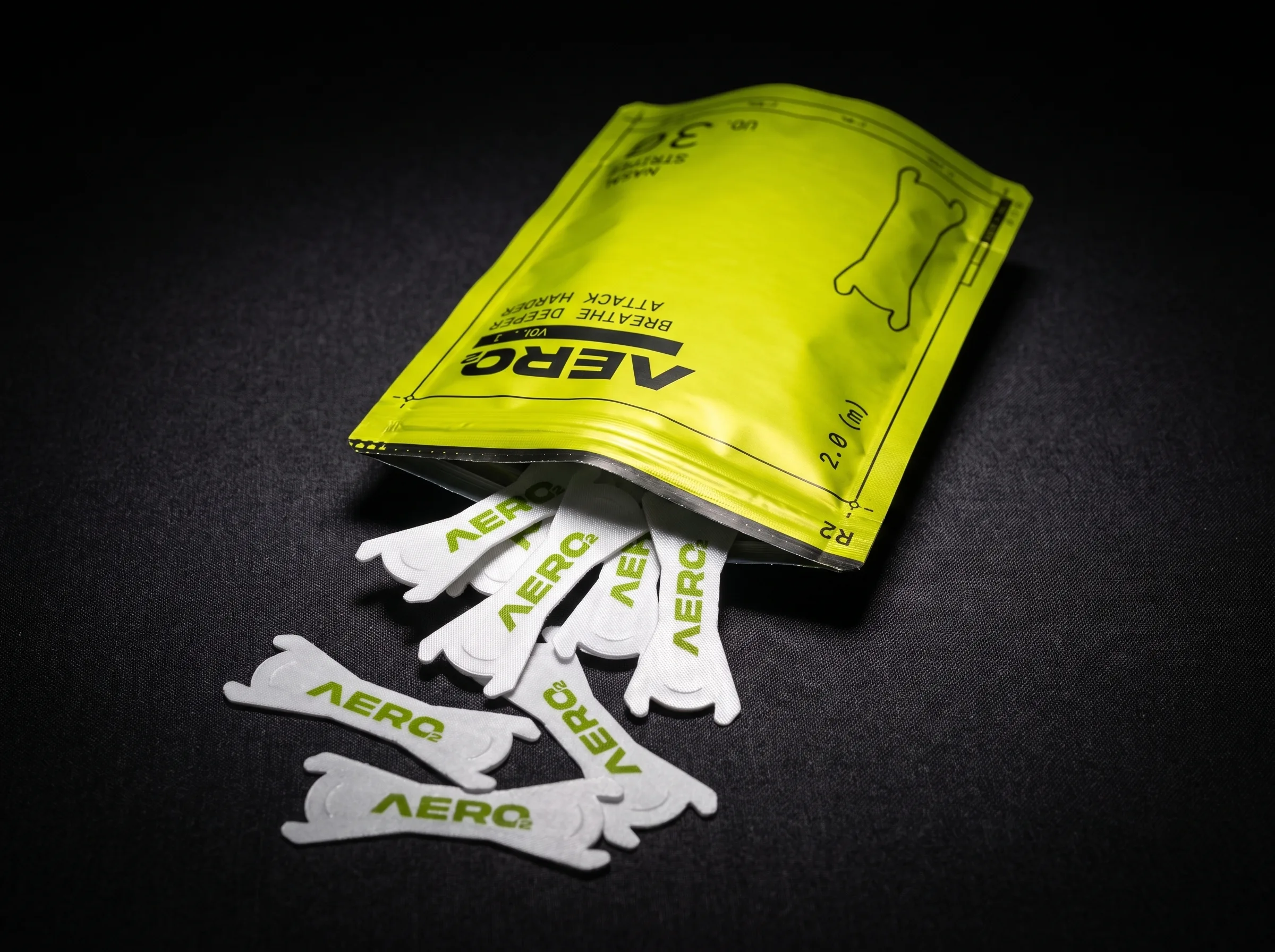
Resealable pouch, opened, hero SKU
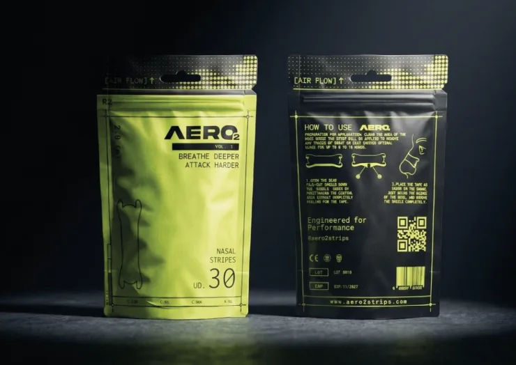
Retail display carton, shelf-ready case pack
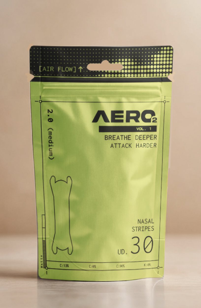
R1, Volt Green, hero SKU
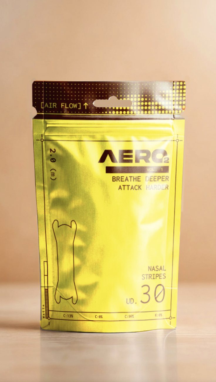
R5, Yellow, limited edition
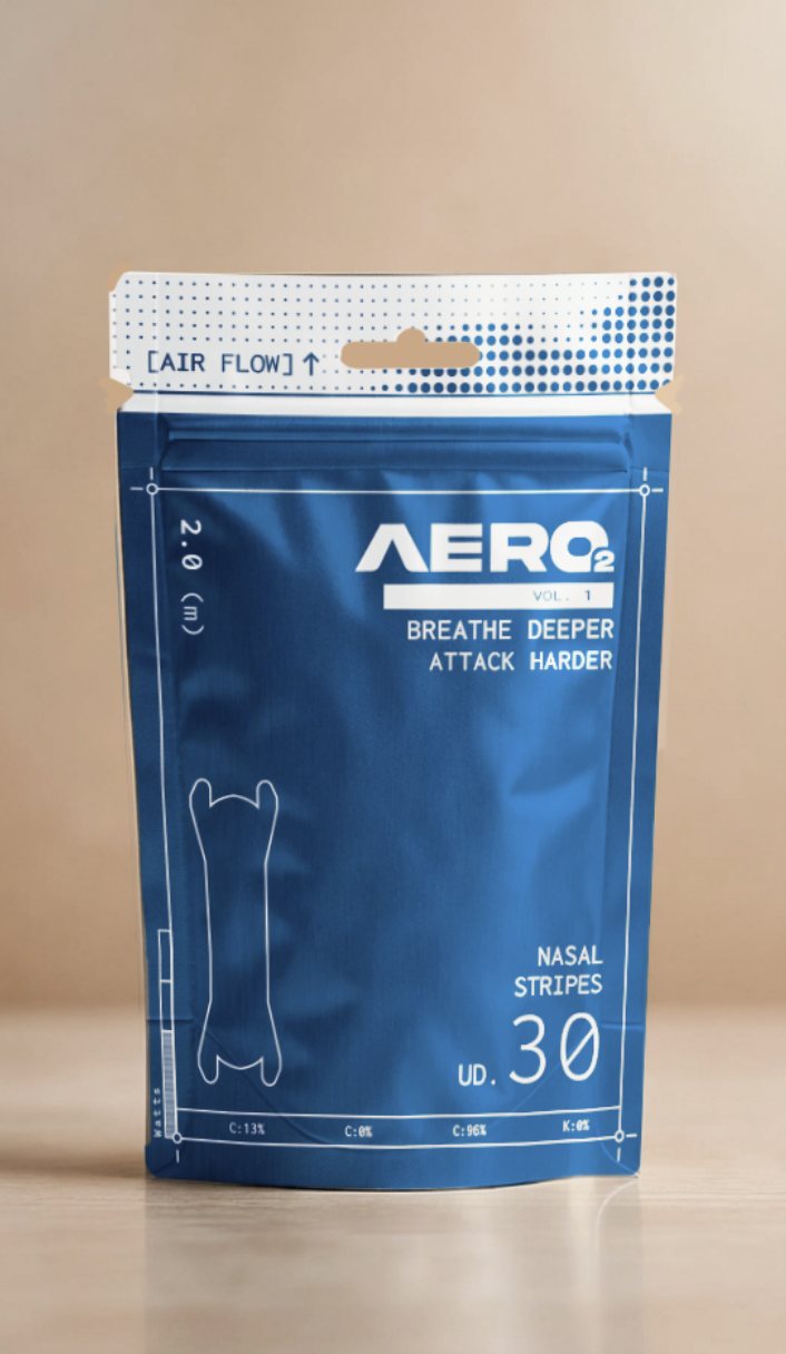
R2, Cobalt Blue, core line
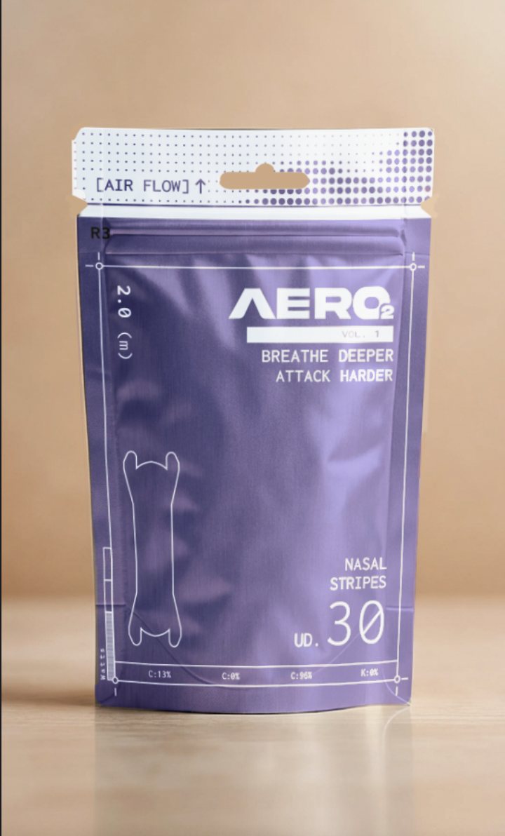
R3, Periwinkle, recovery
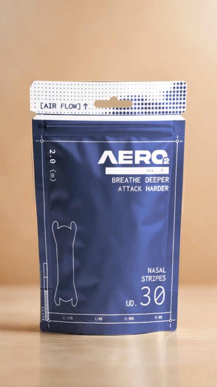
R4, Navy, premium tier
Phase 05, Visual Language
Acid Green on Obsidian Black
The color decision didn't stop at picking a hex code. Volt Green only reads as "engineered performance" because of what it's paired with: near-black backgrounds, dot-matrix halftone gradients, dimension lines, crop marks, and CMYK spec callouts printed straight onto the packaging (C:13% M:0% Y:96% K:0%, [AIR FLOW]↑). That combination has a name in graphic design: acid-green-on-obsidian, dressed in a technical-micrographics graphic language, packaging and product design that borrows the visual grammar of engineering drawings and lab spec sheets instead of retail shelf design.
The pairing has a specific lineage. Acid/volt green is the color the human eye is most physically sensitive to (peak rod-cone sensitivity sits near 555 nm, in the yellow-green band), which is exactly why it's the base color of hazard signage, PCB boards, and night-vision phosphor displays: it's the industrial "look here, this is precise" signal, not a decorative choice. Nike deliberately weaponized that same physiology in 2012, briefing "Volt" as the signature color of the London Olympics kit; in Martin Lotti's words as Nike's global creative director, "the whole point of this was to create impact." Set against black instead of white, the same green stops reading as hazard-tape and starts reading as circuitry, night-vision, lab equipment, in other words, engineered rather than dangerous.
"Technical micrographics" is the second half of the language: dot-halftone gradients that mimic photographic screen printing, registration marks and dimension lines lifted from CAD drawings, spec callouts printed in the position a factory technician would expect them. It's the same graphic vocabulary that fashion-technical crossover labels (Off-White's diagonal technical tags, A-COLD-WALL*'s exploded-diagram graphics) and biohacking wellness brands (Whoop, Eight Sleep, Levels) use to borrow clinical, engineered credibility instead of soft "wellness" softness, a visual shortcut for "this was designed by people who measure things."
The research recommendation on file is explicit about this: the graphic language, micrographs, engineering drawings, halftone screens, does as much work as the color itself, especially for Cobalt Blue and Navy, which read as generic without it.
That's why the same dot-matrix header, dimension lines, and spec-sheet callouts were built once into the dieline and applied identically across all five colorways rather than treated as a Volt Green-only flourish: on the safer, more familiar colors the technical graphic language is doing more of the "this is engineered, not medical" work than the color is.
Phase 06, Brand System & Production
Wordmark, Dieline, Spec Sheet
Alongside the color work, the wordmark itself went through refinement, tightening the "AERO2" lockup and pairing it with a die-cut "bone" icon that echoes the strip's own shape, then locking both into print-ready production files with color specs, barcode, QR code, and regulatory marks (CE, batch/lot, expiry) for every SKU.
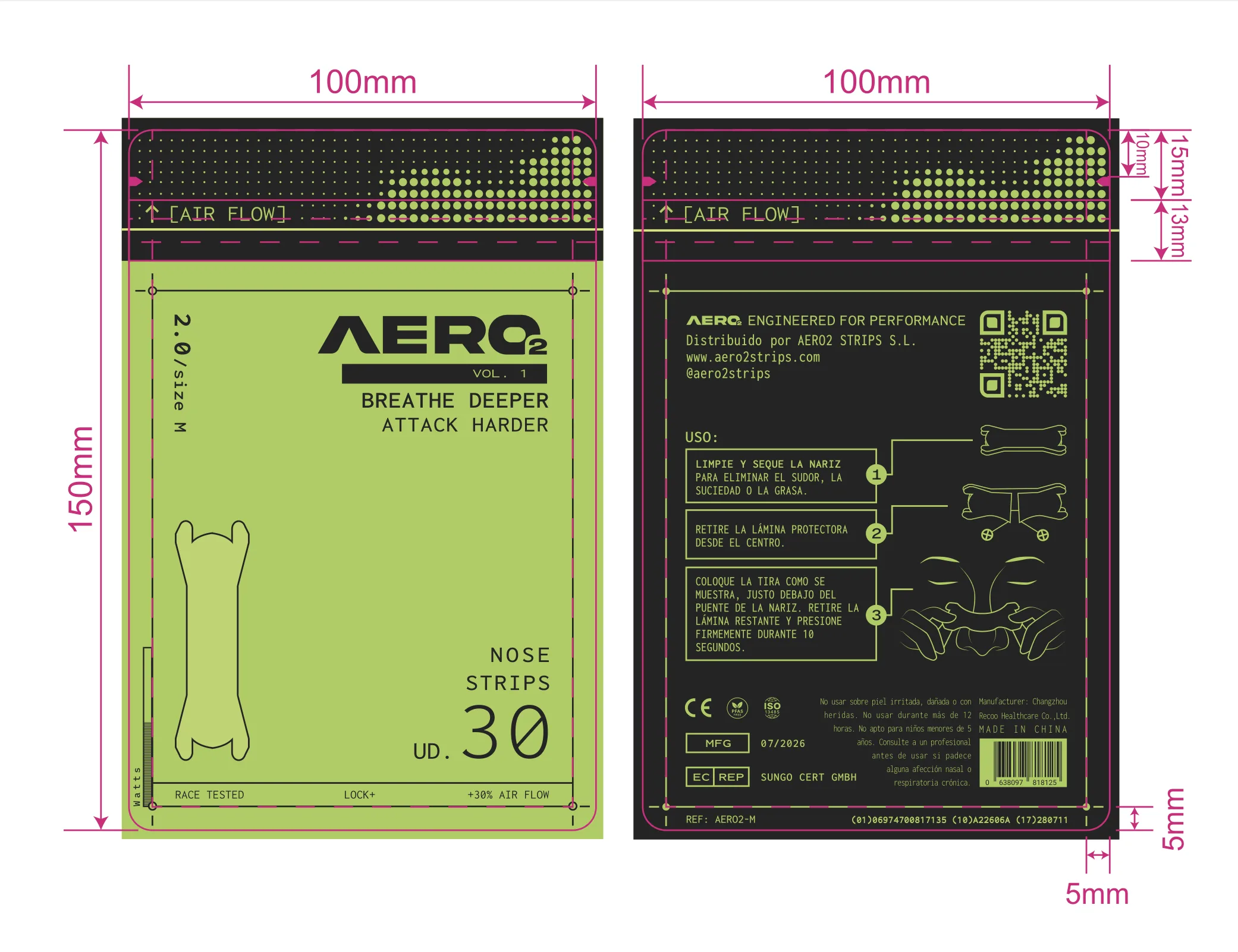
Production dieline, logo lockup exploration
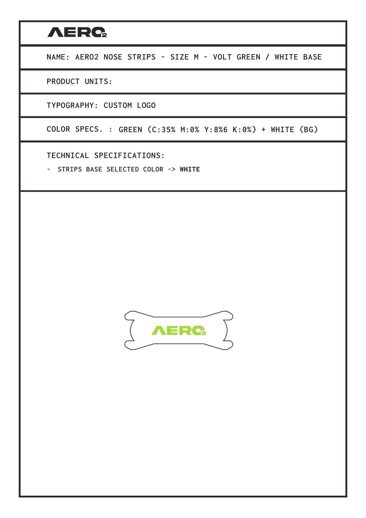
Tech spec sheet, size M
Phase 07, Regulatory & Customs
Designing Inside EU Packaging Law
Packaging design here doubled as compliance engineering. Every element on the 100×150mm pouch back had to satisfy EU medical-device and customs requirements before it satisfied the eye, treated as design constraints rather than legal fine print bolted on at the end:
- Market-language copy. Usage and medical information must be printed in the official language of the country of sale. Spain is the initial launch market, so the entire back panel, "USO," step-by-step instructions, and warnings, is fully in Spanish (visible on the dieline above).
- Serial number & barcode (GS1/EAN). A scannable barcode plus a GS1 application-identifier string, GTIN, batch, expiry, is required for both retail checkout and customs traceability.
- MFG / expedition date. The manufacturing date is printed on every pack so retailers and customs can verify shelf life and import timing at a glance.
- Lot number. A batch/lot code ties every pouch to its specific production run, the requirement that makes a recall or a quality complaint traceable back to a single batch.
- Class 1 medical device certification. Nasal strips are regulated as a Class 1 medical device under EU MDR, so the CE mark and an EC REP (the EU-based authorized representative) both have to appear on pack.
What's Next
Two SKUs, Straight From the Research
Volt Green ships first as the hero, performance SKU. The next two launches come directly out of the color study rather than a fresh guess:
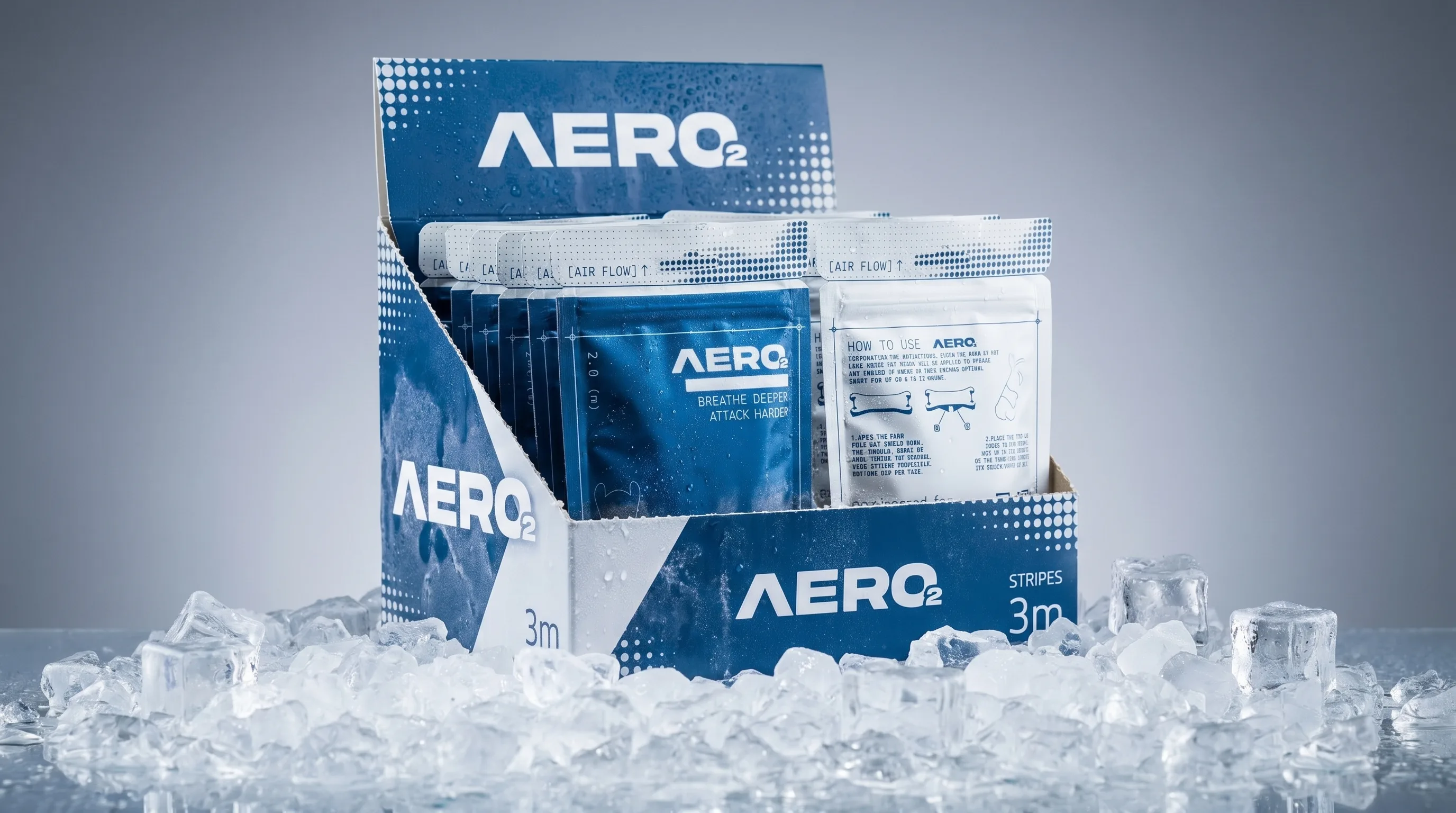
Cobalt Blue, the next line queued for production
Cobalt Blue, Everyday Training
A more affordable, everyday-comfort variant built for daily training rather than race day, using R2, the colorway that tested as the most trusted and pharmacy-ready of the five.
Periwinkle / White, Rest & Recovery
A dedicated sleep-and-recovery SKU built on R3, the direction with the strongest "recovery" association in testing and the best cross-cultural fit for future markets beyond Europe.
Key Learnings
What This Project Taught Me
- Positioning has to be locked before color. Every color argument in this project was actually a positioning argument in disguise, testing palettes without agreeing on "inspirational, premium, race-day visible" first would have produced a prettier deck and a weaker decision.
- Graphic language carries as much weight as the hex code. Cobalt Blue and Navy only stopped feeling generic once the dot-matrix, dimension-line, spec-sheet graphic system was applied consistently, the color was never the whole story.
- Real interviews catch things a moodboard can't. The "reads like a bruise on pale skin" and "reads like blood near the face" risks on Oxblood only surfaced because respondents were shown the color on an actual nose, not a swatch on a screen.
- Regulatory compliance is a design constraint, not a footnote. Packaging rules, especially inside the EU, turned out to be one of the most complicated parts of the whole project. Certification seals, the sold-country's language, barcodes, lot/expiry codes, and mandatory copy all had to fit on a 7×10 cm pouch, and nearly every one of those additions forced another pass on layout, type size, or icon placement. The dieline went through 18 tracked revisions in a single afternoon largely because of this back-and-forth, not because the creative direction was unstable.
Reflection
Honest Limitations
32 respondents is enough to point a launch decision in the right direction, it is not enough to fully de-risk it. Before scaling the color range further, the recommendation on file is to run a larger, region-split quantitative survey to validate Volt Green as the hero color at population scale, and to pressure-test legibility on darker skin tones for the Periwinkle and Navy strips specifically, both read weaker in low-saturation lighting during testing and deserve dedicated visibility checks before a recovery SKU ships.
Toolchain
Research to Production
The project moved from qualitative interviews to a written survey, into vector production files ready for print, all owned end to end.
What's Next, Digital
The Website Is Next
The brand and packaging system built here is now feeding directly into AERO2's e-commerce build, currently in progress. The architecture is headless and split by strength: a Next.js frontend for the storefront itself, and Shopify running the commerce backend, connected through Shopify's Storefront/Admin APIs rather than shipping Shopify's default theme.
That split is deliberate. Next.js gets the parts it's genuinely better at: page speed, SEO, and full control over the same technical-micrographics visual language from this case study, things that are hard to fake inside a templated Shopify theme. Shopify keeps the parts nobody should rebuild from scratch: checkout, payments, inventory, and the B2B integrations AERO2 needs on day one, shipping carriers, warehousing/3PL, and manufacturer/supplier connections, all of which already live natively in Shopify's ecosystem. The two halves talk to each other through the same APIs, so the storefront stays fast and fully custom while the operational backbone stays boring, reliable, and already built.