Armstrong Educational Services, turning a 30-year teaching career into a productized consulting brand.
End-to-end engagement for Camille Hampton, a Georgia DECAL-Approved Trainer and early-childhood consultant: a brand identity, a two-layer design-token system, a 21-route Next.js product built through an agent team I directed, a rebuilt pricing and conversion funnel, and the SEO/GEO groundwork to rank across three states.

Abstract
The project in six lines.
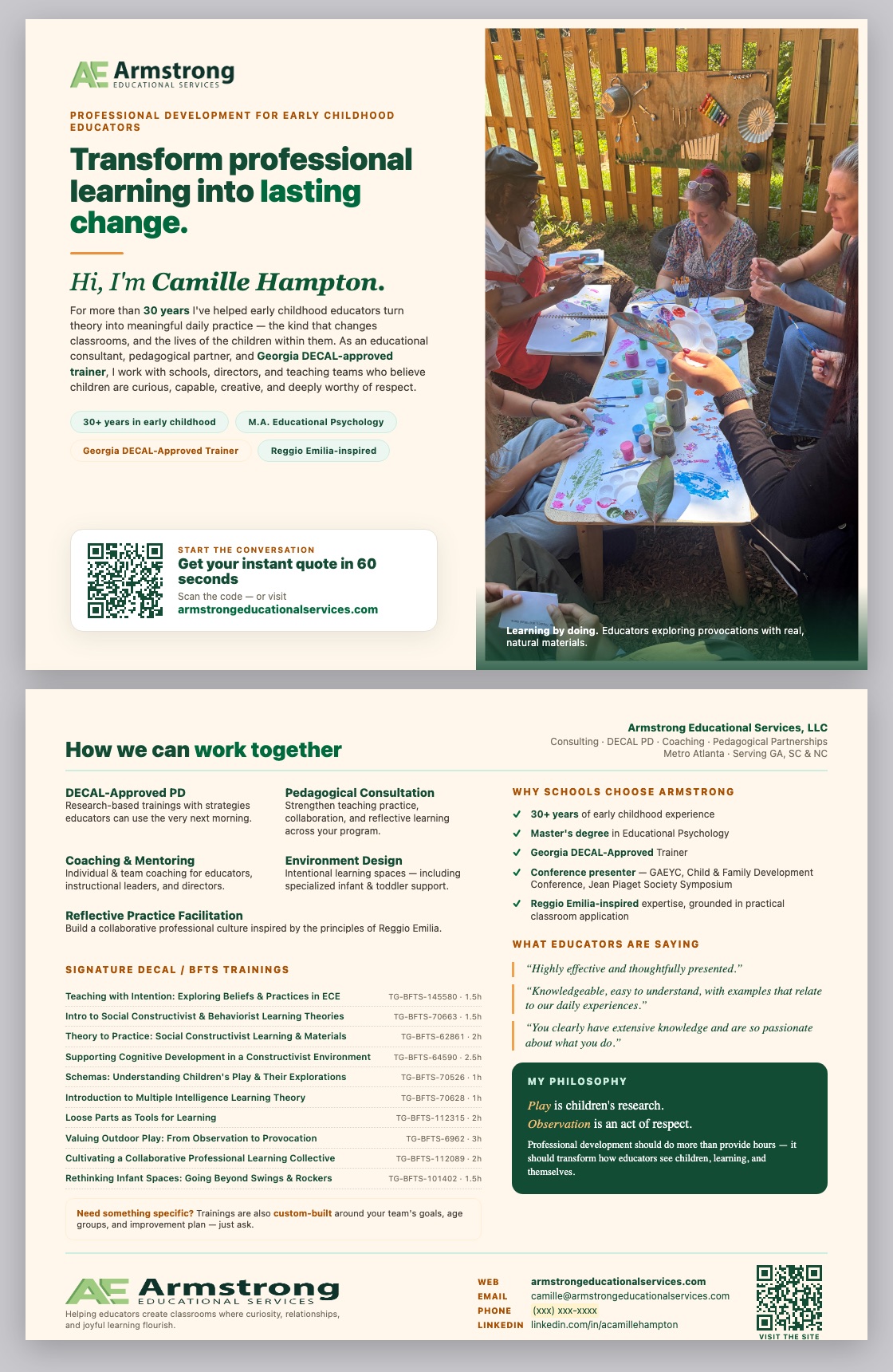
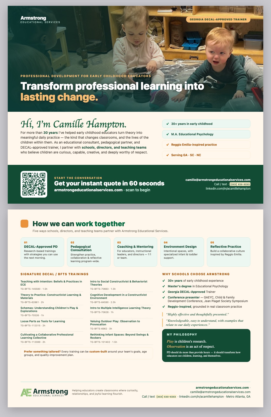
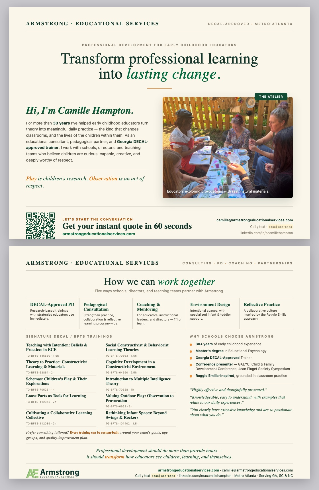
- Rebuilt the brand from a bare business name into a full identity system: logo, a forest/orange/cream palette, voice guidelines, and three print-collateral directions.
- Designed a two-layer, primitive → semantic Figma token system with Light + Dark modes, feeding a Tailwind v4 implementation with zero hardcoded hex values.
- Directed a 4-phase agent team (Foundation → Build → Audit → Verify) that shipped a 21-route Next.js monorepo — the public site plus a documented internal design-system app with Cmd-K — from markdown specs I authored.
- Rebuilt the conversion path: fixed a broken workshop-grid overflow, added the trust signals a skeptical B2B buyer needs, and reframed Camille's own pricing instinct — "3 hours isn't 3× the price" — into an explicit, buyer-tested decay curve.
- Ran a full self-QA pass before calling it done: the pricing calculator validated against 7 worked examples, a hardcoded-color audit, and a static WCAG 2.2 AA accessibility pass with severity-ranked findings.
- Closed the loop with a GA4 + Clarity analytics foundation and a 1-year growth roadmap for after launch.
The client & the problem
30+ years of expertise, zero product around it.
Camille Hampton is a Georgia DECAL-Approved Trainer and early-childhood consultant with 30+ years in the field — an M.A. in Educational Psychology from the University of Colorado at Denver, a formation at the Reggio Emilia-inspired Boulder Journey School, and a conference record that includes the Jean Piaget Society Symposium and GAEYC. She specializes in professional development, coaching, and DECAL-approved CEU training for teachers of children ages 2–6, working with private preschools and Reggio-inspired schools across metro Atlanta and, increasingly, online.
None of that expertise had a product wrapped around it. Armstrong Educational Services existed as a business name with no visual identity, no pricing system a director could self-serve, and no digital presence beyond referrals and a LinkedIn profile. Every booking ran through a manual conversation, every price was negotiated from instinct, and there was no way for a director in South Carolina or North Carolina — states with their own training-hour requirements — to even find her.
Camille's own pricing instinct was correct — schools won't pay 3× the rate for a 3-hour session. What the business didn't have was a system that could prove that instinct, price consistently around it, and let a director quote it herself in under a minute.
My role
I owned brand, business strategy and UX — an agent team built inside the constraints I set.
I was the only designer on this engagement, and the one directing the build. I authored every source document an agent team could execute against: a client profile consolidating Camille's biography and methodologies, a pricing & business-strategy plan, a home-page structure and CRO audit, an SEO/GEO master plan, and the design-system specification itself. I owned the brand identity, the token architecture, the conversion-rate strategy, and the SEO foundation end-to-end.
The agent team executed the Next.js build, ported the component library, and ran the pre-launch audits — inside non-negotiable rules I wrote (below), with every file-ownership boundary and every content source traced back to a doc I authored. Judgment calls — which visual direction to ship, how aggressive the pricing decay should read, what to say about Camille's own past speaking feedback — stayed with me.
Branding & identity
A wordmark, a palette, and a voice rule: sentence-style, not Title Case shouting.
The identity had to read as credentialed and warm at once — a business built on 30 years of trust, not a franchise course-mill. The mark pairs an "AE" monogram with a full "Armstrong Educational Services" lockup in a forest-green/sage duotone; the supporting palette runs a warm cream/sand neutral scale against a single accent orange, kept for CTAs and highlights only. Voice guidelines set one explicit rule across every surface: sentence-style capitalization, never Title Case headlines — a small thing that keeps 20 pages of copy from reading like a stock template.
Design system
Primitives feed semantics; components never touch a raw color.
The token architecture is two layers. Primitives are raw, theme-agnostic values — 52 colors across five perceptual 50→900 scales, 14 spacing steps, 7 radii. Semantic tokens are usage roles aliased to those primitives, with separate Light and Dark maps — primary, surface-cream, on-accent-soft, ring. The golden rule I wrote into the spec: components never bind to a primitive directly, only to a semantic token — so re-theming is a one-line alias change, not a find-and-replace.
Components never use primitives directly. They always bind to semantic tokens — primitives exist only to feed them.
The design-system spec's golden rule, written before a single component shippedHow it was built
Hand-crafted in Figma. Automated by Claude Code agents. Bidirectional, not one-way.
The token architecture above didn't get typed into a CSS file by hand, and it wasn't generated blind by an agent either. It moved back and forth between Figma and Claude Code at every stage: the parts that need a human eye stayed a craft; the parts that are pure repetition became a pipeline.
Hand-crafted, in Figma
- Every primitive and semantic token authored as a real Figma variable, in the two-layer architecture (never a component bound to a primitive)
- Component anatomy and variants (states, sizes, tones) drawn and named first — the code has to match the file, not the other way around
- Spacing rhythm, type scale and the "sentence-case, not shouting" voice rule — perceptual judgment calls a model can't make alone
- Sign-off on which of two visual directions ships
Automated, by agents
- Figma variables exported straight into
tokens.css/tokens.ts— no hand-copied hex values to drift out of sync - Each Figma component spec ported into
@armstrong/uias token-bound React + CSS, prop contracts preserved from the component's own spec - Figma Code Connect maps every shipped component back to its exact Figma node, so Dev Mode shows the real, current code — not a guess
- The documentation app (below) regenerates from the same source, so docs can't quietly drift from what's actually shipped
The documentation library lives as its own Next.js app (apps/design-system) — an internal site, not public-facing — with six sections and a Cmd-K command palette to jump between any of them:
Overview
Introduction, getting started, architecture, changelog — the entry point for anyone new to the system.
Sitemap
Every public route in one explorer, generated from the routing table rather than maintained by hand.
Research
The client profile, SEO master plan and pricing strategy — the source docs every agent's brief traces back to.
Tokens
Color, spacing, radius, typography and elevation — each rendered live from the actual CSS variables, not a static screenshot.
Components
19 components, each with its own detail page (props, variants, usage) — searchable instantly with Cmd-K.
Agents & Skills
Which agent or skill is responsible for which surface — so the next build session (human or agent) knows exactly where to start.
The component library itself — @armstrong/ui and @armstrong/tokens — lives as versioned workspace packages in the same GitHub monorepo, not copy-pasted between projects. That's the actual point of building it this way: any future agent team, or any human developer, building the next Armstrong surface imports from these packages instead of re-deriving a color, a spacing value, or a button's hover state from scratch. Style unity and scalability aren't a style guide PDF someone forgets to open — they're the only path of least resistance.
/* PRIMITIVES — theme-agnostic raw values */
:root {
  --color-green-600: #006a3e; /* brand primary */
  --color-green-800: #124c34; /* forest */
  --color-orange-500: #e9923b; /* brand accent */
  --color-neutral-100: #f8f3e6; /* surface-cream */
  --color-neutral-900: #1c1c16; /* ink */
  /* … 52 colors, 14 spacing steps, 7 radii, one primitive mode */
}

/* SEMANTIC TOKENS — LIGHT (default). Alias primitives, never raw hex. */
:root, [data-theme="light"] {
  --primary: var(--color-green-600);
  --primary-hover: var(--color-green-700);
  --surface-cream: var(--color-neutral-100);
  --ink: var(--color-neutral-900);
  --ring: var(--color-green-600); /* keyboard focus */
}

/* DARK — inverts the neutral ramp, lifts brand one step for contrast */
[data-theme="dark"] {
  --primary: var(--color-green-400);
  --surface-cream: var(--color-neutral-800);
  --ink: var(--color-neutral-50);
}

/* Tailwind v4 @theme — utility classes resolve to the live var(),
   so bg-primary / text-ink keep switching with [data-theme] at runtime */
@theme inline {
  --color-primary: var(--primary);
  --color-ink: var(--ink);
}.aui-btn {
display: inline-flex;
align-items: center;
justify-content: center;
gap: var(--space-2);
border-radius: var(--radius-pill);
font-weight: 600;
transition: background-color .18s ease, border-color .18s ease, transform .18s ease;
}
.aui-btn:disabled { opacity: .5; pointer-events: none; }
/* sizes */
.aui-btn--sm { padding: var(--space-2) var(--space-4); font-size: 14px; }
.aui-btn--md { padding: var(--space-3) var(--space-6); font-size: 16px; }
/* tones — every color is a semantic token, zero raw hex */
.aui-btn--primary { background: var(--primary); color: var(--on-primary); }
.aui-btn--secondary { background: var(--surface-card); color: var(--primary); border: 1px solid var(--hairline-strong); }
.aui-btn--ghost { background: transparent; color: var(--primary); }
.aui-btn--ghost:hover { background: var(--surface-mint); }/* Built ENTIRELY from atomic tokens + primitives — no new colors
invented at the composed-component layer either. */
.aui-workshop {
background: var(--surface-card);
border: 1px solid var(--hairline);
border-radius: var(--radius-card);
box-shadow: 0 1px 2px rgba(18, 76, 52, 0.04);
transition: transform .2s ease, box-shadow .2s ease;
}
.aui-workshop:hover {
transform: translateY(-4px);
box-shadow: 0 12px 28px rgba(18, 76, 52, 0.1);
}
.aui-workshop__placeholder {
background: linear-gradient(135deg, var(--surface-mint), var(--mint));
}
.aui-workshop__cta { margin-top: auto; padding-top: var(--space-2); }Admin panel & email system
Designing for the one person who actually runs this business every day.
Camille isn't just the brand on the homepage — she's the sole daily user of the admin panel behind it. She's in her 50s, not from a technical background, and learned the web through referrals and word of mouth, not through a career of SaaS dashboards. The admin panel had to optimize for her confidence and low cognitive load over feature density, even though the system underneath has eleven distinct admin areas.
@armstrong/ui / @armstrong/tokens packages, so it never looks like a "different, scarier app."Navigation, ordered by how often she actually needs it: Dashboard, Quotes, Contacts, Bookings and Calendar & availability sit at the top of the nav — the four things she checks daily. Trainings catalog, Programs, Pricing, Articles, Admins and Settings sit lower, intentionally lower-frequency, so the first screen she sees never overwhelms her with all eleven areas at once.
Stack: Next.js App Router under /admin, gated by Supabase auth plus a role check (only accounts flagged admin can reach it); Supabase Postgres with row-level security ("owner sees all"); the Google Calendar API syncs her real calendar, so the availability she sees in the app is her actual calendar, not a second one she'd have to keep updating by hand.
The email system — one shared shell, two very different readers.
Every quote passes through an email system that has to satisfy two people who never share a screen: the client filling out the quiz, and Camille checking her inbox from her phone. Both get an HTML email built by one shared renderEmail() function — table-based layout, inline styles, a 600px max width, and a web-safe font stack, because custom fonts and modern CSS don't survive most email clients. Every email also ships a plain-text fallback for inboxes that block HTML entirely. Only the content changes per email; the branded shell (logo, green accent bar, mint recap card, forest footer) is identical everywhere, so nothing about the emails looks improvised.

A client wants to discuss their budget
From Sarah Chen (sarah@sunnydaypreschool.com).
Preferred date: none chosen — propose options. Payment is arranged with you directly — there is no checkout in the app.
Thank you, Sarah!
Anna Camille has received your training budget. Here's a copy for your records.
Warmly,
Anna Camille Armstrong
Armstrong Educational Services
Left — the notification Camille gets. Right — the confirmation copy the client keeps. Same shell, same recap card, two different jobs.
CRO & conversion
Three conversion goals, audited section by section against a real layout.
Before writing new copy, I audited the built homepage against three explicit conversion goals: (1) a director requests a custom quote in about 60 seconds via the calculator, (2) an individual educator self-enrolls in an online CEU course with no contact form, (3) teachers and schools form their own groups to unlock lower per-head pricing. The audit surfaced both layout bugs and missing trust structure.
Before5 workshop cards at 304px inside a 1360px container — 1,520px of cards alone, running past both the 1280px content grid and the 1440px frame.
AfterA 4-up grid at 302px / 24px gap, exactly filling 1280px; the 5th signature workshop wraps to its own row instead of overflowing the page.
BeforeEvery section improvised its own inner width — the visible "things don't line up" problem across hero, programs, calculator and testimonials.
AfterOne shared 1280px content container (80px gutters on the 1440 frame) enforced on every section; full-bleed bands may span 1440, but their inner content always aligns to the same edges.
BeforeNo credentials strip, no answer to the recurring objections (3-hour pricing, DECAL compliance, travel fees, net-30 invoicing), and no path for a director who isn't ready to self-quote yet.
AfterAdded a credentials/affiliations strip (DECAL, Boulder Journey School, GAEYC, NAREA), a trust band beside the calculator, an FAQ answering every recurring objection, and a discovery-call + lead-magnet closing band for warm-but-not-ready leads.
"How I work" — three real speaking critiques, made public as commitments.
Camille's own client profile named three constructive critiques from past speaking engagements: voice projection, slide pacing, and venue/lighting setup. Instead of hiding them, the redesign turns each into a stated commitment ahead of the calculator, right where a first-time buyer needs reassurance: a wireless mic on every booking, chunked slide content with reflection breaks, and a venue checklist required before every booking. Transparency about a fixable weakness reads as more credible than silence.
Conversion flow
Why a 9-step quiz outperforms one long form — and the research behind that call.
The brief behind this flow was a real tension: raise conversion without burying the visitor in a configuration screen that has 9 real variables (state, program, delivery, hours, team size, add-ons, trainings, scheduling, confirmation). Splitting that into one guided question at a time isn't just friendlier — it measurably keeps people moving, and it makes people feel like the quote at the end was built for them, not pulled from a price list. That isn't a hunch; it's a small set of well-documented behavioral-UX findings. (Drawn from established UX/behavioral-research literature in my working knowledge — I didn't have live web access in this session to pull fresh sources, so treat these as the well-known, textbook version of each effect.)
Miller's Law & chunking
Working memory holds a handful of items at once. One decision per screen, instead of 9 fields on one page, keeps each step inside that limit.
Hick's Law
Decision time grows with the number of options visible at once. Showing one question at a time keeps every single decision fast.
Progressive disclosure
A core Nielsen Norman Group heuristic: reveal complexity only when it's relevant — the NC credential-tier question only appears for North Carolina, never before.
Zeigarnik effect
An unfinished task creates a mental itch to close it out. "Step 3 of 9" and a visible progress bar exploit exactly that discomfort with things left incomplete.
Goal-gradient effect
People push harder as they perceive themselves closer to a finish line (Kivetz, Urminsky & Zheng, 2006). A progress bar filling toward 100% is that effect, made visible.
Commitment & consistency
Cialdini's principle: a small, easy first "yes" (just pick your state) makes people far more likely to keep answering than a 12-field form ever could on page load.
The "IKEA effect"
People value what they help assemble more than what they're simply handed (Norton, Mochon & Ariely). Building your own quote step by step makes the same pricing engine feel custom-made.
Mapped end to end below — including the one branch that matters most for conversion: whether the visitor is already logged in when they reach the confirmation step.
Pricing & business strategy
"3 hours isn't 3× the price" — turned into a fairness curve, not a discount.
Camille's asking price of $35 per teacher per in-person hour sits exactly in the market's comfort zone for mid-tier facilitators in metro Atlanta. Her instinct that a school won't pay 3× that rate for a 3-hour session is also correct — market benchmarks across comparable providers converge on roughly a 2.3× multiplier for 3 hours, not 3×. The decay curve below isn't a discount Camille is forced to give: it's the fairness curve buyers already expect, and pricing to it signals professionalism rather than negotiation.
- Group-formation mechanic — teachers and schools can form their own groups to unlock lower per-head pricing, including cross-school events; the calculator previews the next price break as an incentive to add one more attendee.
- Two add-ons raise order value without adding delivery time — an extended Q&A block and DECAL CEU certification, both priced as calculator line items.
- A $280 minimum-viable floor — below that total, the spec calls for an explicit warning rather than a silently thin booking; flagged as still-open below.
- Day-reduction plan — the longer, higher-value session lengths this curve makes attractive are also the ones that concentrate Camille's live workload into fewer working days per month.
Agentic engineering build
I designed the constraints; a 4-phase agent team built inside them.
The public site and its internal design-system app were shipped by an agent team executing a build workflow I wrote, not by hand-coding every route. The workflow encodes phases, ownership, and non-negotiable rules so a large fan-out of work stays coherent and doesn't collide.
Non-negotiable rules written into every agent's brief: Next.js App Router, React 19, TypeScript strict — no any; Tailwind v4 mapped 1:1 to the semantic tokens, never a hardcoded hex; copy sourced verbatim from named sections of the docs I wrote — no invented facts about Camille, her credentials, or her pricing; image placeholders only until real assets land, each with descriptive alt text; WCAG 2.2 AA as a hard bar; and strict per-agent file ownership (nobody but the Foundation agent touches the root layout, nav, footer, or token files) so parallel work can't silently collide.
What the agent got wrong
Strong at exhaustive verification. Blind to visual and business judgment.
I ran the Verify phase as an adversarial pass, not a rubber stamp — re-checking the agent team's own work line by line rather than trusting its self-report.
FoundTwo bugs that failed the production build outright: a curly-quote character breaking JSX syntax on the resources page, and a server-component icon function passed as a prop across a client-component boundary — invalid in React 19.
Fixed, then re-verifiedBoth traced to their exact file and line, fixed, and the full build re-run to confirm — not assumed fixed because the diff looked right.
FoundRe-running all 7 worked pricing examples from my own spec against the shipped calculator: 6 matched to the cent, 1 was off by $14 on a 4-hour, 40-person scenario.
Traced, not patchedThe multiplier table in my own spec was internally inconsistent — the code correctly implemented the authoritative table value (2.70×); the one example's hand-annotation used a different, incorrect multiplier. The fix is a doc correction, not a code change — the agent flagged it as a decision for me rather than silently "fixing" working code.
FoundGrepping every .tsx/.css file for raw hex outside the token files surfaced exactly 3 offenders — all in the marketing homepage's hero, ported pixel-for-pixel from a design reference.
Correctly not flaggedTwo other hex usages (an OG-image renderer and a canvas force-graph) were left alone with a documented reason — neither can read CSS custom properties at render time — instead of being "fixed" into broken code.
The judgment call that stayed human: agents are excellent at exhaustive, structural verification — replay every pricing formula, grep every hex, check every route's title length. They're weak at the perceptual call between two visual directions, or at deciding whether a critique from a past speaking engagement should become public copy. That decision-making stayed with me.
SEO & GEO foundation
Entity-first schema, and a bet on being cited by AI answers, not just ranked.
Every page's JSON-LD resolves back to two stable entities — a ProfessionalService and a Person node for Camille — so schema never dangles across 24 indexable URLs. robots.txt and a published llms.txt explicitly allow-list GPTBot, ClaudeBot, PerplexityBot and ChatGPT-User alongside Googlebot and Bingbot: a deliberate GEO (generative-engine optimization) bet that directors increasingly ask an AI assistant, not just Google, before they ask Camille.
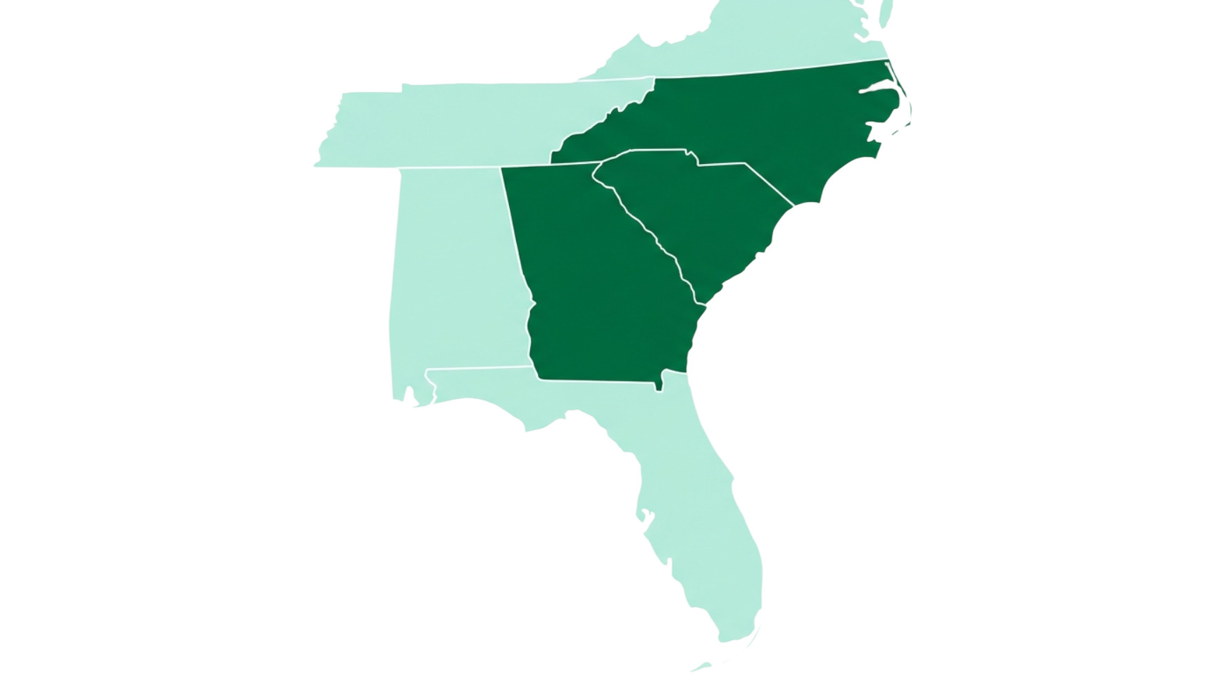
The content architecture centers on a certification hub with three state-specific subpages, each using the correct local terminology and hour requirements — Georgia's DECAL/BFTS (10 hrs/yr), South Carolina's SC Endeavors/ABC Quality (15 hrs/yr), and North Carolina's DCDEE (5–20 hrs/yr by credential) — plus a blog cluster timed to each state's annual renewal season.
Stack & why
Every tool here is load-bearing for the agentic workflow, not a résumé line.
Next.js (App Router) + React 19
TypeScript-strict routes the agent team could fan out across in parallel without a shared-state build tool getting in the way.
Tailwind v4, token-bound
Utility classes mapped 1:1 to the semantic tokens made "no hardcoded hex" a mechanically checkable rule, not a style guideline.
Supabase
Auth and data for the contact form, lead capture, and the booking calendar integration.
next-intl (en / es)
Metro Atlanta's early-childhood workforce is bilingual; the DECAL-hour content had to be genuinely usable in Spanish, not machine-translated.
Figma variables CLI
Authored the primitive → semantic token architecture directly as Figma variables, exported to code rather than hand-copied.
Claude Code, multi-agent workflow
The build engine itself — phases, ownership rules and a verifier are what let one designer direct a 21-route build without losing coherence.
GA4 + Microsoft Clarity
Wired at the layout level, gated behind an environment variable so analytics only fire once launch is confirmed.
Resend + Google Calendar API
Transactional email and the discovery-call booking flow, without hand-rolling either.
Analytics & growth roadmap
The foundation is wired. Here's the first year of turning it into pipeline.
GA4 and Microsoft Clarity are already wired at the layout level — GA4 behind an environment variable so it only fires post-launch, Clarity for session recordings on the calculator and FAQ. The site isn't live traffic yet, so the roadmap below is deliberately a plan, not a results claim.
Launch QA & close the open gaps
- Verify GA4 events fire on quote-calculator start/complete and discovery-call booking
- Ship the $280 minimum-viable floor warning and the next-tier price preview (flagged open by the verifier)
- Submit the sitemap to Search Console + Bing; confirm hreflang en/es
Ride the DECAL renewal season
- Publish the 3-state certification blog cluster ahead of the Jan–Dec DECAL renewal window
- Push the "Director's DECAL compliance checklist" lead magnet through the discovery-call band
- Confirm real
reviewCountand author attribution on every published testimonial
Run the CRO experiment backlog
- A/B the trust-band placement and copy beside the pricing calculator
- Test the "how group pricing works" explainer against a plain discount label
- Instrument FAQ scroll-depth and clicks to see which objection actually blocks conversion
Expand on real data, not estimates
- Replace the SC/NC keyword-volume estimates with actual Search Console data
- Evaluate a retainer-coaching upsell funnel sourced from discovery-call transcripts
- Revisit the group-formation mechanic's real uptake vs. the pricing model's assumptions
Want the full story?
Happy to walk through the token architecture, the pricing model, or the agent build workflow in detail.