Role
Client work – UX-UI & Product Designer
Duration
3 months
Type
Client Project
Tools
 Figma
Figma
 Typeform
 Maze
Maze
Overview
The Brief
"We would like to improve our app and make it more user-friendly and engaging. We want to make sure that our users are getting the most out of our app and that they are happy with it, they use the app every day to be safe, and we would like to explore how we can monetize."
Beloo is a cycling safety app that broadcasts a rider's live position to contacts, provides incident alerts, and integrates roadside insurance. I was brought on as a Collaborator UX Designer to identify why daily usage was low, diagnose the existing UX debt, and design systems to fix it.
The engagement unfolded in four phases: a full heuristic audit, generative user research, hands-on user testing with real cyclists, and an end-to-end redesign covering interaction patterns, information architecture, and the complete UI.
Phase 01, Audit & Heuristic Review
The Problem
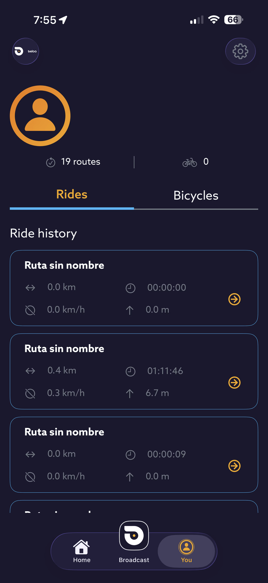
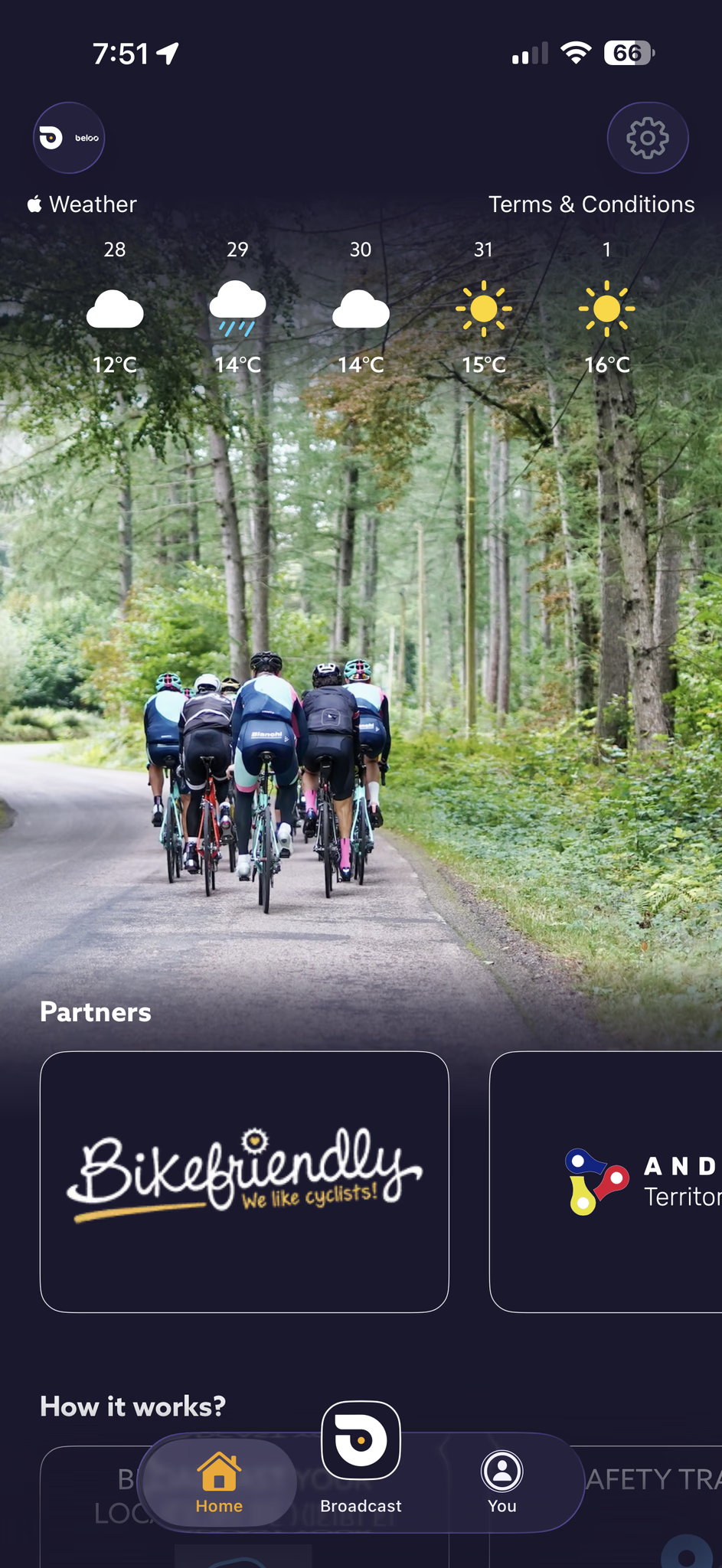
The initial phase focused on identifying the app's existing issues so the client could understand them and take actionable steps. The audit was conducted across three tracks.
Preliminary Analysis, A comprehensive review of heuristics, usage patterns, accessibility, CRO, usability, branding, colorimetry, performance, user retention, daily usage, user product perception, monetization, and business strategy. Key friction points:
- Emotional disconnect, Lack of emotional connection with the user and visual warmth.
- Inverted visual hierarchy, Cluttered, distracting interface with unclear priority.
- Navigation issues, Unintuitive nav bar, no main CTA, unclear action feedback.
- Accessibility failures, Contrast issues, especially critical on the home screen.
- Information Architecture gaps, Wrong content order, no quick access to core features.
- Brand inconsistencies, Visual and brand inconsistencies throughout.
- Suboptimal monetization, Poor perceived value and unclear premium tier messaging.
- Poor sensory experience, Overuse of high-contrast yellows and oranges without functional purpose.
Phase 02, The Client & Requirements
Understanding the Client
Before touching a single screen, I worked with the Beloo team to translate their ambition into concrete requirements. The north star was clear: improve the experience and make it genuinely memorable, turning the app from a tool people tolerate into one they choose. From that goal, three business-critical requirements shaped every decision that followed.
-
Requirement 01
From occasional to daily use
Apply adoption theory to leapfrog straight past regular use into a daily habit. Because Beloo is a safety app, consistent daily engagement isn't a vanity metric, it's what keeps riders protected on every ride.
-
Requirement 02
A value & monetization strategy
Design a clear value ladder and premium tier that lets the company generate sustainable, recurring revenue, without eroding the trust a safety product depends on.
-
Requirement 03
A cyclist-first map system
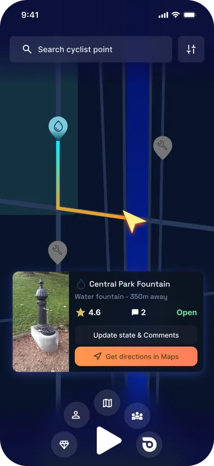
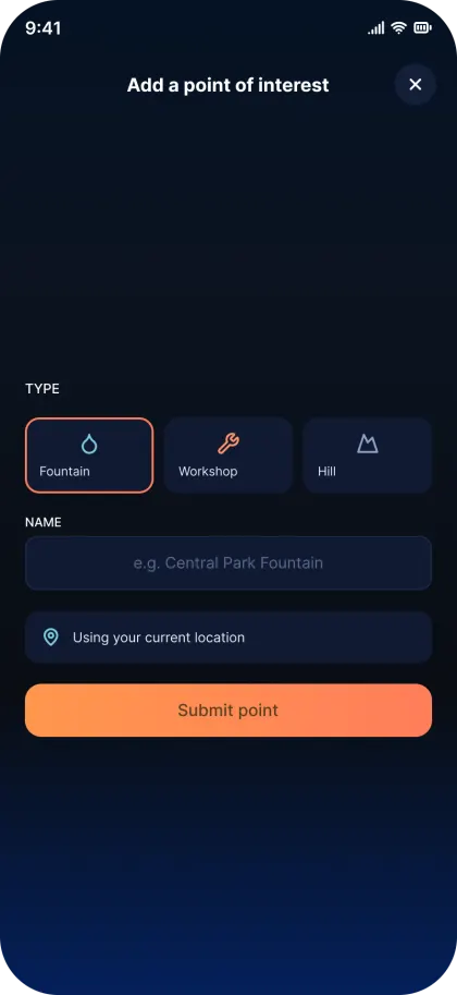
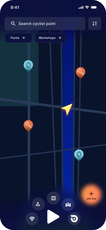
Build a mapping layer that surfaces the key points cyclists actually need, water fountains, climbs, repair workshops, hazards and fellow riders, turning the map into a reason to open the app.
Phase 03, User testing & Research
Understanding the Cyclist
Initial generative research was conducted to align with cyclists' mental models, ranging from professional athletes to casual riders. The goal was to map core pain points, safety concerns, and the incentives needed to integrate the app into daily riding routines. Understanding the "why" behind their interactions was the only way to address the gap between functionality and perceived value.
Testing methods
Online usability tasks
Task-based testing run remotely across different age groups, rider profiles and countries, spanning several European markets and the United States. Nine participants completed structured tracking and safety tasks over three weeks, giving us breadth across demographics and geographies.
Moderated field testing in Calpe, Spain
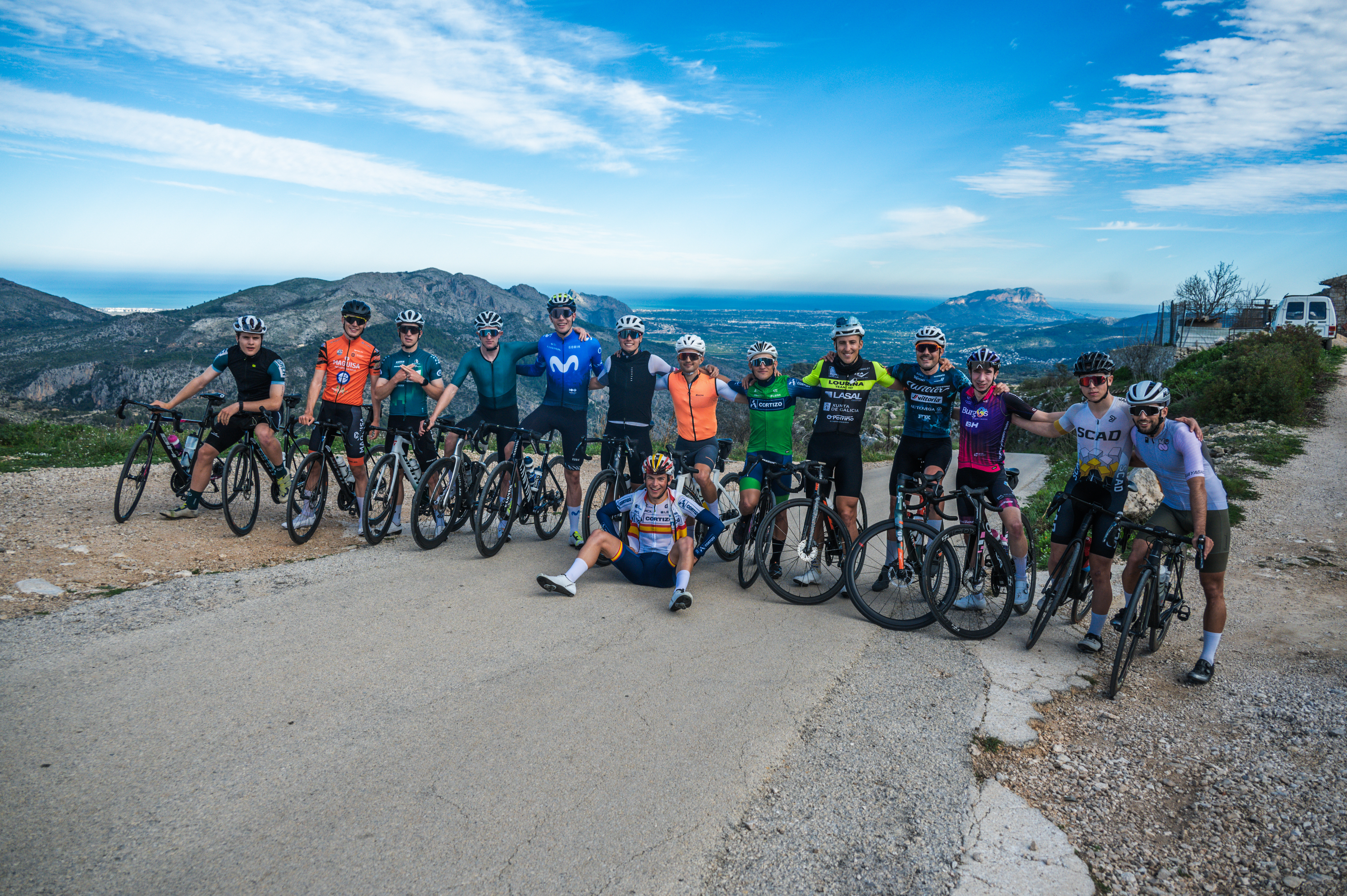
A group of professional, amateur and enthusiast cyclists, including Spanish champion Ivan Romeo, tested the app during a seven-day training camp in Calpe. Profiles were deliberately mixed to cover the widest range of users. A moderated test with control questions at several moments throughout the week, closing with in-depth interviews, a Typeform survey and a focus group.
Primary findings
-
Low Daily Retention
Users frequently forgot to open the app and struggled to perceive its utility beyond basic safety features.
-
Unclear System Feedback
Features felt confusing and lacked tangible value. Participants repeatedly requested integrations with third-party apps and easier access to core tools.
-
Confusing Information Architecture
Users lacked a clear understanding of the app's primary goals and layout, particularly the home screen. A common request: merge the home screen directly into the active tracking screen.
-
Colorimetry and Visual Stress
Riders reported contrast issues and sensory stress caused by an overuse of bright yellow and orange without clear functional purpose.
-
Usability in the Field
Difficulty accessing the tracking panel while wearing gloves, too many taps to reach core features, no device integration.
-
Feature Comprehension
The majority of users didn't understand the 112 button, the incident button, or the roadside insurance; it effectively felt non-existent.
Phase 04, Ideation & Architecture
Defining Scope, Limitations and Solutions
Before redesigning any interface, I mapped the technical reality the product had to live inside, what Beloo could and couldn't connect to, and which services would power the new experience. These constraints shaped the information architecture and the feature set as much as the user research did.
Real-time position & speed broadcast
Beloo's core job is pushing each rider's live position and speed outward in real time. That data has to reach navigation and connected-mobility platforms through their APIs, each with its own limitations on latency, format and access.


Core platform services
On top of the broadcast layer, four services power the rest of the product, from the map itself to storage, assistance and payments.


Moodboard
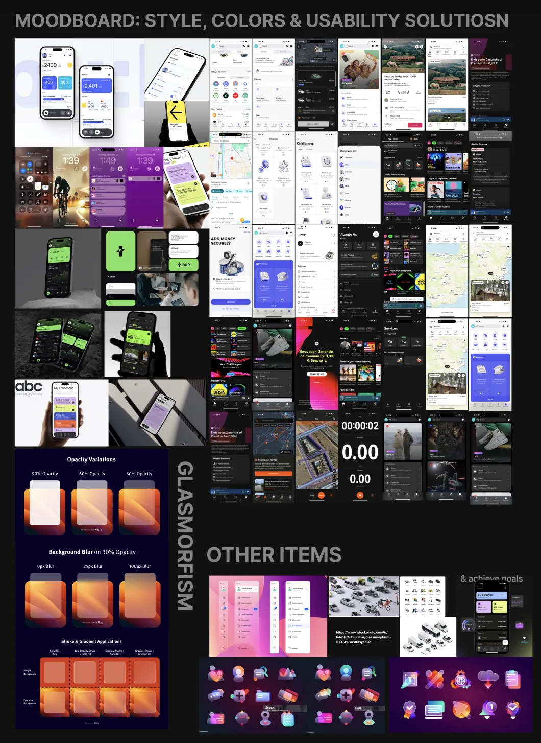
Before any wireframing, I assembled a moodboard covering style, colors and usability solutions. Beyond the visual direction (dark surfaces, glass morphism opacity and blur studies, gradient strokes), it collected proven interaction patterns from other products for the flows the redesign had to solve: checkout, search on maps, listings, partner discounts, premium promotion screens and gamified rewards.
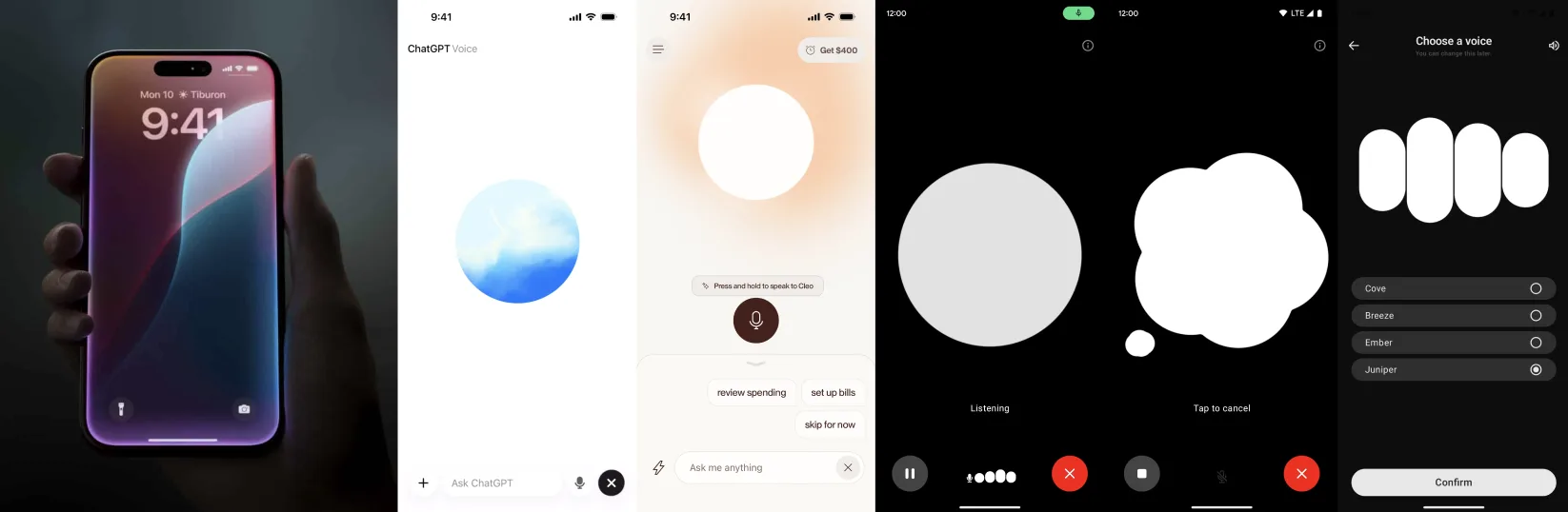
Voice-first interaction
Cyclists have poor tactile access to their phone by the very nature of the sport: gloves, vibration, both hands on the bars, eyes on the road. That constraint made voice one of the most valuable interaction channels in the entire redesign, with the app open and with the phone locked.
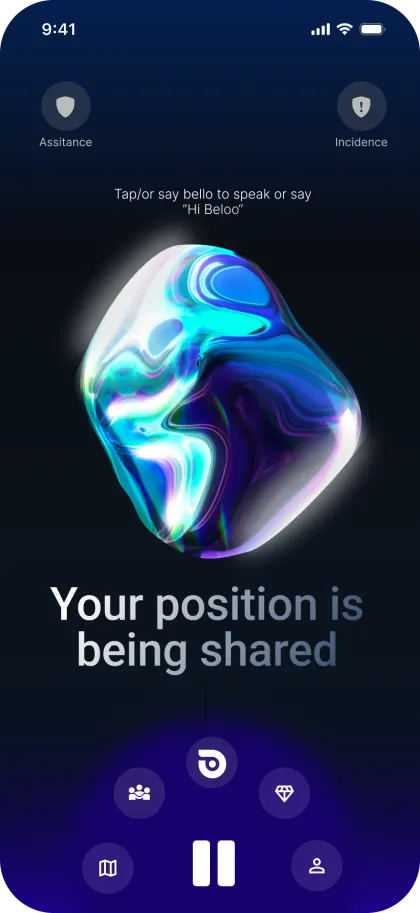
The system is built around a wake word, "Hey Beloo…", followed by the order. Even from the lock screen with the display off, "Hey Beloo, start broadcast" begins broadcasting your position without a single tap, which directly increases real daily usage, the client's core metric. The pattern follows the interfaces riders already know: ChatGPT Voice, Siri, and "Hey Siri" on the lock screen.
Voice commands are surfaced in two places so they actually get learned: during onboarding, and in the hint messages under the AI sphere animation on the main screens.
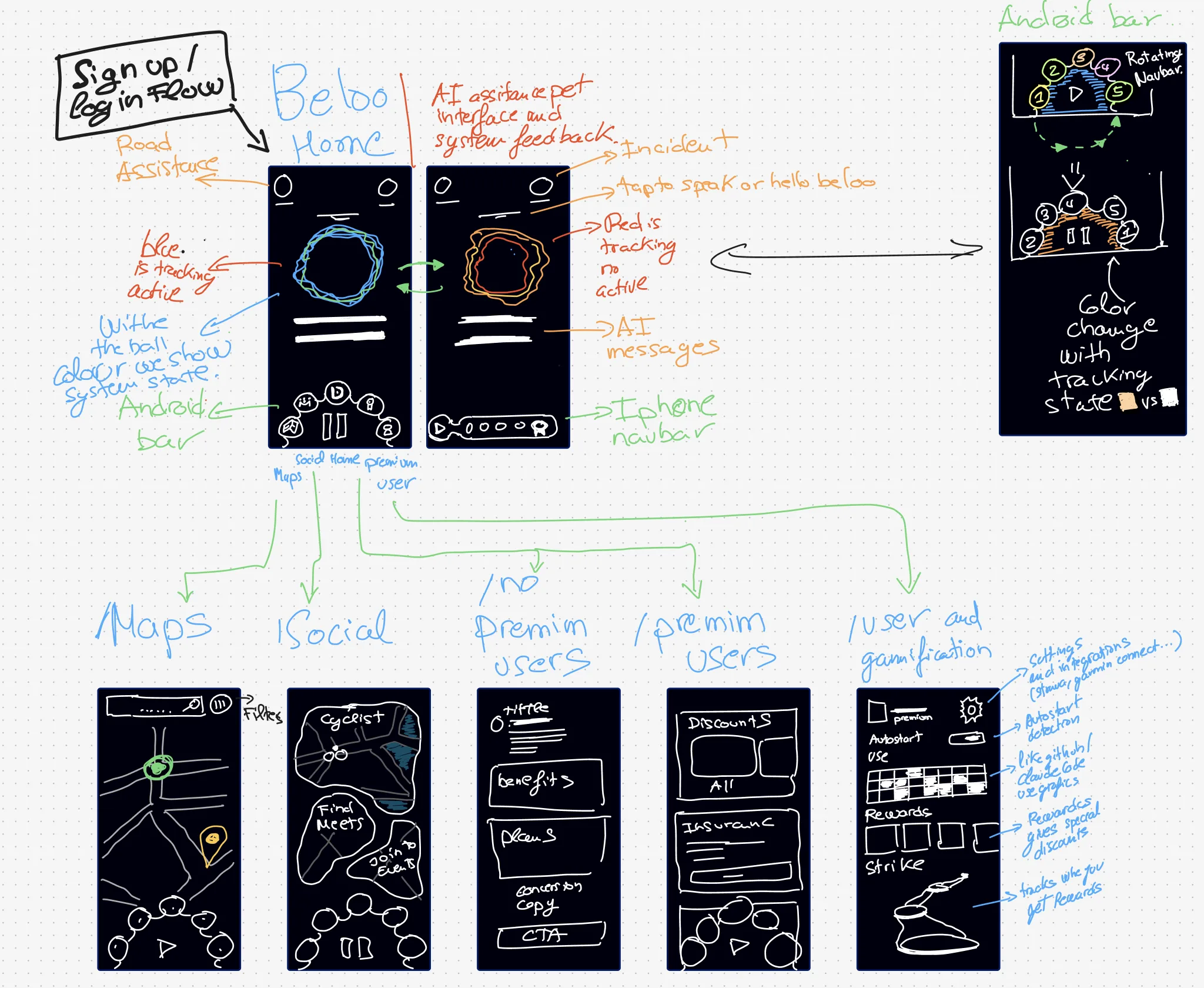
Ideation, iPad sketches
The first round of ideation happened directly on the iPad: quick sketches to define the main screens of the app, the home merged with the tracking view and its AI sphere showing system state through color, the Android vs iPhone nav bars, and the Maps, Social, Premium and User & Gamification screens.
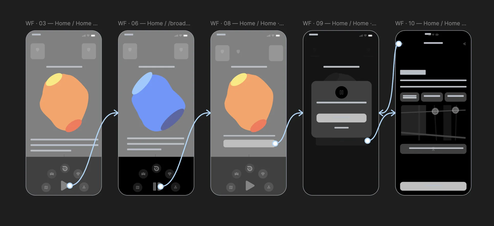
Wireframes for early testing
The sketches became low-fidelity wireframes built for speed: they were put in front of the client and a limited group of 8 users to iterate as fast as possible before committing to visual design. This round validated the color-feedback system, the AI sphere changing color with tracking state, before a single high-fidelity screen existed.
Feature, Structure
New Information Architecture
User testing revealed that riders couldn't find core features and didn't understand the app's primary purpose. The home screen was redesigned and merged directly into the active tracking view, eliminating the biggest source of confusion. Every category was reorganised around actual usage patterns discovered in the field.
beloo/
├── home/                          (merged with tracking view)
│   ├── ai-sphere/                 (live status indicator)
│   ├── safety functions/
│   │   ├── 112-emergency
│   │   ├── incident-report
│   │   └── roadside-insurance
│   ├── report-incidence-btn/
│   │
│   └── tracking controls          (typewriter feedback)
│       ├── start-tracking
│       ├── pause-tracking
│       └── stop
│
├── social/
│      ├── share-location
│      ├── nearby-cyclists
│      ├── join-event-tracking
│      └── find-events-and-groups
│
├── map-controls/
│       ├── points-of-interest (water fountains, hills, repair workshops...)
│       ├── friends-view
│       └── route-highlights (sync with Strava routes to improve your position broadcast)
│
├── you/ (user profile and settings)
│   ├── stats
│   ├── badges-rewards/
│   │   ├── daily-streaks
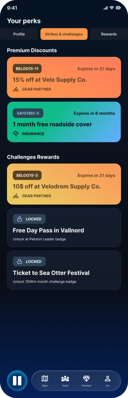
│   │   ├── partner-discounts
│   │   └── achievements
│   │
│   ├── settings-and-preferences
│   ├── widgets-shortcuts
│   ├── notifications
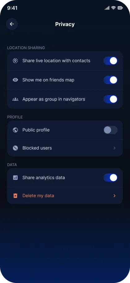
│   ├── privacy
│   └── device-integration/
│       ├── garmin-edge
│       ├── apple-watch
│       └── android-wear
│
└── premium/
    ├── for-no-premium-users: promotion screen with benefits and CTA to subscribe
    └── for-premium-users:
        ├── access-to-partners-discounts
        ├── intelligent-broadcast-auto-starting
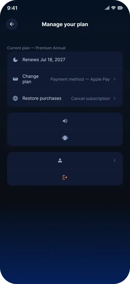
        ├── manage-your-plan
        ├── roadside-insurance-details
        ├── exclusive-earning-points
        └── premium-support
Phase 05, Design
The Redesign
Based on the user pain points identified in research, several solutions were crafted to boost daily usage through incentives, quick access, reminders, and hardware integration.
Feature, Retention
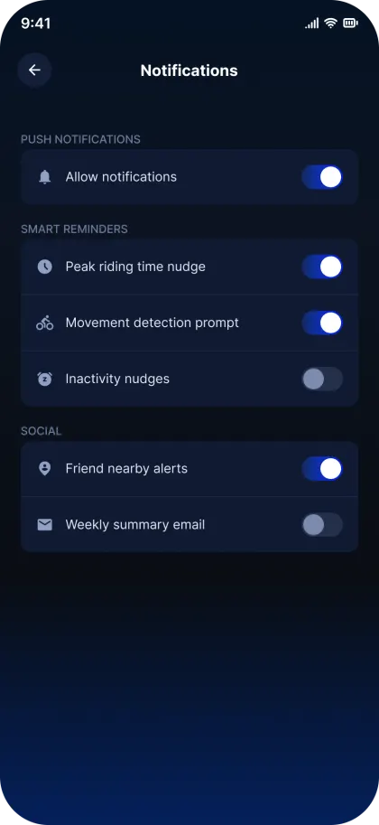
Intelligent Notification & Reminder System
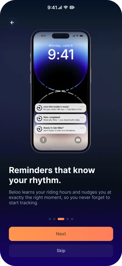
Notifications are one of the most powerful drivers of daily app engagement. For Beloo, they're critical, users forgot the app existed between rides. The solution: a context-aware system that learns from each rider's history and sends reminders at exactly the right moment.
-
Smart ride timing, Analyzes the user's historical ride data to identify peak usage hours and sends a reminder just before that window opens.
-
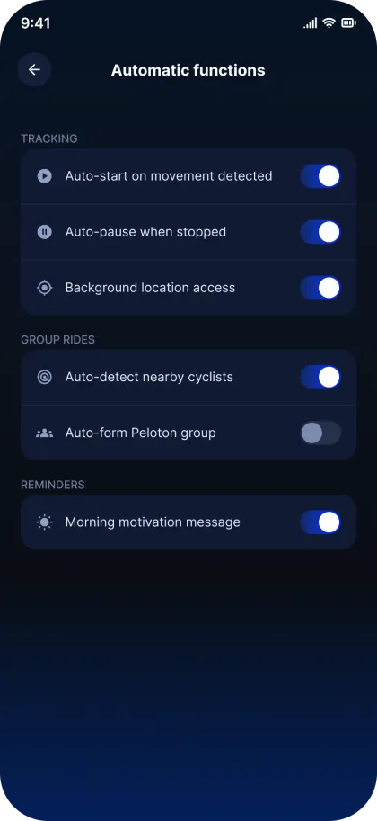
Movement detection, If the phone detects 15 min of movement at 21–37 km/h (average cycling speed) without the app active, it sends a prompt to enable tracking.
-
Social proximity, Notifies the user when a friend or contact is cycling nearby.
-
Inactivity nudges, After extended periods of no app use, sends a motivational re-engagement message.
-
Morning motivation, On each user's most common riding days, sends a personalized morning message to build the habit loop.
Feature, Quick Access
Shortcuts & Widgets
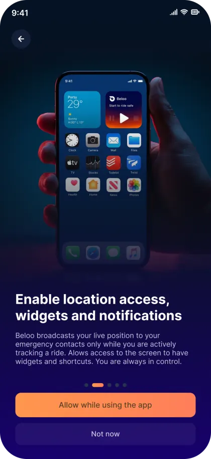
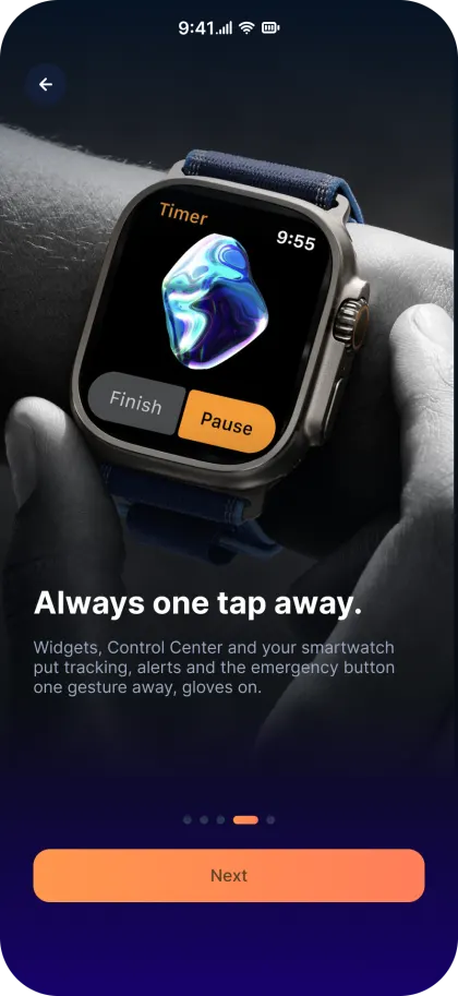
Starting a ride should take one tap, not five. Quick access controls were designed for the Always On Display, iOS Control Center, Android Quick Settings panel, and home screen widgets, so Beloo is always one gesture away.
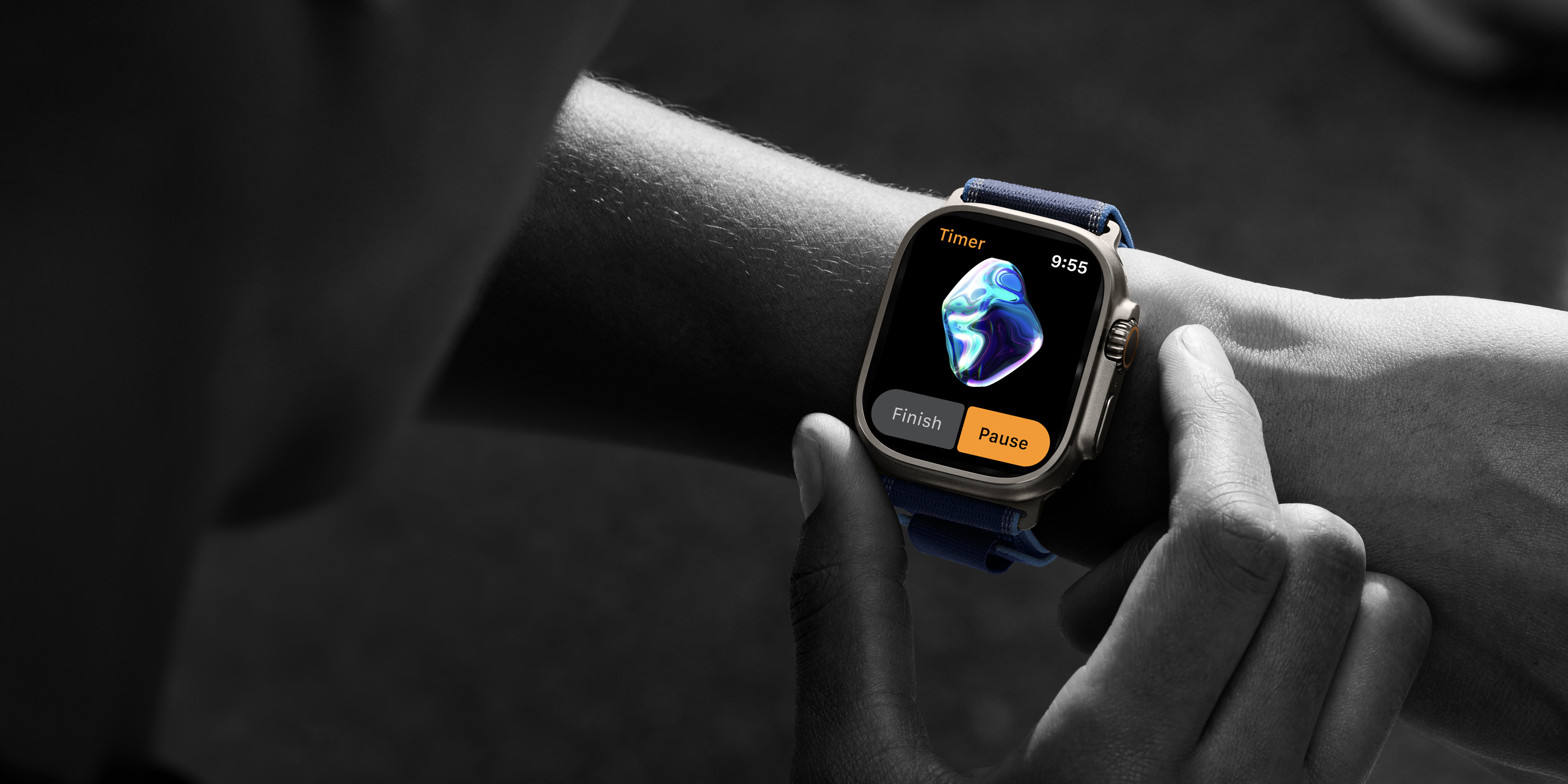
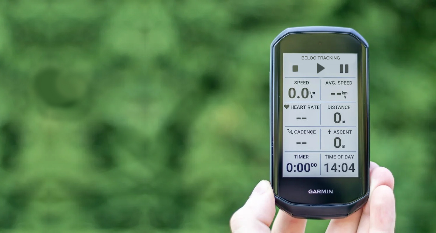
Users asked for these features, so I researched the industry's standards and existing solutions. Other integrations followed: Strava sync, TrainingPeaks sync, Suunto sync, smartwatches, and Garmin Edge.
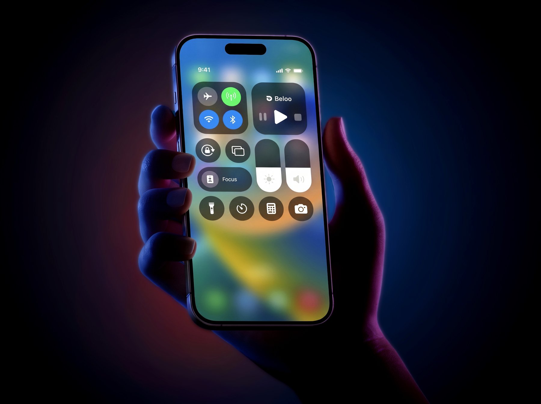 iOS Control Center
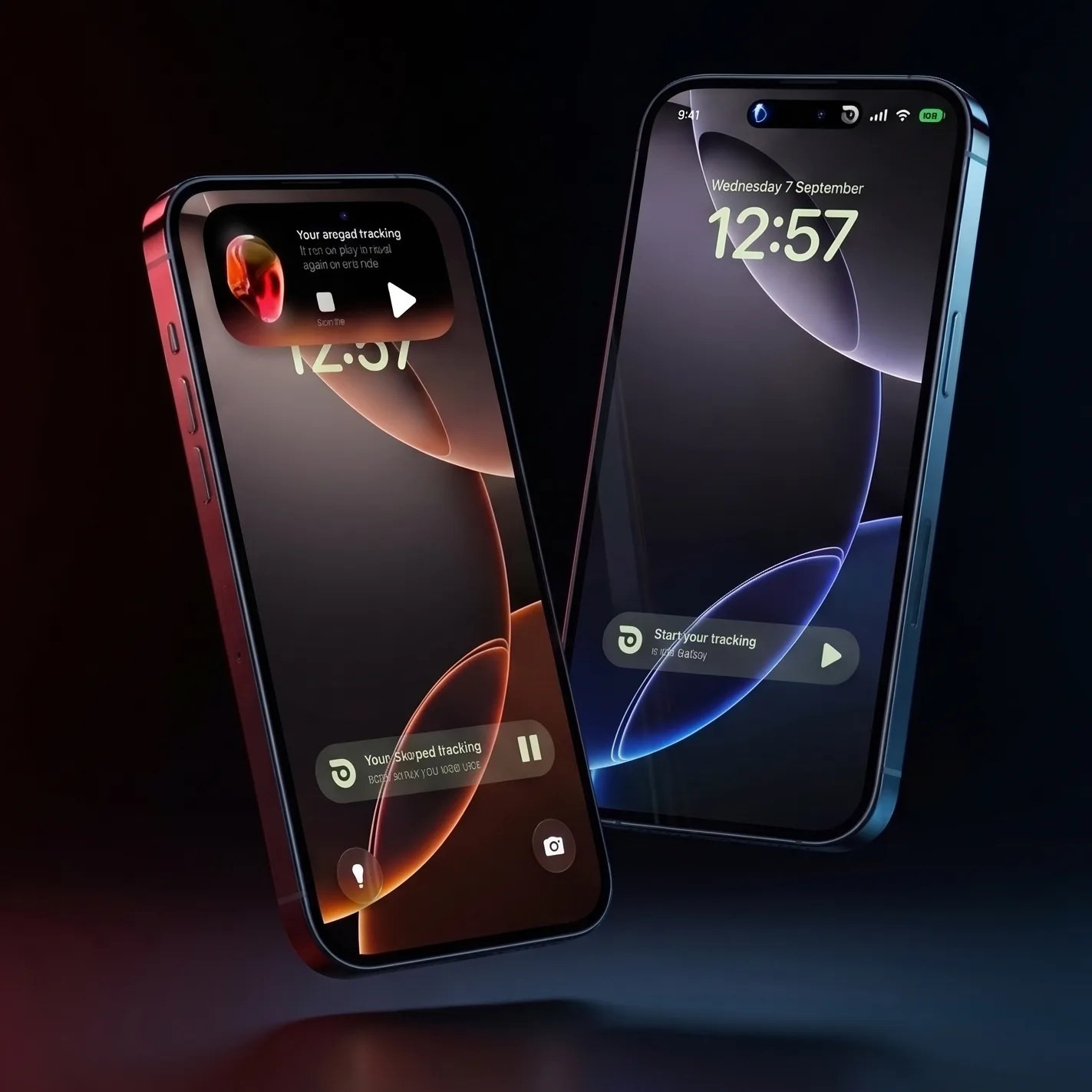 Always On Display
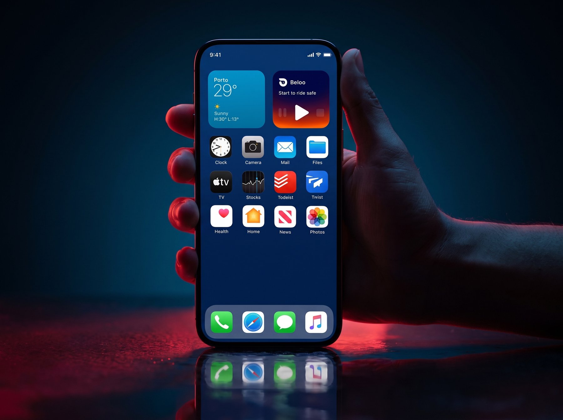 Home Screen Widget
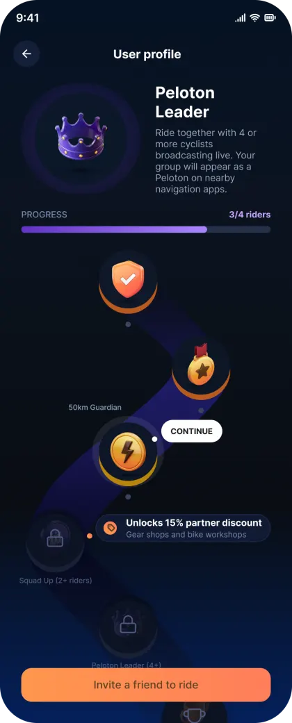
Rewards & Gamification
Badges, social features, and partner rewards to increase daily engagement and retention. Making safety a habit through positive reinforcement.
Device Integration
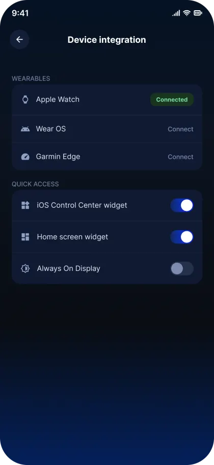
Seamless integration with smartwatches and Garmin Edge devices, offering controls, notifications, and automatic start features directly from the handlebar.
Social & Contextual Maps
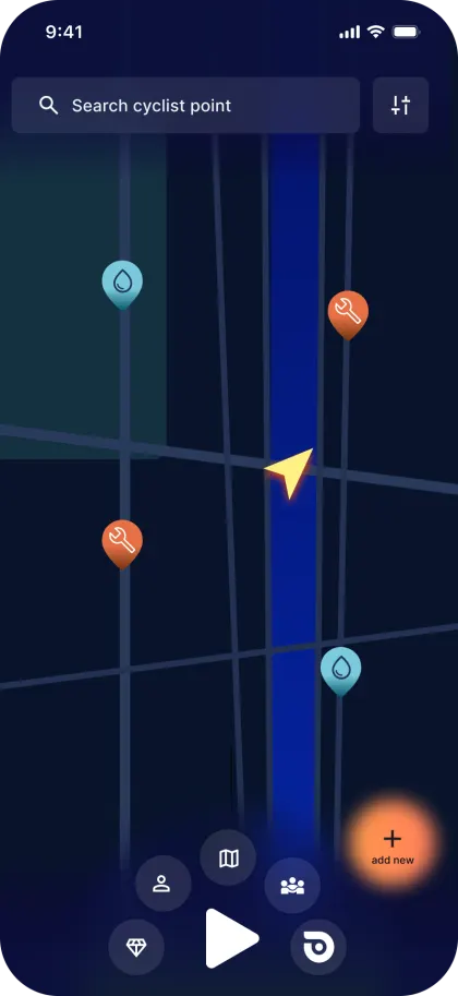
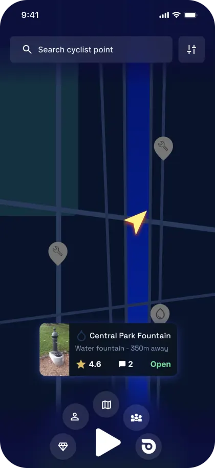
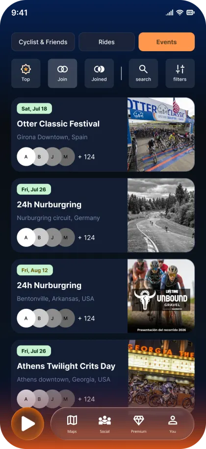
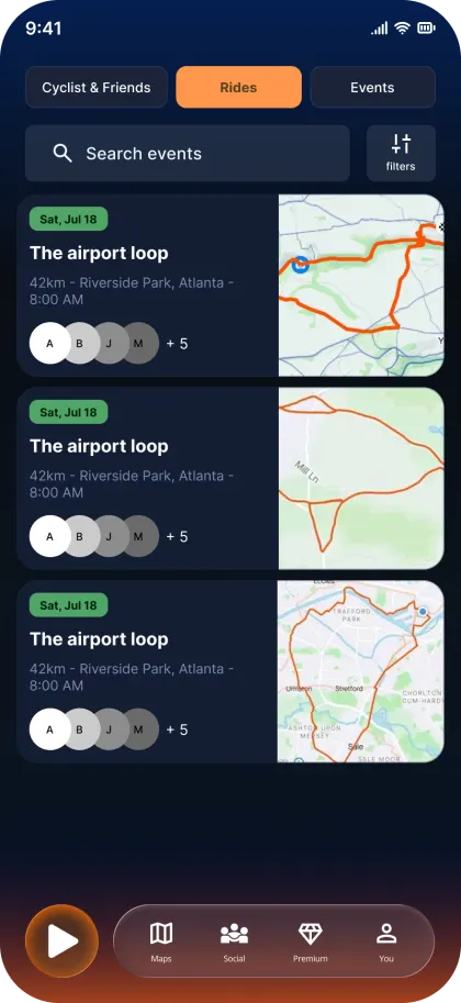
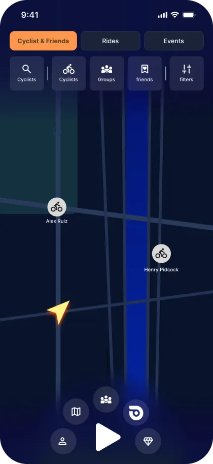
Share live location via link, view other cyclists on the map, create or join riding events, and surface contextual POIs: water fountains, hills, repair workshops.
Feature, Main Screen
Easing Interaction, Safety & Refined UI Navigation
Research showed that cyclists couldn't find critical safety features when they needed them, buried deep in menus, requiring multiple taps while wearing gloves. The redesigned main screen brings incident reporting, roadside insurance, and the emergency 911 button to the first touch. A new color system and carousel nav make every action immediately clear.
-
Incident report, Persistent button to flag an incident instantly, triggering alerts to your contacts.
-
Emergency 911, One-tap emergency call, always accessible from the home screen.
-
Roadside insurance, Premium coverage surfaced directly on the main screen, not hidden in settings.
-
Glove-friendly targets, All critical controls designed with large tap areas for use on the road.
-
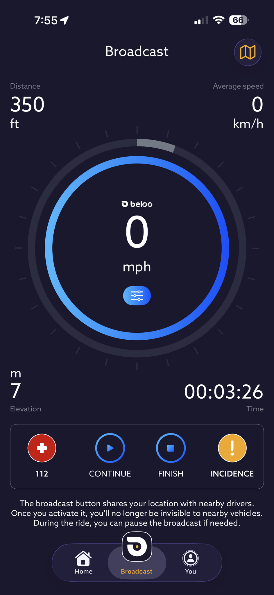
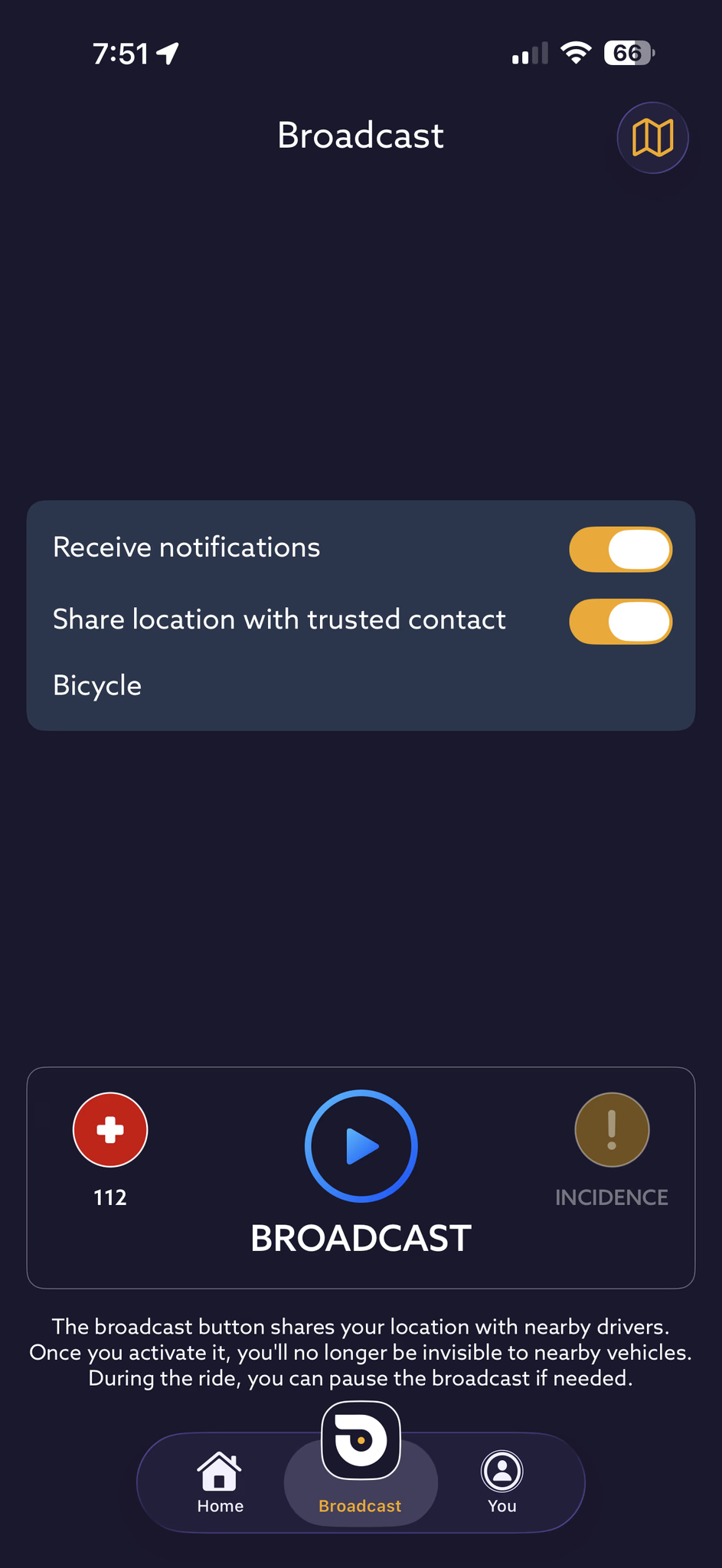
Color as system feedback, An orange sphere signals standby (not tracking); blue-green signals active broadcasting. The color of the AI element is the primary status indicator throughout the app.
-
Carousel nav, A swipeable menu gives quick access to all functions, with a cleaner top bar housing logo, social, and map controls.
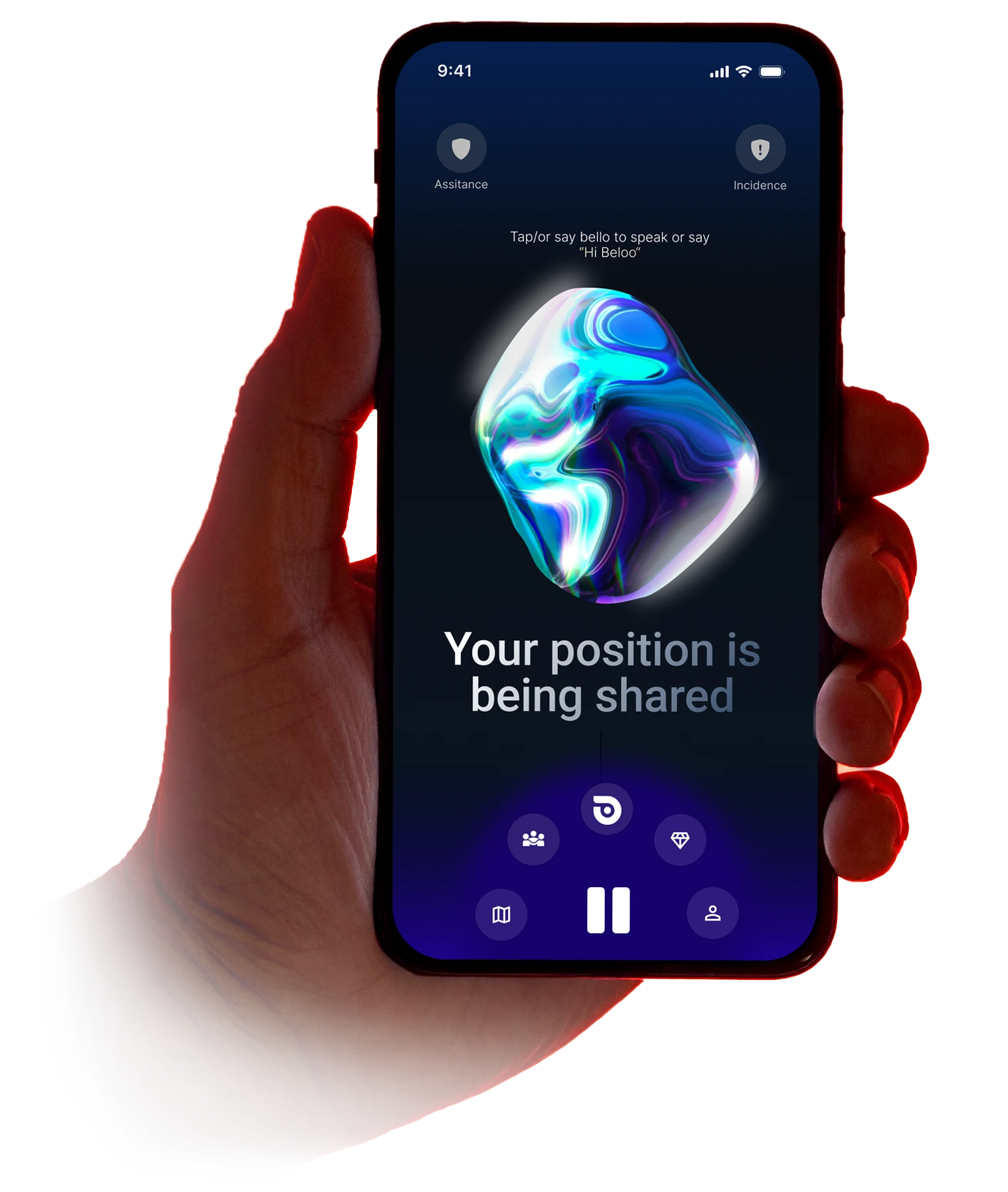
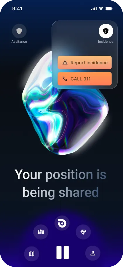
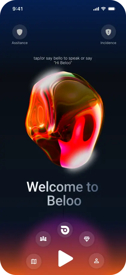
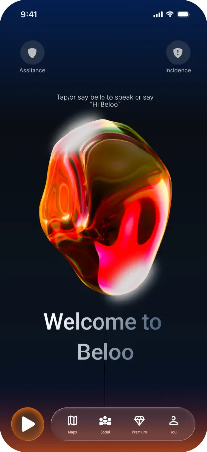
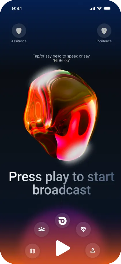
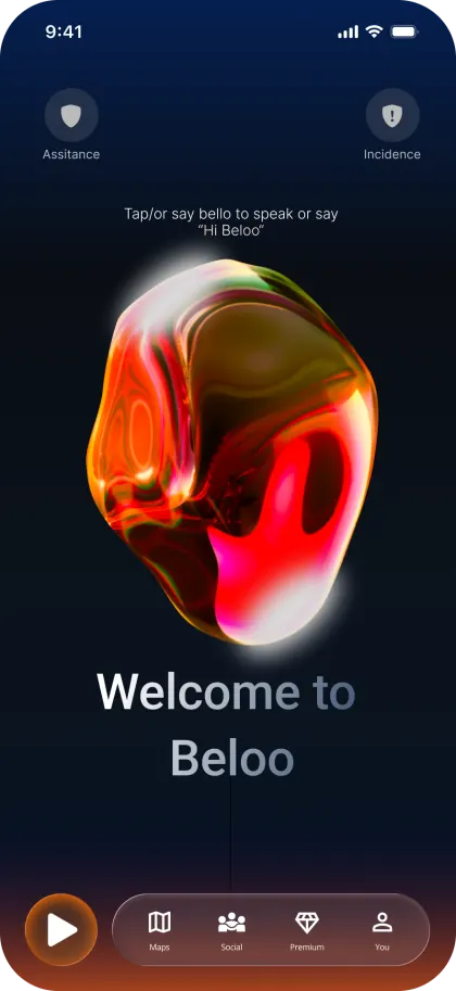
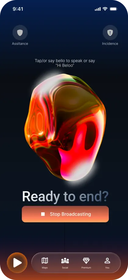
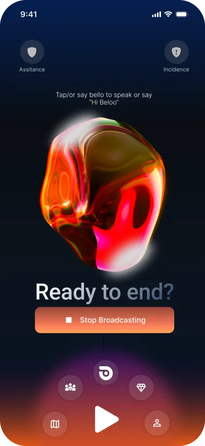
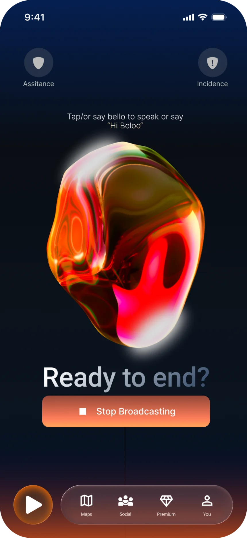 Assistance and Incidence sit in the top corners, one tap from the home screen instead of buried in a menu.
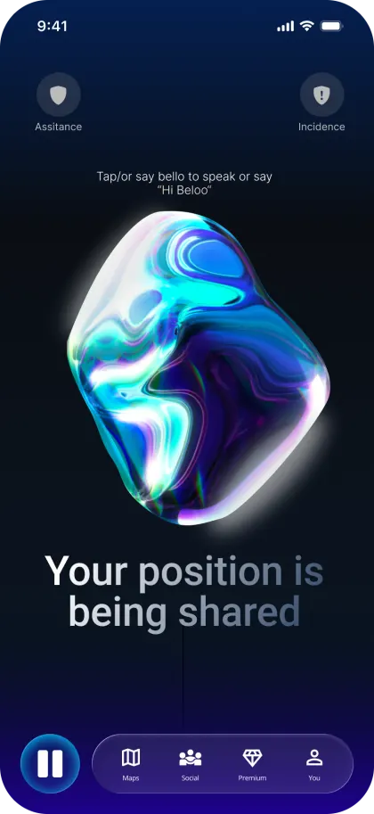
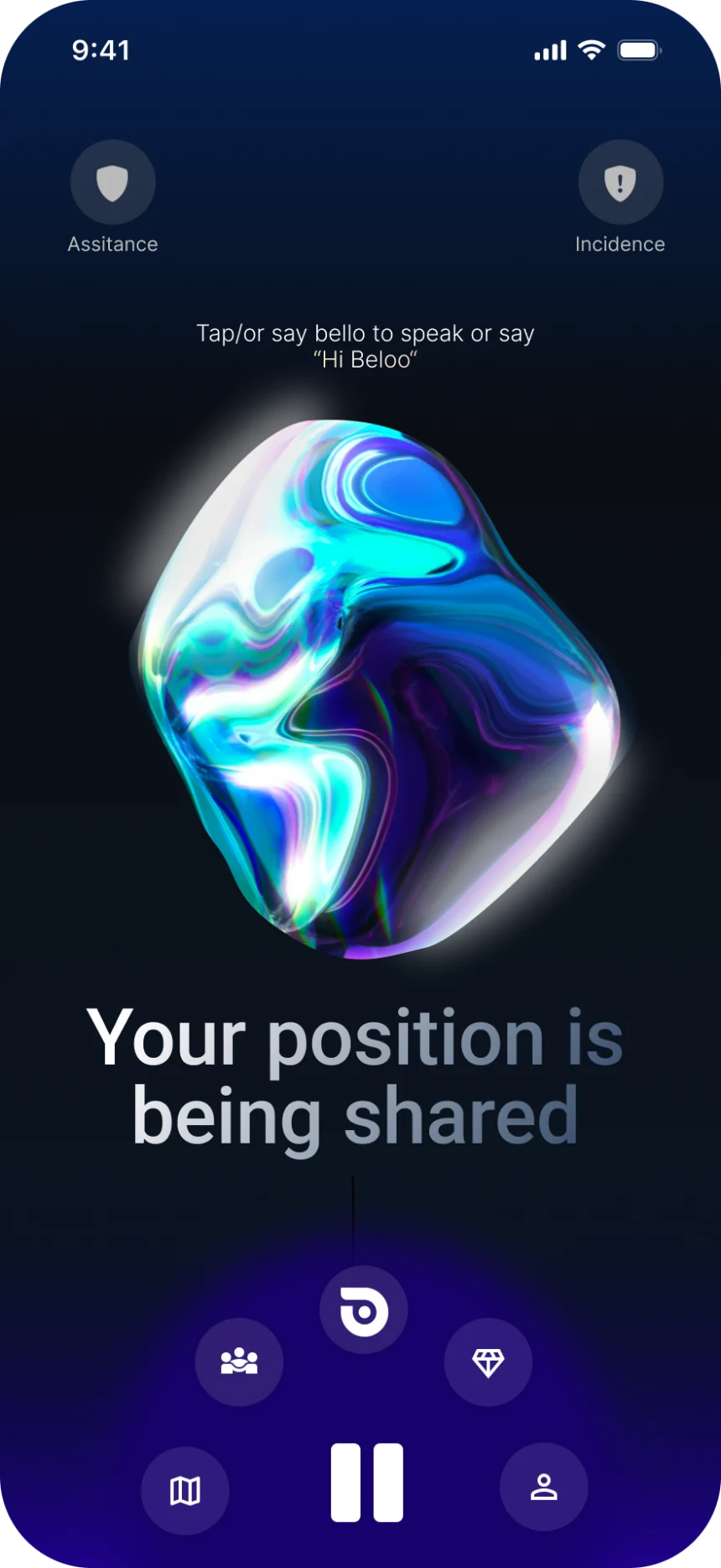 Broadcasting: the state is written on the screen and in the sphere, and the centre control expands into the quick-action ring.
3D Interactive AI (Spline)
A 3D interactive sphere acts as the primary UI element of the home screen. It humanizes the app and responds to the user's current state, standby or actively tracking. Its large surface also works as a touchable area for voice commands, critical for glove use in cold conditions. Below the sphere, the UI displays contextual feedback messages to guide the user in real time.
Waiting to track
An amber-orange pulsing sphere signals standby, the app is ready to broadcast your position when you start your ride.
Actively broadcasting
A calming blue-green color indicates that the user's position is actively being transmitted. Calm = broadcasting = safe.
System Design, AI
The system behind the sphere
The sphere is the face of the assistant, and something has to do the thinking behind it. This is the architecture I'd build for it today, shaped by one hard constraint: a rider at 30 km/h will wait for an answer to start, but not for it to finish loading. Latency here isn't a performance metric, it's a safety feature.
Request path
Hover a node for details (tap on mobile) · swipe sideways if it doesn't fit
The answer travels back the same path and is spoken by the voice layer, never read aloud by a second one.
- Rider: "Hey Beloo…", gloves on, hands on the bars. Audio in, audio out.
- Voice layer, a realtime speech model, full duplex: the only voice the rider ever hears. It passes intent and ride context to the agent and speaks the answer back.
- Beloo agent, built on Vercel Eve: durable session, tools, skills, schedules and subagents.
- Hard queries leave the agent through the Vercel AI Gateway, which routes them to an open-source reasoning model and brings the result back.
- The agent runs on Fluid Compute, a full Node runtime with native WebSockets for the realtime audio stream, and executes its tasks inside Vercel Sandbox.
Latency is the interface
A cyclist can't glance at a screen to check whether the assistant heard them. The realtime voice model is the only thing standing between the question and the first spoken syllable: it listens while it speaks, survives interruptions, and replies in the time a conversation expects. Anything slower than that happens behind it, never in front of it.
One voice, two brains
Hard questions, insurance coverage, road conditions, what happened on last week's ride, go to a separate high-performance open-source model running in parallel behind the conversation. It reasons, hands the result back, and the voice layer delivers it in its own tone. The rider never hears the handover, and I get to pick that model for how well it thinks rather than for how fast it talks.
Swappable on purpose
The reasoning model sits behind the AI Gateway, so replacing it is a provider/model string in config, not a refactor. Open-source models get better and cheaper on a quarterly cycle; an architecture that can't take that discount has locked in today's bill forever. The gateway is also where observability and provider fallbacks live, which matters when the product is a safety app.
Durable sessions, managed execution
The agent lives in Vercel Eve, a filesystem-first framework for durable AI agents, running on Fluid Compute with its tasks executing inside Vercel Sandbox. A ride goes through tunnels and dead zones, so the session has to outlive the connection. And for a team this size, hand-maintaining isolated container infrastructure is the wrong place to spend the year.
Feature, Motion
Nielsen’s first heuristic, visibility of system status: always tell the user what the system is doing — on a bike, without a glance. So the navbar carries the state in its own light. Orange at standby, blue-violet the moment broadcasting starts, play morphing to pause in the same wash.
Phase 06, Handoff
Prototyped for Production
The final hi-fi prototype was built for production handoff, not just presentation. Every flow, connection and interaction is documented directly on the Figma canvas so developers can read screens, states and transitions without needing a walkthrough call.
Documented flows & connections
Screens are grouped and tagged by route, /index/home, /maps, /social, /premium and more, each carrying a "Ready for dev" status and color-coded annotations that trace conditions, states and platform variants directly on the canvas.
Interaction specs
Connector notes call out triggers, transitions and edge cases next to each frame, so a flow reads the same way in Figma as it behaves in the shipped app.
Tokenized system, in-file
Color, type and spacing were built as reusable tokens, and recurring UI pieces became components, both living inside the same Figma file rather than a separate library, a deliberate scope call for an engagement of this size.
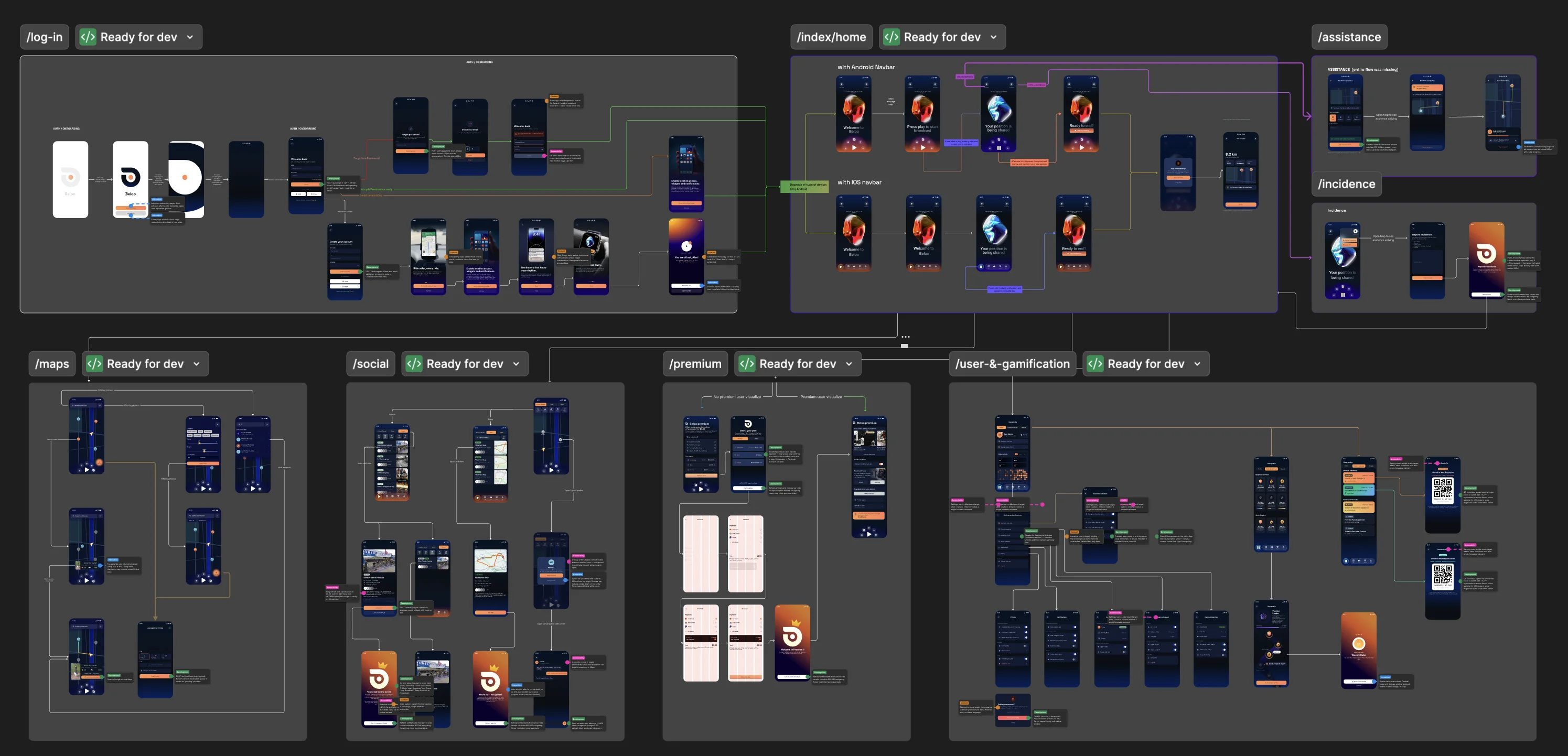
Screens grouped by route, each tagged for build.
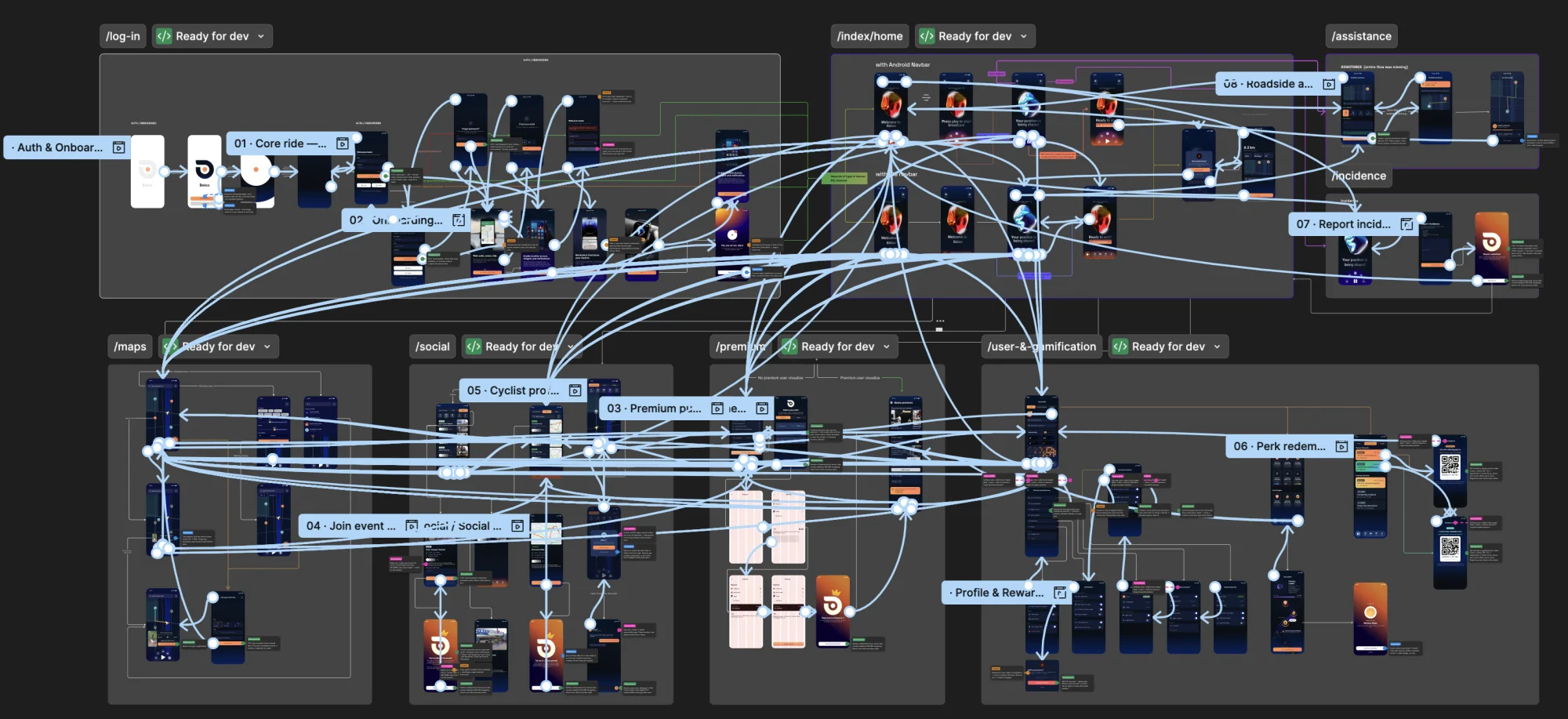
The same canvas zoomed into the wiring: every connection carries its trigger, its transition and its conditions, so a developer reads behaviour off the prototype instead of asking for it.
Motion in Feedback Messages
Dynamic feedback messages communicate vital context to the user using typewriter animations. Depending on current conditions, the app greets the user and updates them on their status in real time.
Deliverable
The Full System, Screen by Screen
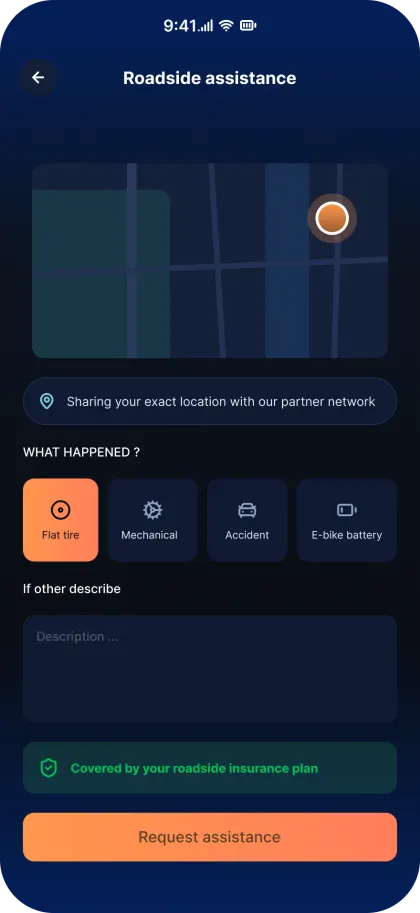
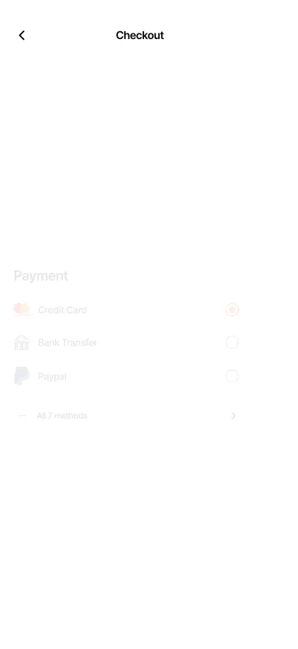
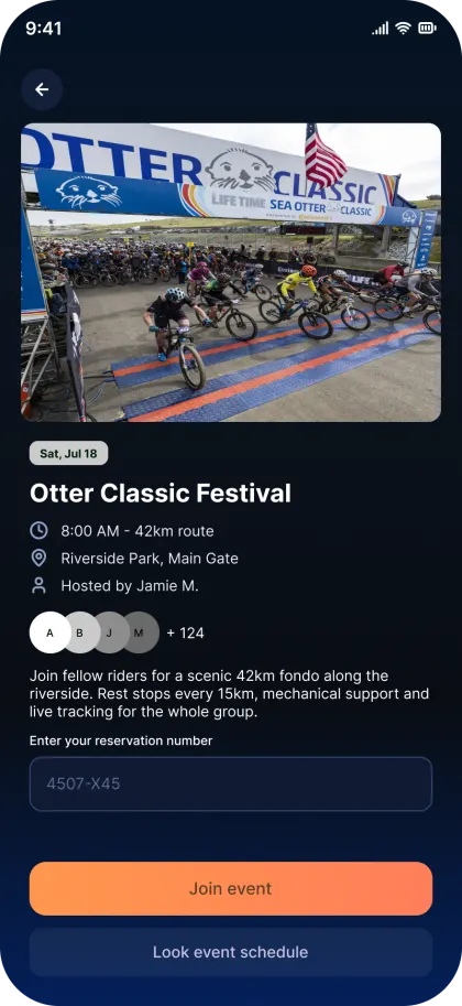
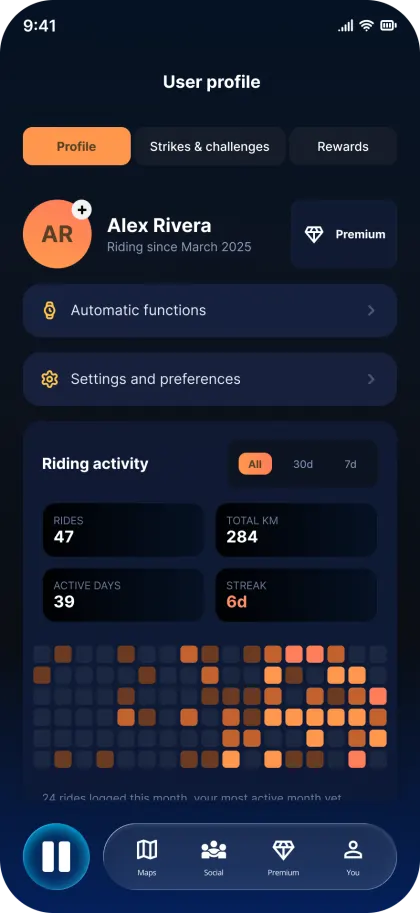
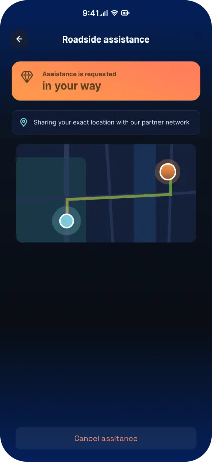
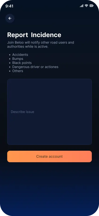
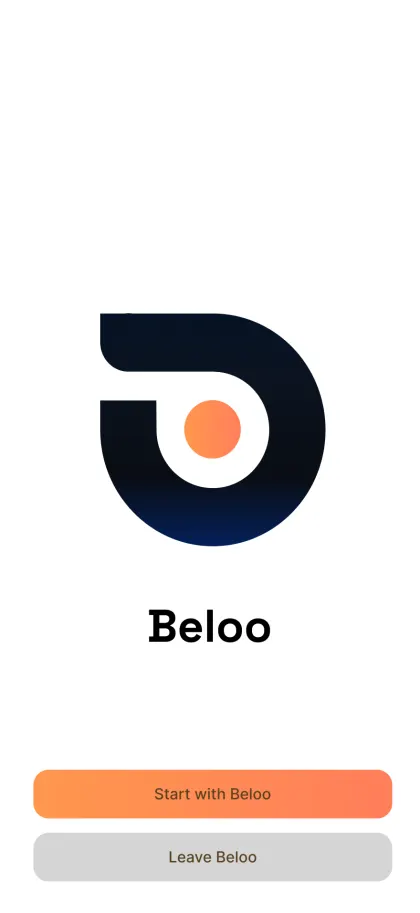
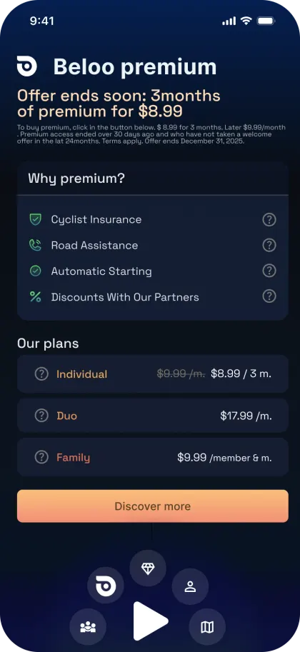
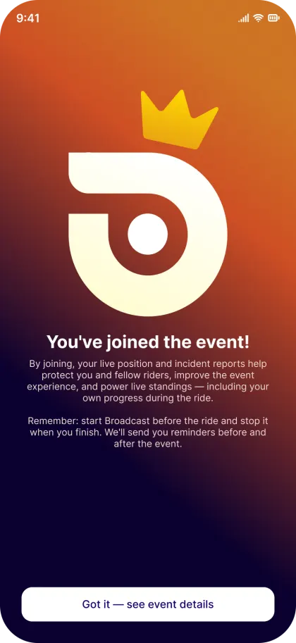
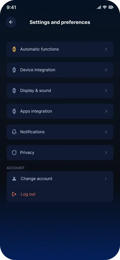
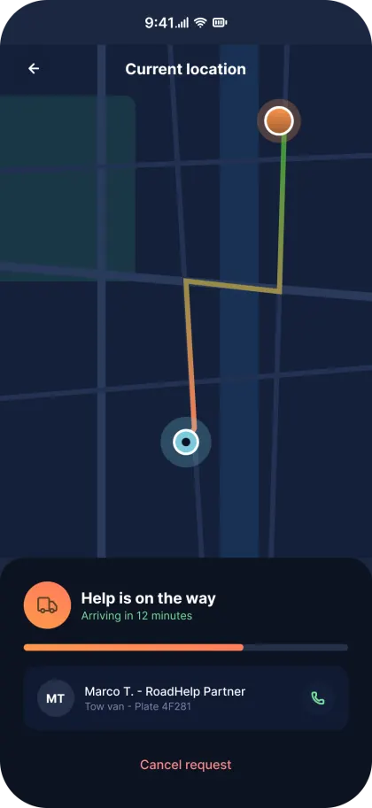
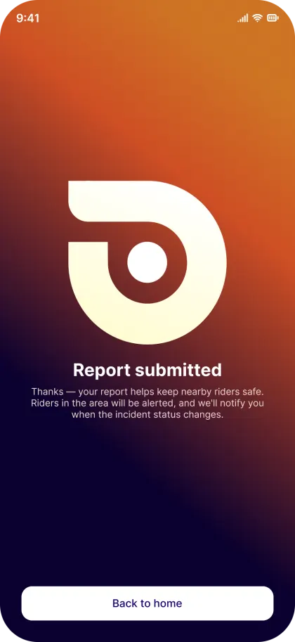
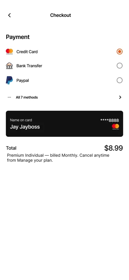
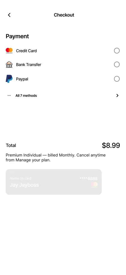
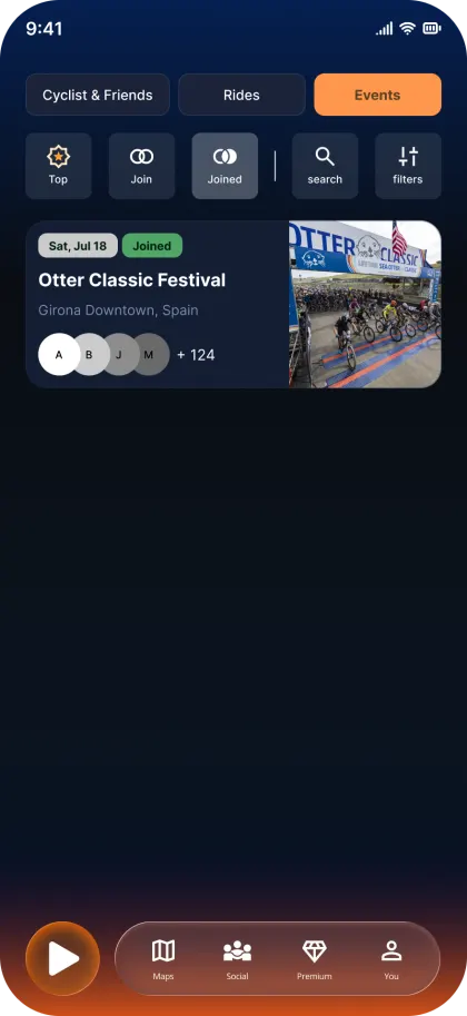
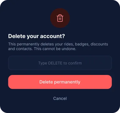
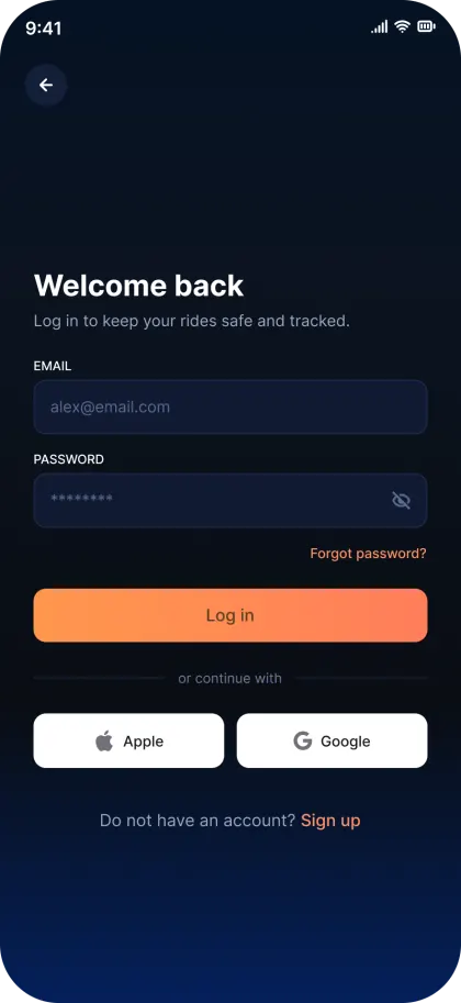
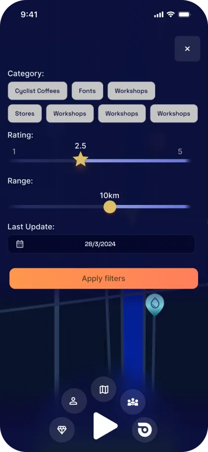
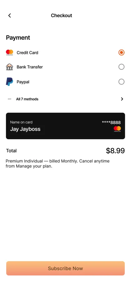
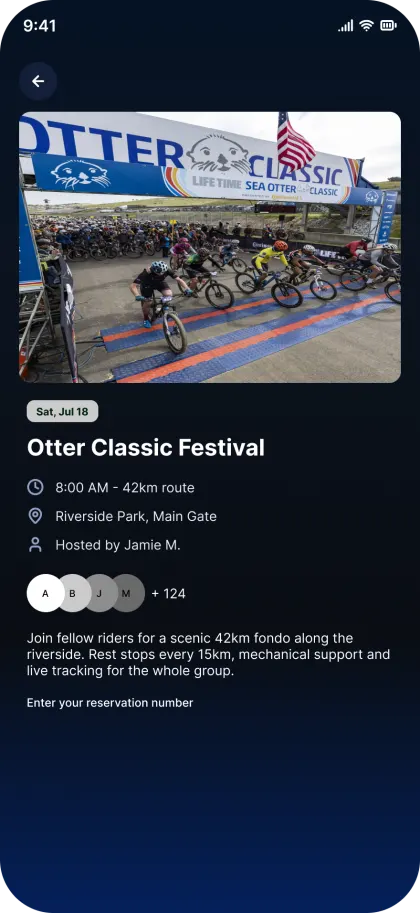
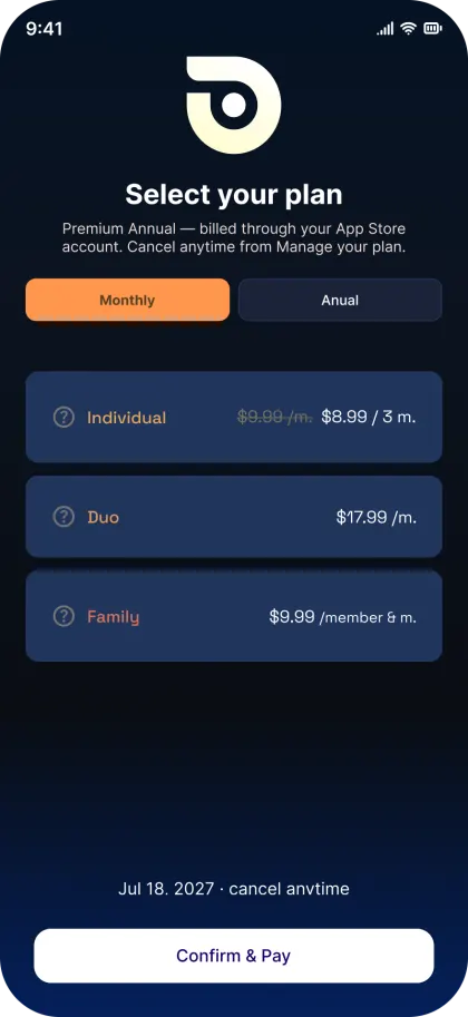
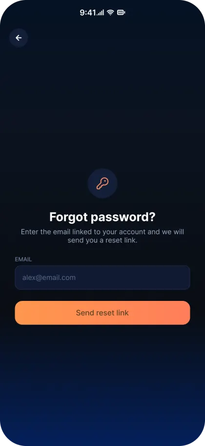
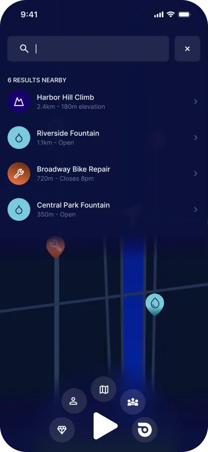
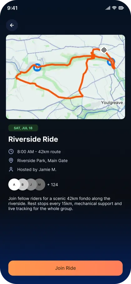
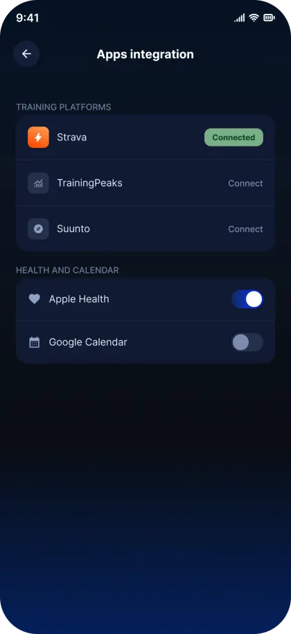
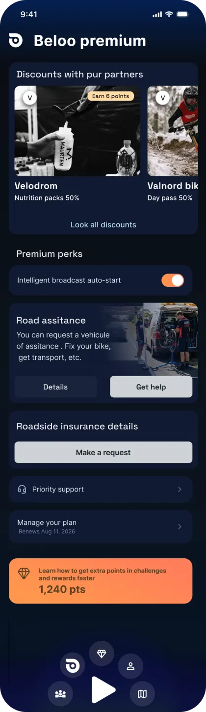
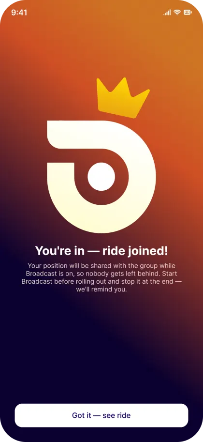
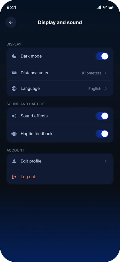
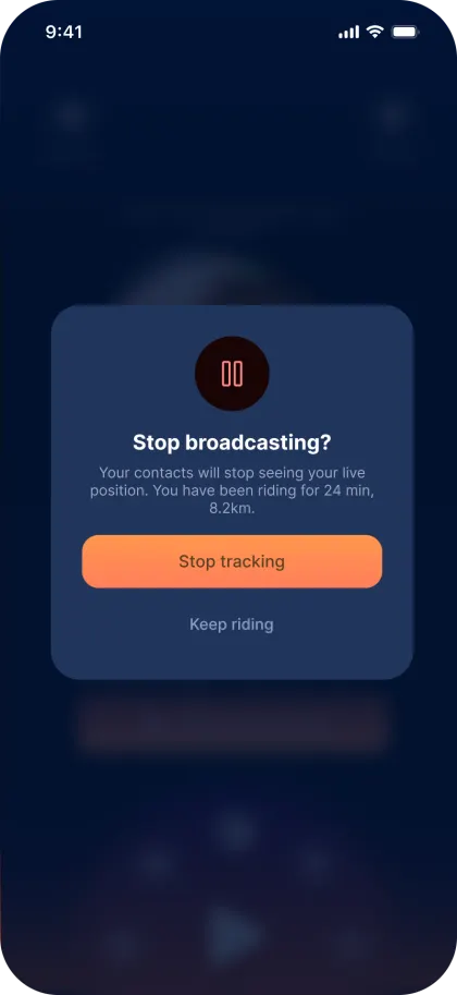
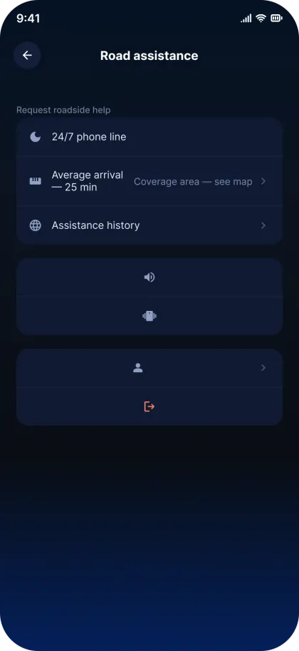
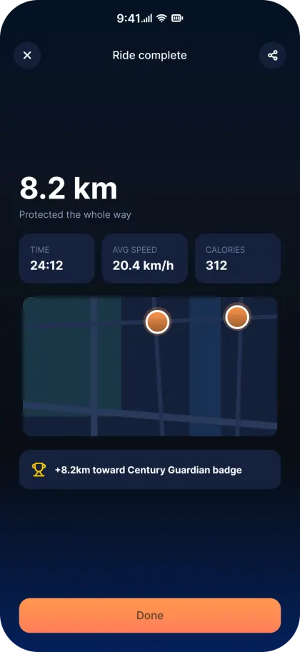
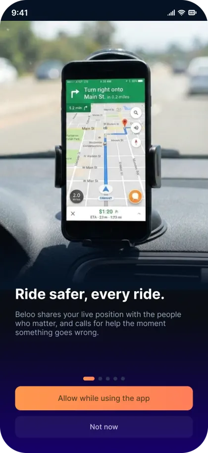
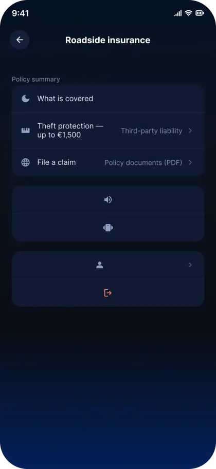
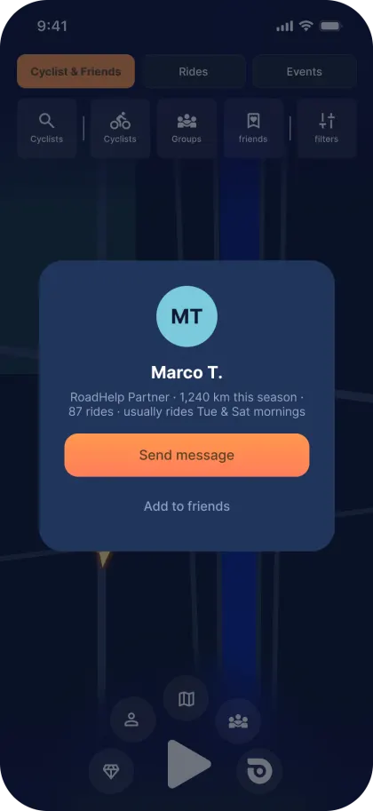
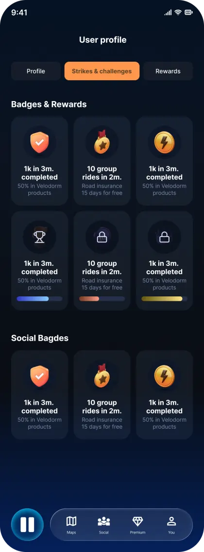
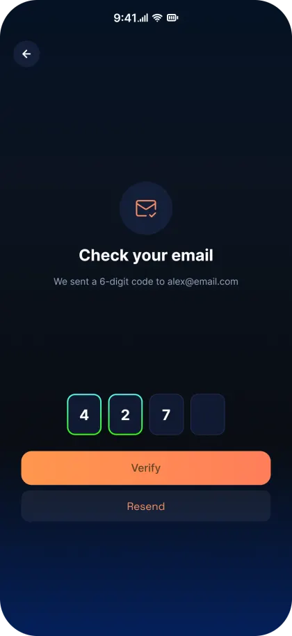
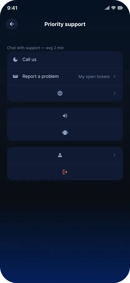
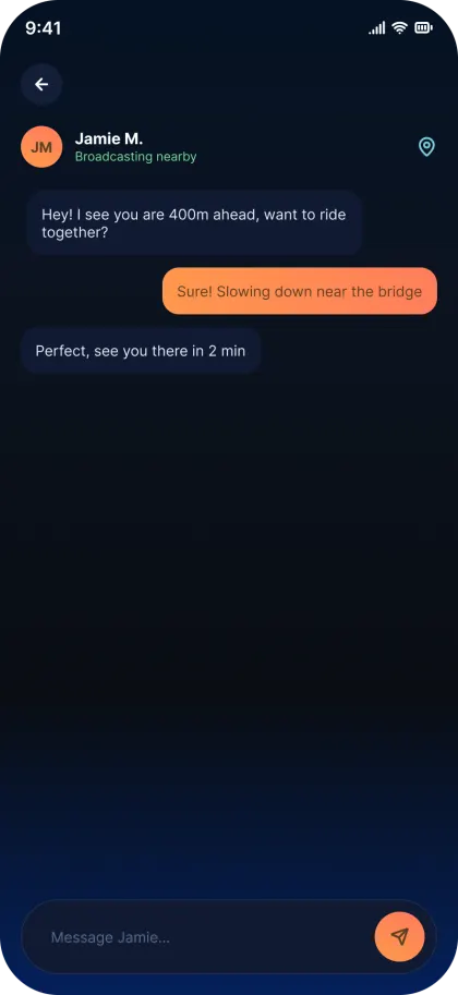
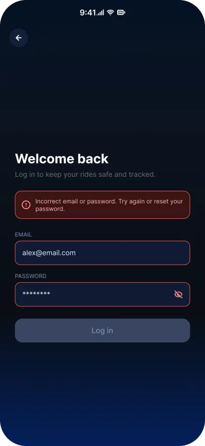
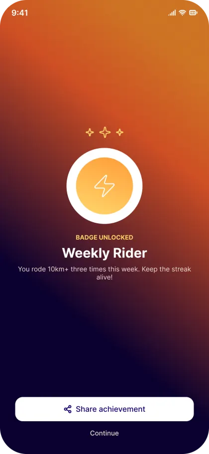
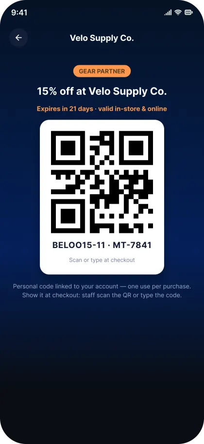
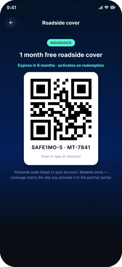
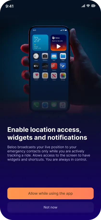
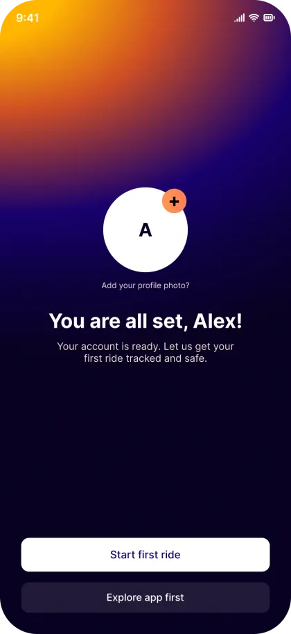
The redesign was handed over as 78 screens across 8 flows, log-in and onboarding, home and live tracking, maps, social, premium and checkout, incident reporting, roadside assistance, and profile and rewards, each one tagged Ready for dev on the Figma canvas.
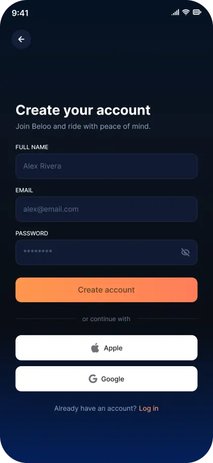
There is no highlight reel here, on purpose. This is the whole system in motion, including the screens that rarely make it into a portfolio shot and decide whether a product can actually be built: location permission prompts, log-in error states, email verification, checkout steps, success confirmations, filter panels, and the iOS and Android variants of the same navigation bar.






- 78
- Screens
- 8
- Flows
- iOS & Android
- Platforms
- Ready for dev
- Every screen tagged
Outcomes
Where It Landed
This engagement ran from heuristic audit to delivered UI. Instrumentation and post-launch measurement were never part of the scope, so there are no instrumented retention numbers on this page and I'm not going to invent any. The closest thing to one: preliminary follow-up testing with target users points to an estimated 60–70% increase in repeat usage, and it stays labeled an estimate, not a result, until the plan below runs on the live build. What there is: a system that can be built, and a chain from each decision back to something a rider said or failed to do in testing.
A system, not a screen set
78 screens across 8 flows, built on in-file color, type and spacing tokens, with recurring UI turned into components. A developer opens the file, reads the route tags and the connector notes, and builds. No walkthrough call required.
Status became a color, not a label
The clearest failure in testing was that riders couldn't tell whether the app was actually broadcasting. The answer was one language spoken by two surfaces: the AI sphere and the navigation bar's ambient light. Amber is standby, blue-green is broadcasting, and neither one asks you to read anything at 30 km/h.
The home screen stopped being a menu
Merging home with the live tracking view removed the single biggest source of confusion in the audit, and moved the emergency call, incident reporting and roadside assistance out of buried settings and onto the first touch, with glove-sized targets.
A revenue model trust could survive
Premium was designed as a value ladder, roadside insurance, automatic broadcast, partner discounts and priority support, with checkout, plan management and the non-premium promotion screen all designed end to end. The features that keep a rider safe stay free; convenience and coverage are what's paid for.
Voice and hardware as primary input
"Hey Beloo, start broadcast" from a locked screen, plus Control Center, Always On Display, home screen widgets, Apple Watch, Wear OS and Garmin Edge. The design assumes the phone stays in the jersey pocket, because in the field that's exactly where it stayed.
Research that changed the brief
Nine remote participants, a seven-day moderated camp in Calpe, and eight users on wireframes before a single hi-fi screen existed. The color-feedback system was validated at wireframe stage, which is why it survived intact all the way into the delivered UI.
Measurement plan
How I'd Measure It
Nothing in this section is a result. The engagement ended at delivered UI, so what follows is the instrumentation I'd put into the build and the bar I'd hold it to, written as hypotheses because that's what they are until someone actually runs them.
Reflection
What I'd Do Differently
Looking back, the biggest surprise from Calpe wasn't a UI complaint, it was how invisible the safety features actually were. Riders who use this app to stay safe on the road didn't understand what the 112 button or the roadside insurance did, features that exist specifically to protect them. That gap between what a safety app assumes people understand and what they actually understand is the thing I'd probe earlier next time, in the heuristic audit itself, rather than waiting for the field week to surface it. I'm also honest that I don't have post-launch numbers to prove the reminder system and the new IA actually moved daily usage, the engagement covered research through to delivered UI, not a live retention study. If I got to extend this project, that's the phase I'd add: instrumenting the shipped redesign and coming back with real usage data instead of resting on user-testing intent.
Road-test the voice UI, don't desk-test it
The wake word and the hint messages under the sphere were designed and reviewed on screens. They were never tested with wind at 30 km/h, a truck passing, and a phone muffled inside a jersey pocket. Before committing to "Hey Beloo", I'd run a road session with real audio capture and measure how often the wake word fires when it should, and how often it fires when it shouldn't.
Test the color system on cold users
Color as the primary status indicator is elegant, and it's also learned. Everyone in Calpe had been introduced to the app before they rode with it. I'd run a five-second test with people who have never seen Beloo, show them the sphere and ask one question: is it broadcasting? It also leans on color alone, which fails riders with color-vision deficiency, so the honest fix is a redundant cue in motion or shape, not a better tutorial.
Widen the sample past the performance rider
Calpe gave me pros, amateurs and enthusiasts, an unusually strong sample for a seven-day camp, and a narrow one. Commuters and urban riders take the most traffic exposure and are probably the larger market for a safety product, but their rides, their reminder windows and the POIs they care about look nothing like a training camp's. I'd rerun the field study on city streets.
Price premium with riders, not with the client
The value ladder came from the client's revenue requirement and from what testing suggested people valued. Willingness to pay itself was never tested. A designed price is a hypothesis, and I'd put the real checkout in front of users before treating it as a plan.
If there's a phase two, the order is already set: instrument the shipped redesign (time-to-tracking, rides tracked per rider per week, incident-report completion), road-test the voice layer with real audio, run the cold-user color test, then revisit the premium price with data instead of an assumption.
Next steps
Where This Goes Next
One thing came up in the field study that the current scope doesn't answer. Riders kept asking for two things Beloo doesn't do yet: turn-by-turn navigation they can actually follow at speed, and advanced training metrics, power, normalised power, cadence, heart rate and VAM, read live without a second device on the handlebar. Both already exist elsewhere; what riders said was missing is a version of them with an experience worth using.
That makes it a real opportunity rather than a feature request: Beloo already owns the ride session, the position stream and the handlebar surface, so navigation and live metrics are the natural next layer rather than a new product. It stays an exploration for now, not a commitment. It needs its own research round, and the training-metrics audience is not automatically the safety audience.
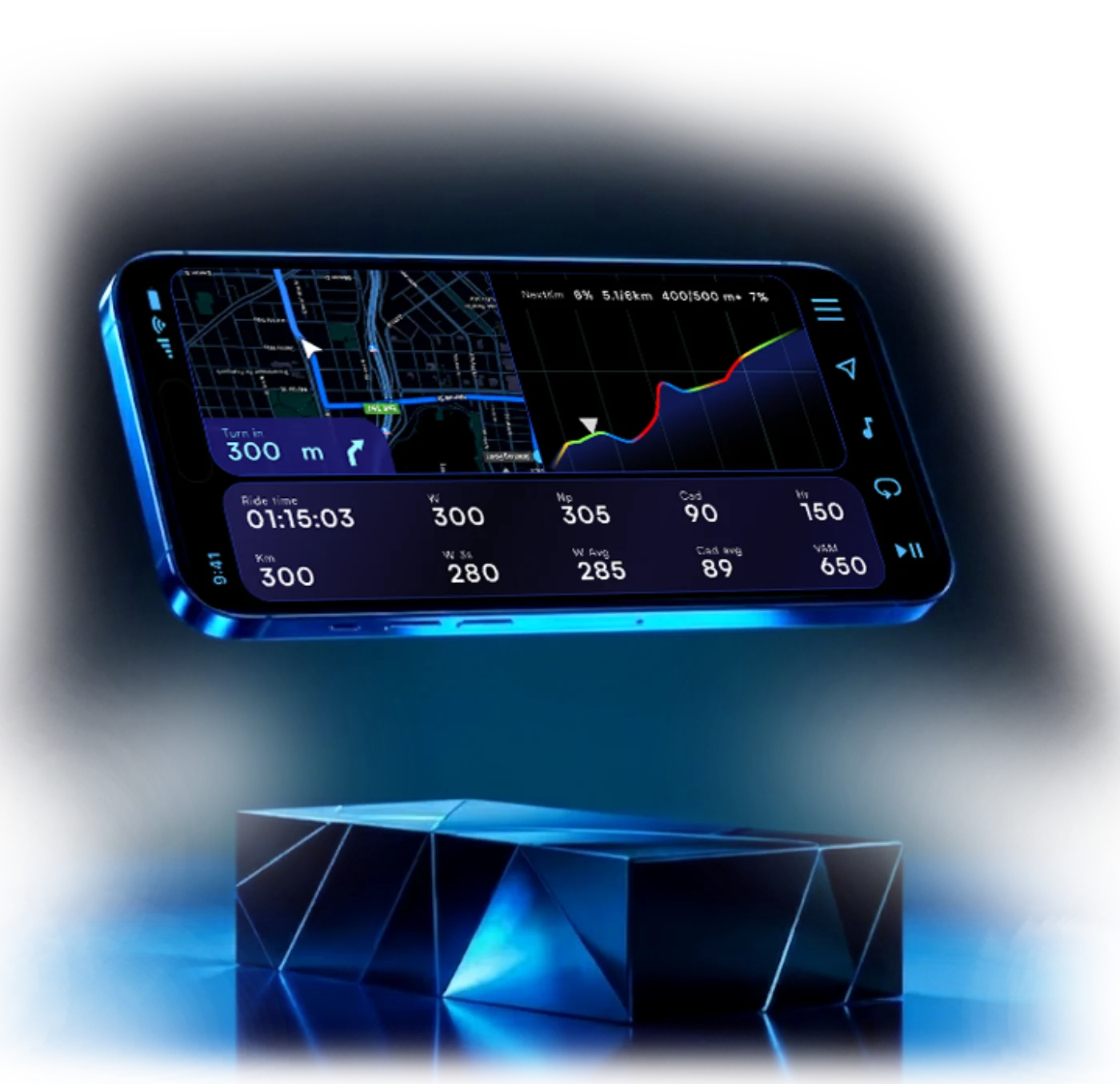
Exploration only: navigation and live training metrics sharing one landscape screen, with the elevation profile carrying what comes next.