Overview
The Brief
A single WordPress page that describes the trips but can't be found on Google, can't be edited without a developer, and can't take a payment. Every real conversation happens off the site, in a PDF or an inbox.
Centre Point Global is a real, family-run school-travel agency in Madrid, organizing trips, language-immersion programs, and end-of-year excursions for roughly 40 schools. Their entire online presence was one static WordPress page: no indexable pages for Google, no management panel for the team, and no way for a family to pay online. Every lead ended the same way, a downloaded PDF or an email exchange with no path to close.
I joined as Product & UX Lead alongside co-founder Jorge J. Rolo (business & engineering) to turn that page into a platform. Phase 1 scopes three new capabilities: a dynamic, SEO-optimized trip catalog with its own page per trip and category; a self-serve CMS so the ops team can publish, price, and photograph trips without touching code; and Stripe Payment Links so a family can pay a deposit or the full amount in two clicks, live from day one. Everything outside that, split/institutional payment, role-based portals for families and schools, nationwide SEO, an editorial CMS, is explicitly scoped to Phase 2 so Phase 1 ships focused.
Research, Phase 01
Stakeholder Mapping Before Personas
School travel is a B2B2C model with three decision-makers in a chain, not one user: the coordinating teacher initiates and compares agencies, the school's leadership authorizes the trip, and the paying family settles the bill while the child is the one who travels. A PTA often pools and staggers the family payments. Rather than sketching personas first, I mapped the full stakeholder set, internal and external, direct and indirect, and scored each on power × interest (Mendelow) before deriving any user archetype from it, matching NN/g's guidance that a persona without a real stakeholder behind it is decoration.
Manage Closely
Coordinating teacher, school leadership, paying family, and the internal CMS manager, high power and high interest, get first priority in every design decision.
Keep Satisfied
Education authorities, AEPD (data protection), Spain's accessibility law and travel-agency licensing, high power, lower day-to-day interest, but they set hard constraints on forms and disclosures.
Keep Informed
The PTA (which pools payments across families), the wider teaching staff, and the traveling student, who doesn't pay but drives the family's decision emotionally.
Monitor
Hotels, coach operators, activity providers and insurers, indirect, but they define the sector's #1 real complaint: accommodation that doesn't match what was booked.
- The most underserved stakeholder is the coordinating teacher. The administrative load of organizing a trip falls on them voluntarily; removing that load is the single strongest adoption lever, and it's exactly the product gap the market leader has already proven with an app.
- Families already pay in installments through the PTA for many school activities, so a Stripe link that splits a deposit from a balance maps onto a payment habit they already trust, rather than introducing a new one.
- Adoption should target the pragmatic early majority first (the coordinator who wants less admin, the family that values paying online), leaning on relative advantage and observability, per Rogers' diffusion model, rather than chasing innovators.
Research, Phase 02
An 11-Competitor Heuristic Audit
Eleven direct competitors serving Madrid and Spain were reviewed URL by URL and scored against Nielsen's usability heuristics, plus a review of verified Google ratings and forum complaints to separate real pain points from assumptions.
Colegia · 4.5 / 5
The category leader: a real management app with live enrollment and payment tracking, ~220 "Excellent" Google reviews. Its own gap: pricing shown as "from €135" without transport, and a chaotic WordPress UI.
Viajestudiantes · 3.0 / 5
Scale and 48 years of trust, but every price sits behind a "request a quote" wall, high friction for a B2B buyer trying to compare options.
Fin de Curso Colegio
The strongest UI in the set: Next.js + Vercel, GA4 and Clarity already instrumented, and a hero with a clear destination/date selector, used as the visual-quality benchmark, not a threat.
Transparent pricing, 100% online reservation and payment, and a real-time tracking portal for families and teachers: no competitor in the set covers all three. That intersection is the opening.
- Verified sector pain points: accommodation that doesn't match what was booked, chaotic last-minute coordination, opaque cancellations and refunds (worse since the pandemic), and near-nobody solving online payment or real-time family communication well.
- Price transparency is a clear split in the market: agencies that show "from €X" convert better on trust than the ones hiding everything behind a quote request, exactly the friction a B2B buyer comparing three vendors resents most.
Research, Phase 03
UX & Conversion Foundations
Before any component got built, I compiled the applicable evidence from Nielsen Norman Group and Baymard Institute, plus CXL, Fogg, Rogers and Cialdini, for every recurring pattern the catalog and checkout would need. This became the review checklist for the design system, not a mood board.
- Text carries the decision; photos earn the right to be read. In e-commerce, ~82% of viewing time goes to text and ~18% to images (NN/g); a trip's description needs to close the sale, the photo just needs to open the door.
- Hidden costs are the #1 cause of checkout abandonment, ~48% of drop-off, with forced account creation adding another ~26% (Baymard). Applied directly: show "from €X per student," what's included, and let a request move forward without an account.
- The average checkout has 11.3 fields against an optimum of 7–8 (Baymard); the quote-request flow was scoped to a single-column, 3-step form with visible labels, no placeholder-as-label, and non-premature validation, straight out of NN/g's ten form-usability rules.
- Filter categories have to be predictable and ranked by real decision order, not alphabetical: for this audience that means educational stage first, then destination, duration, dates, and price per student.
- Trust is a requirement, not decoration, when the service moves minors and charges a family: design quality, upfront terms, and visible insurance/licensing signals are load-bearing, not polish.
Research, Phase 04
Catching a WCAG Failure in the Brand Palette
The client's three brand colors, coral #E0645A, magenta #E5478F, and indigo #43508F, were audited for WCAG 2.1 AA contrast before a single token shipped to globals.css. Coral and magenta both fail as normal text on white or the page background (3.42:1 and 3.73:1, against a 4.5:1 minimum); only indigo passes outright, at 7.55:1. Coral or magenta directly over indigo fails even harder, at roughly 2:1, unreadable.
The fix: two text-safe variants, coral-700 #B23A30 and magenta-700 #B81E63, both AA-verified, an AA-checked tint/shade scale for the rest of the palette, and a 60-30-10 rule, 60% neutral surfaces, 30% indigo as the structural and trust color, 10% coral as the primary CTA, magenta capped under 5% as a pure accent. This was flagged as a P0, ship-blocking item, not a style suggestion.
A simulated round of persona testing on the palette (explicitly labeled as simulated, not real users, and later scheduled for replacement with moderated sessions) surfaced a real tension worth designing for rather than resolving by picking a side: parents and the school coordinator read a coral/magenta-dominant page as "a fun camp," not "an institution I'd sign a contract with," while a 17-year-old reader loved the warmth and found indigo "boring." The resolution channels coral and magenta to emotional, family-facing moments and promotes indigo to the structural, trust-facing ones, rather than diluting either audience.
Marta, 41 · parent
First time her daughter would travel without her. Wants the "serious" signal indigo gives before she'll trust a coral-heavy page with her child's trip.
Carlos, 53 · coordinator
Compares vendors for a B2B decision. Reads magenta-as-dominant as "not corporate enough to sign a contract with."
Lucía, 17 · student
Checks the site on mobile, in sunlight. Loves the coral energy, but the exact low-contrast text WCAG flags is also what she can't read outdoors.
Strategy
Information Architecture & SEO, Template by Template
The Phase 1 sitemap was designed as 11 page templates, not 11 one-off pages, each with its own purpose, minimum on-page content, schema.org type, and accessibility requirement, from the trip-detail page (Product/TouristTrip + breadcrumb) to the four local Madrid landing pages that anchor Phase 1's SEO. A scoring formula (volume × commercial value × Phase-1 fit ÷ keyword difficulty) ranked every target keyword so effort followed opportunity, not guesswork.
Category hubs
4 templates, one per line (ministay, summer immersion, national school trips, Europe), each with an FAQ block and seasonal interlinking tuned to the sector's real booking calendar.
Destination landings
~6 templates capturing "[product] + [destination]" at zero keyword difficulty, the fastest wins identified in the research.
Local Madrid layer
4 geolocated landings (agency, end-of-year trip, excursions, language immersion) built around Madrid's confirmed Local Pack presence, Phase 1's primary SEO engine.
- Quick wins identified at keyword difficulty 0: summer-Ireland, and the London / Dublin / Edinburgh trip pages, structural gaps only 1–2 competitors currently cover.
- Canonical rules were written before a single page shipped, since Ireland alone appears in three different lines (ministay, summer, Europe) and could easily cannibalize itself without a differentiation rule per title, H1 and FAQ.
- Semantic contamination flagged early: "viaje fin de curso" (end-of-year trip) is dominated in search by a Netflix film, and "colonias inglés" collides with a department-store fragrance line, both explicitly excluded from targeting rather than fought.
The Build, So Far
Product Walkthrough
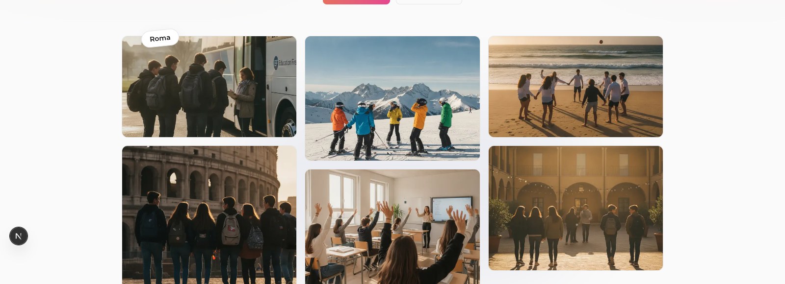
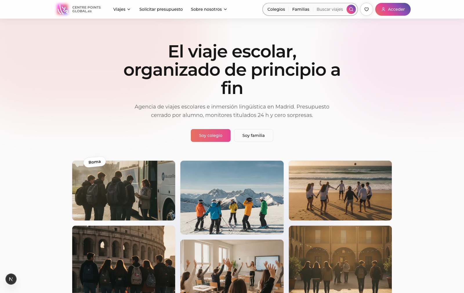
Screenshots below are from the live Phase 1 build, not mockups. The homepage splits into two entry points from the first screen, "I'm a school" and "I'm a family," acknowledging the B2B2C split from the stakeholder research directly in the hero.
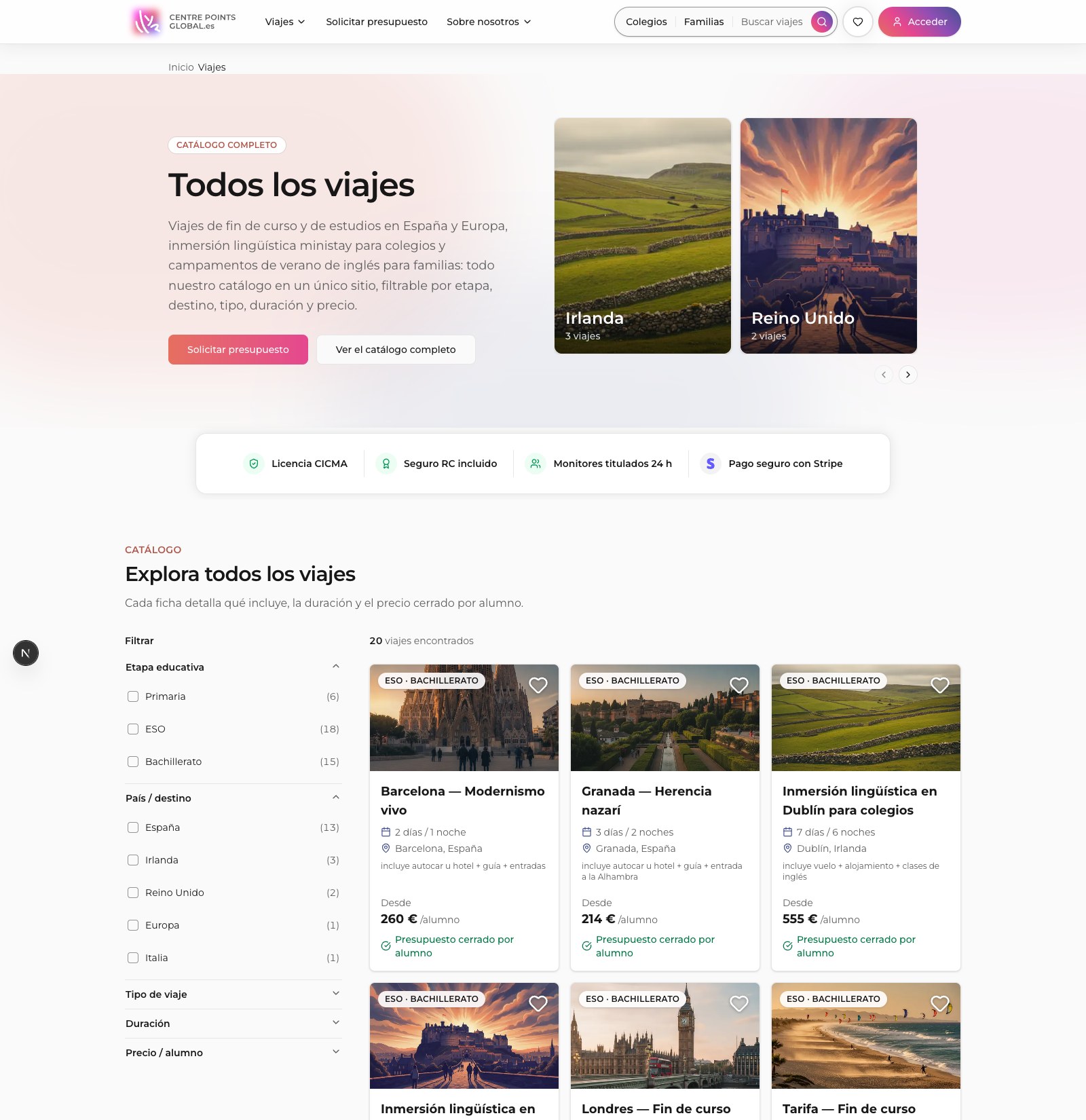
Catalog: 20 trips live, faceted filters ordered by real decision priority (stage first)
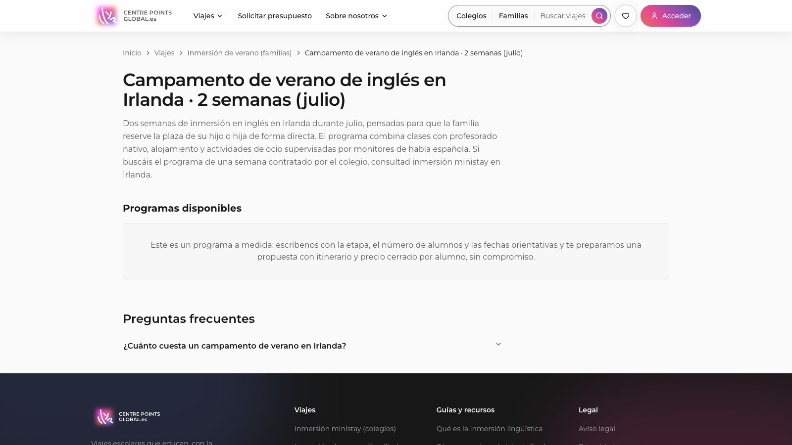
Trip detail page, breadcrumb navigation and self-contained FAQ (schema-ready)
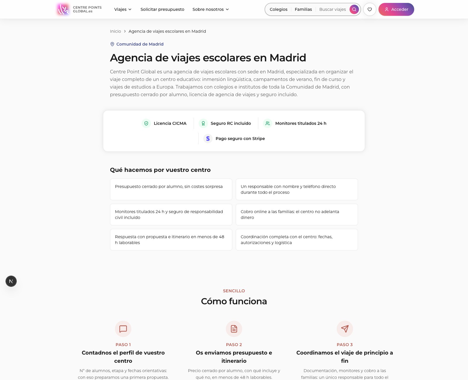
Local Madrid landing: trust badges, how-it-works, four B2B advantages
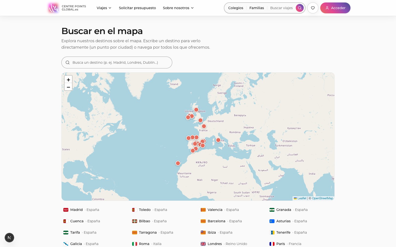
Map search (Leaflet), an alternate path to the same catalog
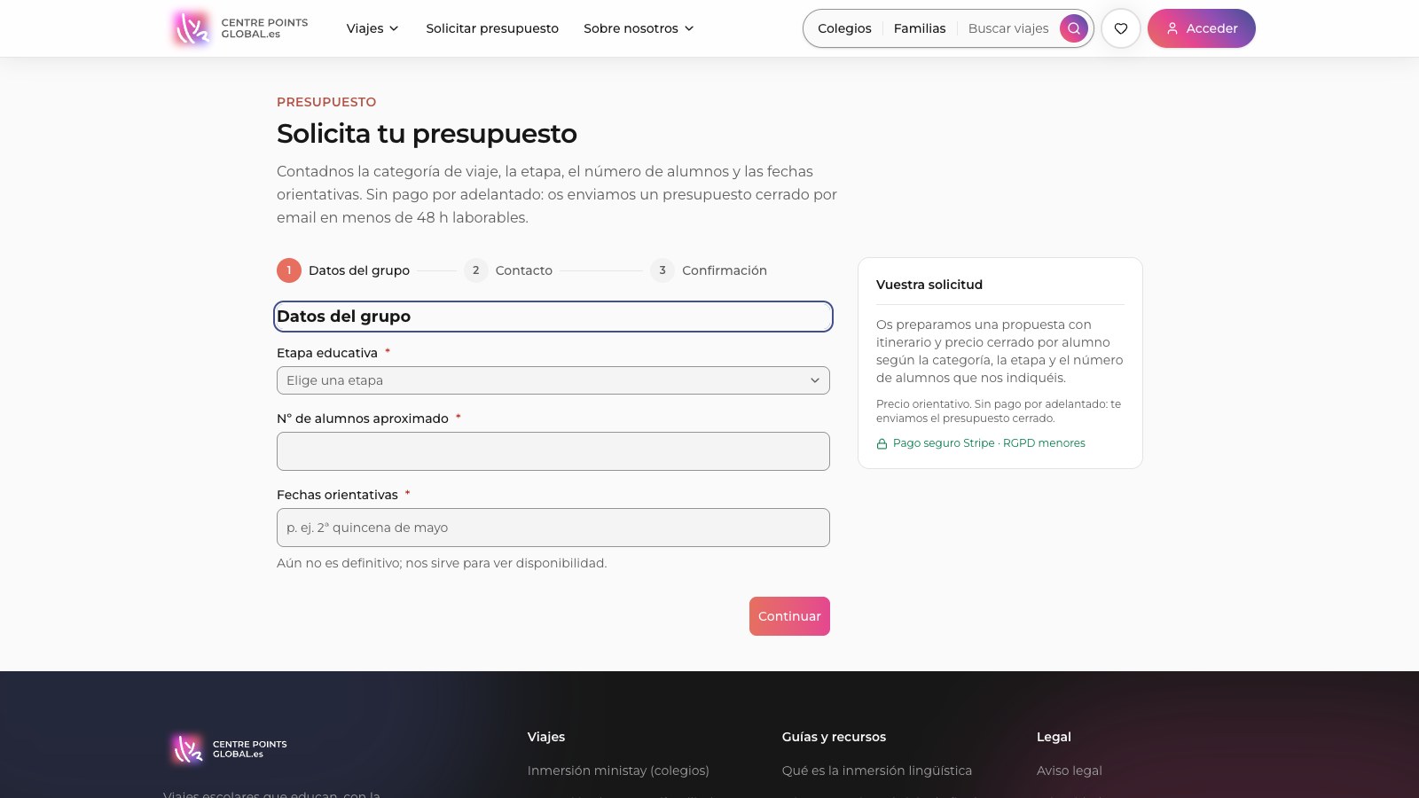
Quote request: single-column, 3-step, labels above fields, no placeholder-as-label
Execution
Design System & Agentic Build
The stack is Next.js 16 (App Router) with React 19 for SSR/SSG, shadcn/ui and Tailwind CSS v4 on Montserrat, Supabase (Postgres, Auth, and row-level security on every table) for the catalog and CMS, and Stripe Payment Links for checkout, deliberately kept in test mode until the full flow is validated end to end. Hosting is Vercel.
The build itself runs on an orchestrator-plus-specialist-agents pattern in Claude Code: one ephemeral sub-agent per concern, SEO architecture, frontend/design system, CRO & copywriting, accessibility, CMS/data modeling, content & imagery, and QA, each returning a deliverable, a short summary, and any unverified facts flagged rather than guessed. The orchestrating session reviews every delivery, including re-checking contrast ratios and business figures, before accepting it. No price, phone number, or business claim ships without confirmation.
SEO Architect
Route tree, sitemap, canonical rules, JSON-LD schema map per template, interlinking.
Frontend / Design System
shadcn components, brand tokens, mobile-first responsive layouts, motion.
CRO & Copywriting
Conversion-focused hierarchy, microcopy, and low-friction form design.
Accessibility
Continuous WCAG 2.1 AA auditing, not a pre-launch checklist.
CMS & Data
Supabase schema, RLS policies, and the real catalog seed from the client's own trip PDF.
QA & Verification
Build health, Core Web Vitals, broken links, and data verification before anything ships.
My Role
Product & UX Lead
I own the research, IA/SEO strategy, and accessibility for Centre Point Global, and I direct the agentic Claude Code build as the orchestrating designer: writing the brief for each specialist agent, reviewing every deliverable against the research before it ships, and keeping the brand's WCAG compliance non-negotiable. Co-founder Jorge J. Rolo owns the business side, the client relationship, and engineering decisions outside the design system. Together we scoped Phase 1 down to three capabilities on purpose, catalog, CMS, payment link, so the MVP could ship focused instead of chasing the full Phase 2 vision on day one.
Toolchain
Research to Production
Research, strategy, and the design system all feed the same living codebase, no handoff gap between the two.
Status
In Development & Next Steps
Centre Point Global is not shipped. This is an honest snapshot of a real, ongoing build, not a finished case study dressed up as one.
Scoped for Phase 2
- Institutional single payment and split/installment payment for families.
- Three role-based panels, family, institution, and admin, replacing today's single manager role.
- Programmatic SEO for the rest of Spain, beyond the Madrid local layer.
- A full editorial content CMS and blog.
- Stripe Connect and multi-institution accounts.
Open right now
- Final logo files (SVG/PNG) still pending export from the client's brand assets.
- NAP phone number needs client confirmation before it's locked into schema, footer, and the Google Business Profile.
- Legal pages, privacy, cookies, terms, and the accessibility statement, are drafted but awaiting client/DPO sign-off.
- Several catalog fields depend on documentation still pending from the client's tour-wholesaler partners.
- The shipped UI hasn't fully migrated to the indigo-led 60-30-10 palette yet, that's a tracked P0, not a rejected recommendation.
- The simulated color-testing personas are a placeholder for real moderated sessions with parents, coordinators, and students, five participants per group, including one with low vision or color blindness.
- Stripe stays in test mode until the full payment flow is validated end to end, no cobro goes live without that gate.