Redesigning Delta for Business as one connected platform for travelers and managers.
Migration of three Delta corporate web properties into a single, validated end-to-end product, built on a tokenized design system shipped through an agentic build pipeline.
Context
SCAD · Spring 2026
Team
3 designers
Status
Live prototype
Scope
End-to-end
Tools
 Next.js
 TypeScript
 Tailwind
 shadcn/ui
 Figma MCP
 Claude Code
 Vercel


Abstract
The project in five lines.
- Migrated three Delta corporate web properties (Delta Business, Delta SkyMiles for Business, and Delta–AMEX Business Cards) into one connected product structure.
- Co-designed a new business-tier Medallion model after research showed business travelers want to fly Delta more but lose status to competing carriers.
- Built the design system in Figma, automated token export via Claude Code CLI + Code-to-Figma, and shipped to React.
- Wrote SEO + GEO-optimized markdown specs per page → an agentic AI system built the production website and the Manager Dashboard.
- Validated end-to-end: 5 contextual interviews, 2 testing rounds, 1 Tree Test, 1 CRO micro-survey. The new site beat the old one 7/10 vs 6/10 head-to-head.
The problem
Business travelers want to fly Delta more. The loyalty math pushes them away.
My role
I owned product structure across three products and led the migration into one platform.
The business-model redesign was joint with my teammate; everything below was mine.
Product structure
Owned structure across 3 connected products, spanning the public site, calculator and DBT dashboard.
Migration
Migrated 3 Delta corporate properties into one coherent system.
Research orchestration
Benchmarking, hypotheses, contextual interviews, and user flows.
Design system
Tokens, variables and base components in Figma, tokenized with Claude Code CLI + Code-to-Figma.
Token + component export
Shipped tokens and primitive components to React.
Information architecture
Structured the IA and sitemap of the new Delta for Business site.
SEO + GEO specs
Wrote per-page markdown specs that feed the agentic build.
Guided selector (Quiz)
Designed the progressive-disclosure flow that routes users to the right tier.
Testing protocol
Set the user-testing protocol structure and the base documents the team used.
CRO experiment
Launched the public-site micro-survey + Microsoft Clarity integration.
Jai Grant helped build the design system and was the lead designer of the Dashboard. He also co-designed the business model with me, based on the main research I led.
Research
A current-state audit, a competitive benchmark, five interviews, the boarding journey, and adoption archetypes.
The starting point was a fragmented experience
Before the redesign, Delta's corporate offering was scattered across three disconnected web properties and two separate tools. The first research job was auditing what already existed and understanding why users got lost in it.
- business.delta.comDelta business traveler site
- skymilesforbusiness.delta.comSkyMiles for Business platform
- delta.com/…/american-express-business-cardsDelta–Amex Business Cards
- + two separate management toolsTravel-manager dashboard · SkyMiles management
Moderated tests and contextual research surfaced the core problems of the existing web and app:
Competitive benchmark
I started with Delta's own metrics next to Qatar, Emirates, Singapore, United and American. The differentiation gap was clearest around premium-service consistency and loyalty mechanics for high-spend corporate accounts.
Contextual interviews (n=5)
Jorge Jimenez Rolo (SEO & Behavioral Manager), Najah Bradley (frequent traveler), Sarah Kling (Sr. UX Researcher, Amazon), Stephanie Krell (Service Designer & Professor), and Stehle Craig (Industrial Designer & Professor).
- Reimbursement vs. pre-approval. Travelers must choose between reimbursing their own expenses or using pre-approved, streamlined bookings.
- Status is hard to keep. Travelers struggle to maintain Medallion tiers because thresholds keep rising.
- Fragmented benefits. Travelers manage multiple credit cards and point systems to capture the best benefits.
Business-traveler user flow
I mapped the end-to-end boarding & travel journey to find where status decisions and friction collide. Friction points are highlighted.
Adoption theory & archetypes
Instead of personas, I defined the audience as adoption archetypes by company size and placed them on Rogers' Diffusion of Innovations curve, asking which organizations adopt a new B2B loyalty platform first, and which hold back. Each archetype was read against Rogers' five attributes: relative advantage, compatibility, complexity, trialability and observability.
Startups scored 20/25, ready to adopt, sitting with the Early Adopters. Mid-Market travel managers scored 14/25, not yet, holding back in the Late Majority. Small businesses adopt fast for clear ROI, while large enterprises carry the highest value but move slowest, gated by procurement and security. Observability was the weakest attribute across the board (2/5). Teams can't easily see other companies' results, which is exactly why "add customer case studies" became a P0 fix.
Based on E. M. Rogers' Diffusion of Innovations, 5th ed., with Delta for Business archetypes placed by adoption readiness.
Startups
Adopt fast when the ROI is obvious; almost no procurement friction.
e.g. Linear, Notion, UserTesting
Rogers' 20/25 · ready Early Majority · Deliberate
Small Business (SMB)
Lean teams that adopt for time saved once the value is proven.
e.g. Basecamp, Buffer, Wistia
Likely adopter Late Majority · Skeptical
Mid-Market
Policy and spend control matter; needs proof before committing.
e.g. Zapier, Asana, HubSpot
Rogers' 14/25 · not yetLarge Enterprise
Highest value and slowest to move, held up by security, procurement and policy gates.
e.g. Amazon, Coca-Cola, IBM, Microsoft
Interviewed a manager at AmazonIndividual Business Traveler
Flies often on a corporate card; self-selects into status and a smoother boarding day. The end-user inside every company above.
e.g. management consultants, enterprise sales leaders, frequent-flyer founders
Self-selects inA smoother Medallion ladder, one business tier per archetype.
Delta's business offering had only two tiers, with a big jump between them. Using the archetype study, we kept the Individual traveler and designed a smoother ladder (a new Gold for small business, Platinum Business for mid-market, and Diamond Business for large enterprise), each tuned to a studied reference travel-spend range so the offer fits the profile.
 Individual traveler
Individual
< $15kref. annual travel spend
Individual traveler
Individual
< $15kref. annual travel spend
 Small Business
Gold
$15k–$100kref. annual travel spend
Small Business
Gold
$15k–$100kref. annual travel spend
 Mid-Market
Platinum Business
$100k–$1Mref. annual travel spend
Mid-Market
Platinum Business
$100k–$1Mref. annual travel spend
 Large Enterprise
Diamond Business
$1M+ref. annual travel spend
Large Enterprise
Diamond Business
$1M+ref. annual travel spend
The business solution
Medallion Suite for Business, nine connected benefits.
A new business-tier system designed to make high-spend corporate accounts feel rewarded inside Delta rather than penalized by it.
A promotions policy that fills Comfort+, a low-effort upsell tied to Medallion status.
Filling Comfort+ (Economy+) has been one of Delta's biggest gaps in recent years. So beyond the tiers, we designed a promotions policy for business travelers that channels them into Comfort+, promoted in direct relation to their business Medallion status.
It's a low-effort upsell: it lifts occupancy in a cabin Delta struggles to fill, while improving the traveler's comfort and their perception of both Delta and their employer. The company looks like it takes care of its people, at almost no extra cost.
SilverGoldPlatinumDiamondDesign system & agentic build
I designed the constraints an agent team built inside — not the pixels.
I built a tokenized design system in Figma — 137 tokens for color, type, spacing, radius and shadow, extracted straight from Figma variables — and wrote the instruction system a 5-agent Claude Code team read before touching a file: 8 markdown specs (sitemap through agent instructions), a 1,172-line CLAUDE.md, and an orchestrator prompt. I didn't hand-write the site's TypeScript. I wrote the constraints that made the agents' output predictable, and made the visual judgment calls the agents couldn't.
 Figma tokens
 Claude Code CLI
 React exportAgentic build
Four decisions, not one prompt
Nothing here started from "build me a website." The agentic build only worked because of a handful of upfront decisions about how much structure to hand the agents before they wrote a line of code — and where the trade-offs of that structure showed up later.
Specs as markdown, not tickets
WhyAn agent reads its context once per spawn — there's no back-and-forth clarification like there'd be with a ticket. A markdown spec has to be self-contained enough that an agent that's never seen the project can execute it correctly the first time.
Trade-offWriting that upfront is slower than filing a ticket, and any ambiguity in the spec becomes a bug in five agents' output instead of one clarifying question.
Tokens as the single source of truth, enforced mechanically
Why"Use the design tokens" is a suggestion. A verification grep for hardcoded hex colors that has to return zero matches before a phase is marked done is a rule. Agents are reliable at satisfying rules that get mechanically checked, less reliable at satisfying taste-based instructions.
Trade-offThe rule only catches what it's built to catch — it stops a raw hex value, not bad spacing or an agent reaching for the wrong existing token.
Agent specialization with file-ownership boundaries
WhyOne orchestrator that never writes code, five specialized agents (Architect, Marketing Pages, Interactive Tools, Dashboard, SEO & Quality), each scoped to its own part of the file tree. Agent 3 never touches dashboard code. Boundaries turn a collision between parallel agents into an impossible state instead of a silent overwrite.
Trade-offThe seams have to be drawn correctly upfront — get one wrong and an agent either can't finish its task or leaves a TODO in a file it isn't allowed to touch.
Verification gates + human curation between phases
WhyThree phases, each closed out with npx tsc --noEmit, a clean build, the token/icon greps and an agent-log entry, before the next phase starts. A build can compile and look plausible while quietly breaking a rule three files away — gating between phases catches that before it propagates into 60 more pages, and I reviewed the diff at every gate.
Trade-offGates only check what you thought to check for. They didn't catch a badge sitting on the wrong background or a stroke reading as an error state, because "does this look right" isn't a grep — that's what I was still there for.
Three phases, gated — not one shot
The orchestrator never wrote application code itself. It spawned agents, read their agent-log.md entries, ran the verification commands below, and re-spawned a fix agent targeted at the specific broken files if a gate failed — before letting the next phase start.
Foundation
Agent 1 — Architect. Scaffolds the app, extracts the 137 Figma tokens, defines every TypeScript type. All other agents wait.
tokens.css populated · types compile · agent-log entry
Parallel build
Agents 2, 3, 4 — Marketing Pages, Interactive Tools, Dashboard — run simultaneously on separate file trees.
tsc --noEmit · clean build · zero-hex grep · zero-Lucide grep
SEO & quality
Agent 5 closes gaps: generateMetadata() on every page, JSON-LD, sitemap, a11y and heading-hierarchy pass.
full build + type check pass · every page has metadata
Color tokens
Type scale · Whitney
Spacing scale
Base components
What the agent got wrong
Strong on structure. Blind to visual judgment.
34 commits over 15 days: 21 features, 13 fixes. The fixes are corrections to what the agent team had already shipped, and the pattern holds across all of them — the agents got the structure and logic right (the right component, the right route, the right data), and missed the calls that are pure visual judgment. Those 13 fix commits are the closest thing this project has to my fingerprint.
Agent shippedA red active-state outline on the Gold business plan card — the same "active" treatment used elsewhere in the file, applied without noticing red reads as an error state next to a premium tier, not a selection state.
I correctedDropped the red stroke. The code was right; what it communicated in context wasn't.
Agent shippedA MedallionTeaser grid that compiled and rendered fine, just not at the proportions the tier cards needed — leftover space at the end of the row instead of the cards filling it.
I correctedForced the grid to 3 columns so the tier cards spanned the full row and read as a set.
Agent shippedThe correct SkyTeam badge, correct alt text, correct placement — sitting on its own white background instead of blending into the page.
I correctedSwapped in a transparent PNG. A small asset-hygiene detail no build spec spells out.
None of these were logic bugs — tsc passed, the token grep passed, the build passed. They were the fix commits doing the job the verification gates couldn't: judging whether it looked right.
Stack & why
Every tool here is load-bearing for the agentic workflow, not a resume line.
Next.js
App Router's file-based routing matched the 63-page sitemap one route per file, so agents could scaffold a page straight from the spec's URL.
TypeScript
Types are a contract an agent can't quietly violate. npx tsc --noEmit was the gate that caught what looked right but wasn't.
Tailwind + tokens
Utility classes mapped 1:1 to the 137 Figma variables, so "use the tokens" had a mechanical answer instead of a stylistic one.
shadcn/ui
Unstyled primitives the agents customized from the Figma spec, instead of fighting a pre-styled library's own opinions.
Figma MCP
Agents pulled real design context per section instead of working from a description of the design.
Claude Code
The five build agents, plus the orchestrator that never wrote a line of application code itself.
Vercel
Deploy target for every phase's clean-build check, and the platform the OG images render against.
Information architecture & SEO
One hub from three properties, structured to outrank competing carriers.
I unified three Delta properties (Business, SkyMiles for Business and Delta–AMEX Business Cards) into a single hub, with a hard line in the information architecture: everything business and corporate, we build; general consumer features (book a flight, personal SkyMiles, flight status) link out to delta.com. Enrollment is self-serve for small business and contact-sales for mid-market and enterprise.
Every page shipped with a search spec.
Each page got an SEO / GEO markdown spec covering title, meta, heading hierarchy, JSON-LD schema and a target query. Comparison pages (Delta vs United vs American) capture high-intent competitor searches, while program and benefit pages target long-tail B2B-loyalty queries, so Delta for Business surfaces above competing carriers' corporate programs in both Google and AI answers.
Rich snippets as shortcuts, and better ranking. Every page ships JSON-LD for BreadcrumbList, SiteNavigationElement and FAQPage. Google renders that markup as rich-snippet sitelinks that act as shortcuts straight into the funnel, and the structured data also improves the page's ranking. One result becomes a column of links dropping users directly onto Programs, Cards or the tools, and it surfaces above competing carriers.
Delta for Business, Corporate Travel & SkyMiles
One hub for business travel: programs by company size, Corporate Priority benefits, Delta–Amex cards and the SkyMiles for Business loyalty program.
Rich-snippet sitelinks (from BreadcrumbList + SiteNavigationElement JSON-LD) act as shortcuts into the funnel, and lift the page's ranking.
Sitemap, the full URL tree
The hierarchy stays shallow, at most three levels below the homepage. Sections (Level 1) open into sub-pages (Level 2) and, only where needed, detail pages (Level 3). A flat tree keeps every page a few clicks away and gives crawlers a clean, predictable path. Each node below is tagged with its level. Drag, scroll with two fingers, or open a node to read what it does.
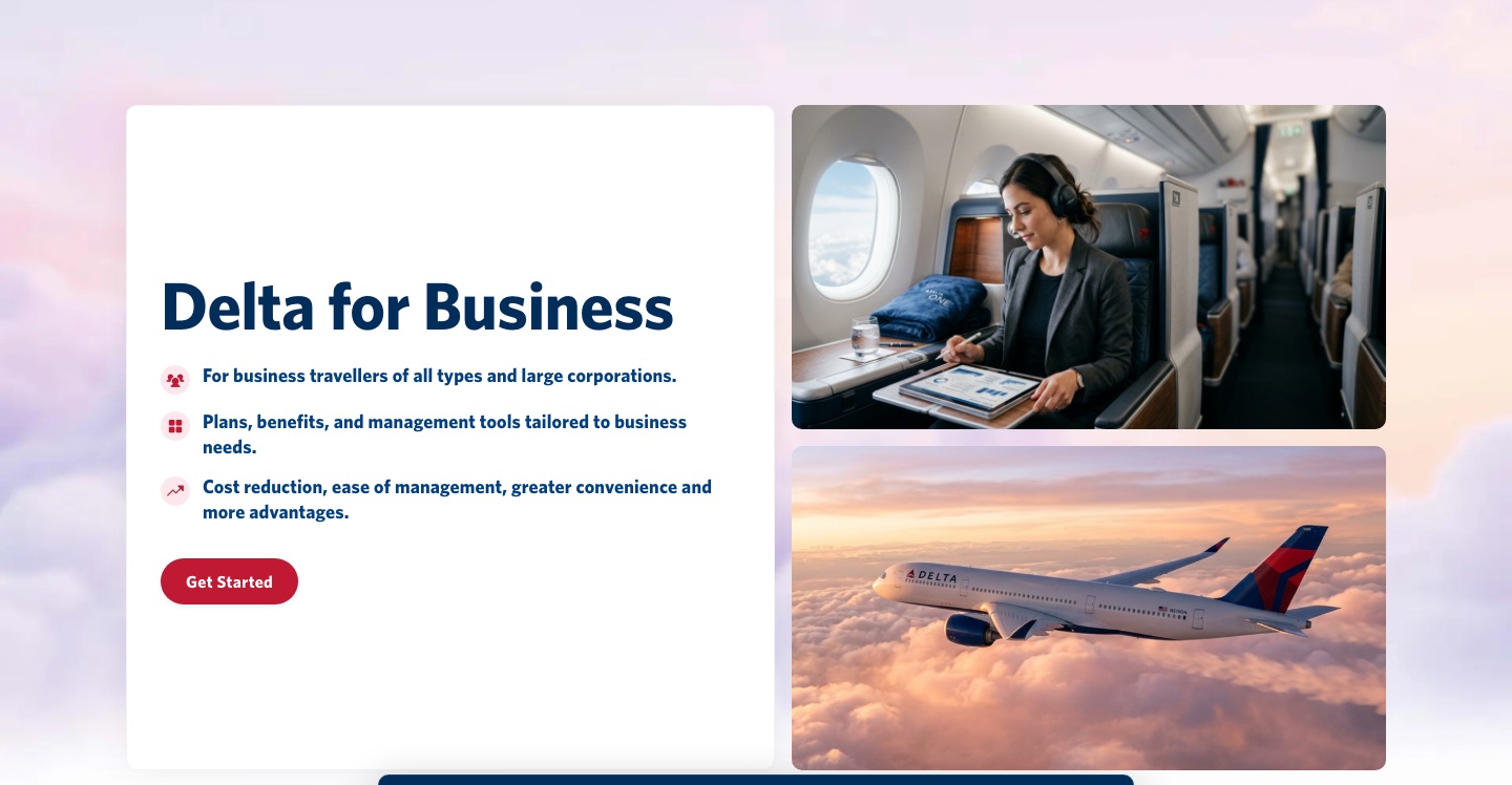
Public website
The live landing page, built inside the specs, tokens and boundaries above.
The live Delta for Business landing page came out of the same system described above: the SEO / GEO markdown specs, the tokenized React components, the agent-ownership boundaries, and the verification gates between phases. Below are captures of the live pages — open the full site in a new tab to click through it yourself.
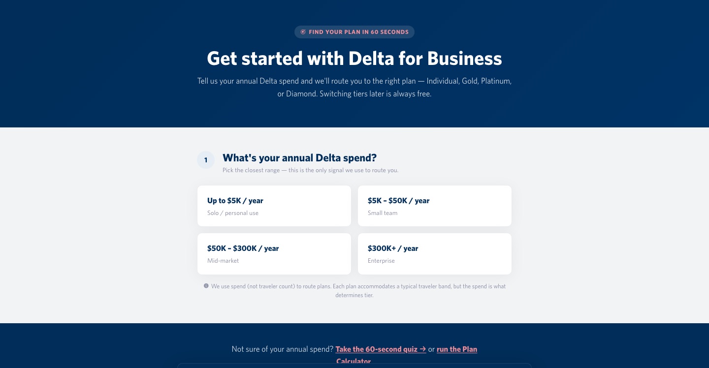
A few short questions instead of a tier comparison wall.
Instead of dropping users onto a tier comparison wall, the site asks a few short questions and walks each user to the right product and tier. The flow is built on progressive disclosure, showing only what the user needs to decide the next step.
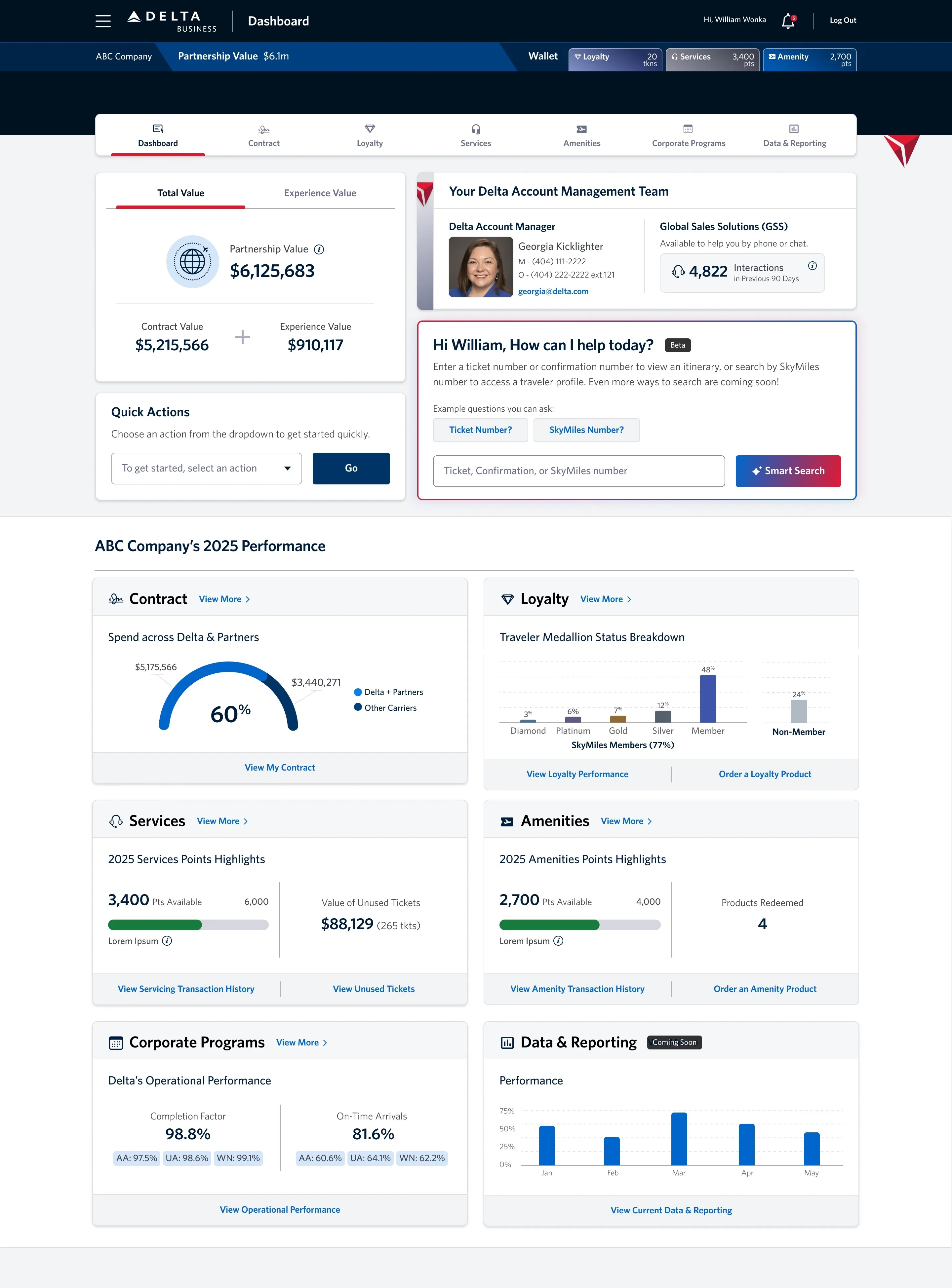
DBT Dashboard · travel manager tool
A manager surface designed around the daily workflow.
A travel-manager surface built around requests, trips, spend and alerts, built by the same agent team, from the same spec-and-token system.
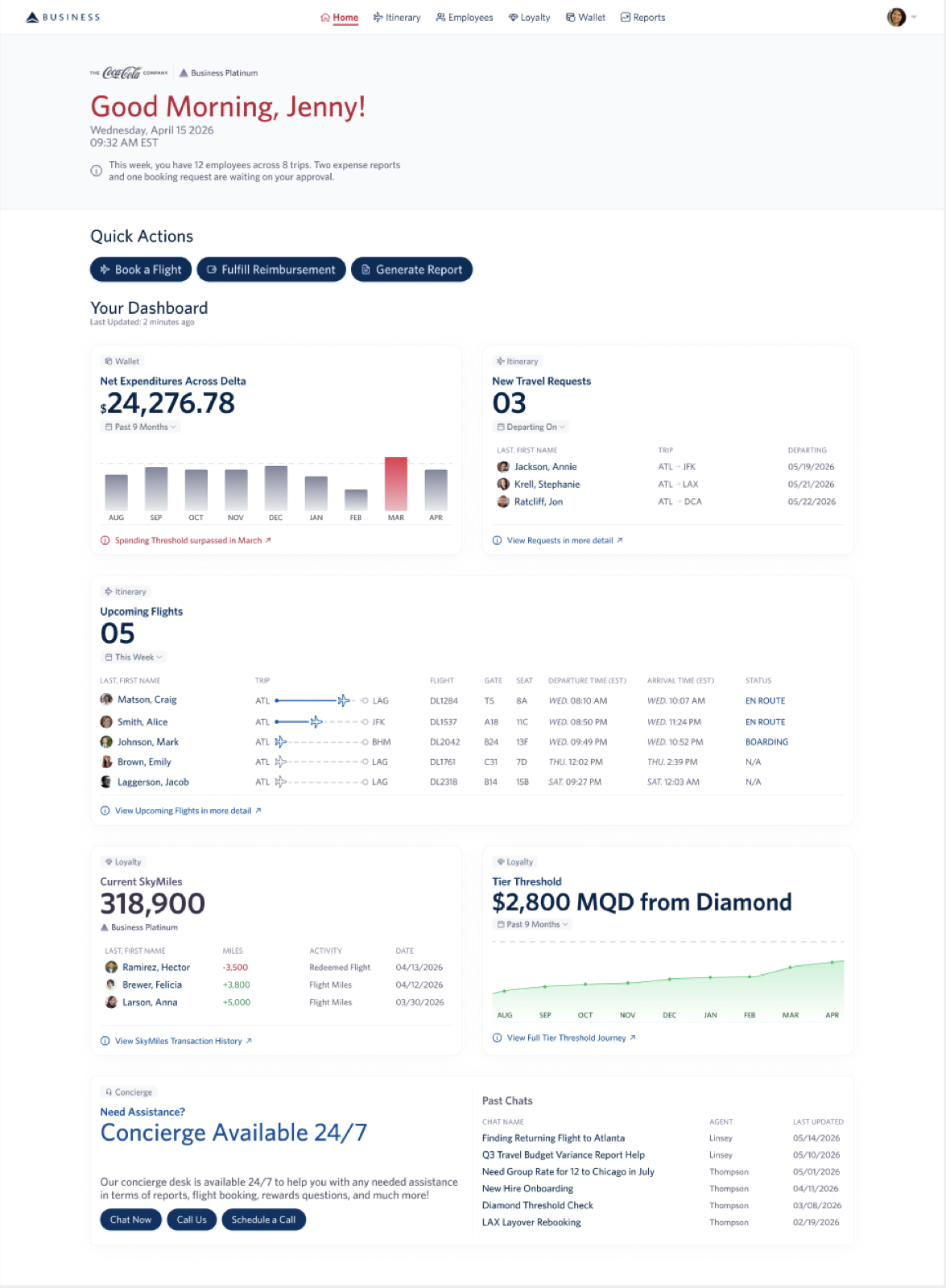
- Wallet + spend vs threshold. Company spend tracked against tier thresholds.
- Travel requests queue. One-click approve for incoming requests.
- Upcoming flights view. Every trip at a glance.
- Traveler profile drill-down. Per-traveler detail and history.
- Reports & exports. P0 expansion for deeper reporting.
Benefits calculator
Built independently by a teammate.
The Benefits Calculator was built independently in Figma Make by Brian Glennon. It matters to this case study as the trigger for the broader progressive-disclosure / guided-selector work that now sits on the public site.
User testing · three methods, three products
Two rounds, a Tree Test, and a live-site CRO micro-survey.
The numbers below are real and verifiable in the transcripts, except where marked projected.
Run in collaboration with UserTesting, a learning exchange for both teams: we got a real remote-testing platform and panel, and shared our research framing and findings back.
CRO micro-survey · live site
Capturing real-traffic signal beyond the lab.
To start capturing real-traffic signal beyond the lab, I launched a short Google Form on the live site and connected Microsoft Clarity via code for heatmaps, scroll depth and session replay.
Microsoft Clarity is wired into the live site for web analytics (heatmaps, scroll depth and session replay), turning real visits into behavioral signal.
These metrics are early signal (projected), because the experiment is still capturing data and they are not final. The purpose: drive traffic to the new site, populate Microsoft Clarity heatmaps, and validate the Tree Test finding that tier-name labels are the main IA friction.
Improvements & roadmap
What ships now, and what comes next.
UX opportunities · what's pending
The logical next chapter, mostly from the interviews.
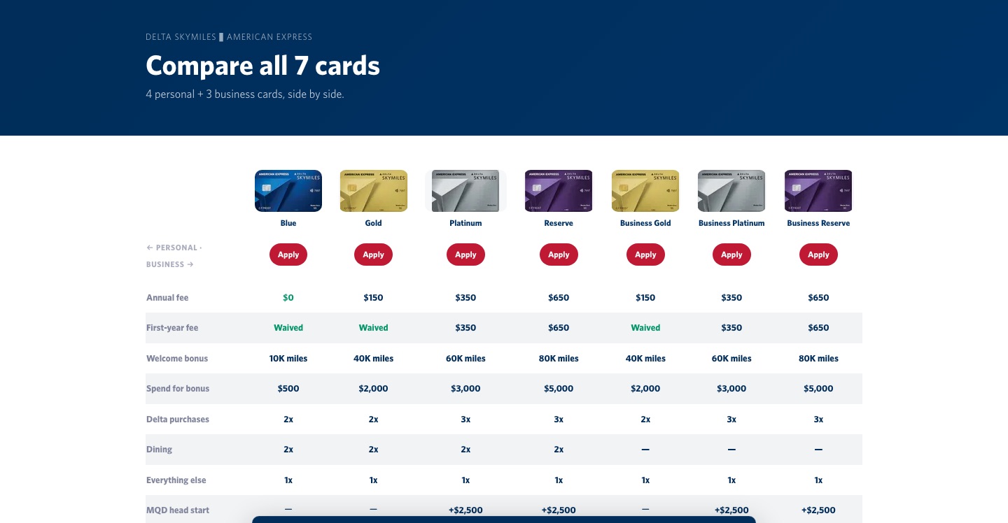
Blue Delta SkyMiles
No annual fee, the entry card. Earns SkyMiles on Delta, dining and groceries; the simplest way for a small team to start pooling company miles.
Gold Delta SkyMiles
First checked bag free and priority boarding, with bonus miles on Delta and everyday business spend, the workhorse card for frequent flyers.
Platinum Delta SkyMiles
A Companion Certificate, higher earn rates and an MQD head-start toward Medallion status, built for travelers chasing tier.
Reserve Delta SkyMiles
Top tier: Delta Sky Club access, the highest earn, and the biggest MQD boost, for the company's heaviest travelers.
Corporate AMEX inside DBT
Issue / freeze / replace cards, per-traveler limits, real-time auth vs settled spend.
Multi-issuer card support
Visa, Mastercard and Chase alongside AMEX.
Off-card expenses + receipt capture
Photo → OCR → categorized expense, off-card flow tied to a trip.
Open-platform integrations
Concur / SAP, calendars, Slack, NetSuite / QuickBooks, HRIS.
Personal AMEX bridge
Split corporate / personal on one trip; route personal MQDs to the traveler, corporate MQDs to the company tier.
Key metrics & learnings
What surprised me about the agentic build was where the split actually fell. I expected to spend my time on structure and let the agents handle the small judgment calls. It was the other way around. Five agents with clean file-ownership boundaries produced 63 correct pages and 55 working components without me touching the file tree — routing, data shape, component boundaries, all of that held up. What they couldn't do was see their own output: a red stroke reading as an error state, a grid with the wrong proportions, a badge on the wrong background. Thirteen of 34 commits were me fixing exactly that, not bugs. Agentic build earns its place anywhere a rule can be written down and mechanically checked — tokens, types, routes, metadata. It doesn't earn its place anywhere the only real test is "does this look right," which is most of what a design system is actually for. What I took from the project as a whole: owning structure across three connected products at once; running a tokenized design system and an agentic build pipeline end-to-end while knowing exactly which decisions I couldn't delegate; separating what users said from what we interpreted; and knowing when to lead, when to delegate, and when to absorb work to protect the deliverable.
Links
Want the full story?
Explore the live prototype, or see the rest of my work.
If this is the product thinking your team needs, let's bring it to your company.
I work end-to-end (research, design systems and agentic builds) on enterprise and B2B products. If you'd like this applied at your company, let's talk.