Role
Prototyping Lead · Design Systems Lead
Timeline
January – April 2026 · 15 Weeks
Client
HUD Atlanta Regional Office · Deloitte Digital via SCADpro
Program
SCADpro Professional Internship
Team Size
~25 people (Design, Research, Marketing, Operations)
Deliverables
- Design System
- Interactive Prototypes
- User Flows
- Research Support
Tools
 Figma
Figma Make
Figma
Figma Make
 Claude
 Claude Code
 NotebookLM
 Nano Banana (Gemini)
 Slack
Slack
 Dropbox
Section 01, Overview
The Challenge
The shift to NSPIRE — HUD's new federal inspection standard — fractured the process between inspectors, landlords, and tenants into a high-friction, disconnected experience.
No standardized digital platform existed to connect the three actors who keep regulated housing compliant.
Deloitte and HUD's Atlanta Regional Office tasked our SCADpro team with an AI-powered mobile platform — built to scale nationwide under NSPIRE.
HUD (U.S. Department of Housing and Urban Development) is the federal agency that funds and regulates affordable housing across the United States. Our primary stakeholder was HUD's Atlanta Regional Office, which oversees federal housing programs across eight southeastern states, including Georgia, Alabama, Florida, and Tennessee.
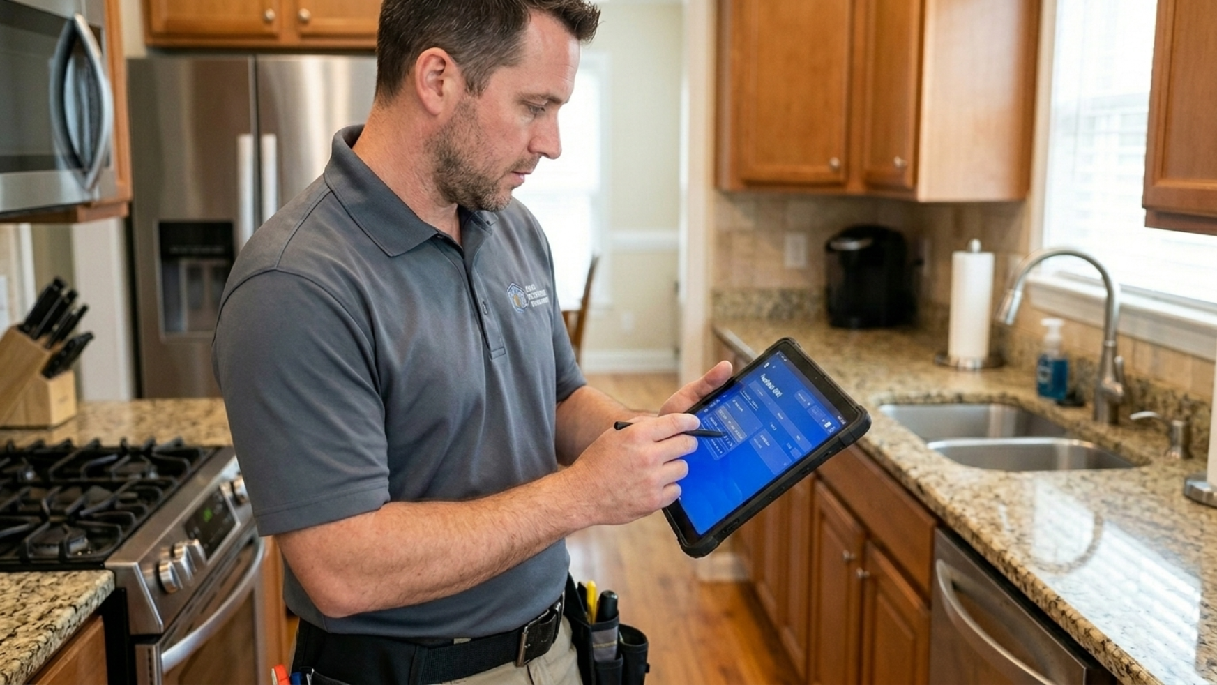
HUD doesn't operate the housing itself. It subcontracts the day-to-day management and operation of each property to landlords, who are legally responsible for keeping every unit in compliant condition. Inspectors enforce that contract, running annual inspections and responding whenever a deficiency is reported. If a landlord fails to repair within the regulated timeframes, they lose the right to operate the housing.
NSPIRE (National Standards for the Physical Inspection of Real Estate) is HUD's new federal inspection framework. The transition to NSPIRE created a fragmented, high-friction process between inspectors, landlords, and tenants, with no standardized digital platform connecting the three. Deloitte, working with HUD's Atlanta Regional Office, tasked our SCADpro team with designing an AI-powered mobile platform to bridge that gap. Because NSPIRE is a federal standard, the platform is designed to scale to any regulated housing group operating under it, nationwide, not just the Southeast.
Section 02, Ownership
What I Owned
As Prototyping Lead and Design Systems Lead, I owned the structural backbone of the product, from component architecture to interactive prototypes. I also contributed to research using AI tools, designed the AI interaction model, and led the resolution of a branding crisis mid-project. My work spanned strategy, systems thinking, and hands-on design execution.
01
Design System Architecture
Modular, brand-agnostic system built from day one
02
Interactive Prototyping
Figma + Framer prototypes for 3 user roles
03
AI Interaction Design
Defined how AI assists inspectors without replacing judgment
04
Branding Strategy Resolution
Role-based color system that resolved team deadlock
05
Dev Handoff & Validation
Component structure praised by Deloitte's dev lead
The UX & Research Team
I worked inside a tight UX and research pod embedded in the broader ~25-person SCADpro × Deloitte team.
Prototyping · Design Systems Lead
Vicente Hernáiz
Component architecture, interactive prototypes, AI interaction model, branding resolution
UX Research Lead
Valeria Munera
Led user research across tenants, landlords, and inspectors
UX Logic Lead
Catelynn Kai
Owned UX logic and cross-role flow architecture
UX Designer
Xander Grant
UX/UI design execution across the three role experiences
UX Researcher
Alex Wang
Usability testing and research operations support
Section 03, Research & Discovery
Understanding the Ecosystem
The inspection ecosystem involves tightly coupled stakeholders with conflicting needs. Our research revealed a vicious cycle: tenants distrust management, so they underreport issues. Landlords receive inaccurate data, so they can't prioritize repairs. Inspectors are buried in documentation overhead. The system erodes itself.
Stakeholder Mapping
Before jumping into personas, we mapped every actor in the NSPIRE ecosystem, how they depend on each other, and where the friction lived. Four roles carry the day-to-day system; a wider ring of program and delivery stakeholders shaped how we could build it.
Click a node to see its role
End user
Tenants
Live in the housing, report issues, and are the ones most affected when the system fails. Direct stakeholder, inner ring, highest day-to-day relevance.
From Stakeholders to Personas
Mapping the ecosystem told us who was in the system. To design for them, we built short-form personas grounded in research, one per role, so every design decision could trace back to a specific motivation or pain point.

Maya Thompson
Tenant · Age 34
Long-time renter in a HUD-regulated unit. Juggles two jobs and a family at home. Has reported issues before and watched them go unanswered.
Motivations
- A safe, compliant home for her family
- Being heard when something breaks
Pain points
- Reported issues ignored or delayed
- Fear of reprisal from the landlord
- No visibility into whether an inspector will come

Derek Reyes
Inspector · Age 41
Field inspector covering dozens of properties a month for a regional housing authority. Already uses his own inspection and team-management software.
Motivations
- Reduce travel time and paperwork
- Focus expertise on real deficiencies, not minor ones
Pain points
- Reluctant to migrate from existing tools
- Duplicate data entry across systems
- Unnecessary on-site visits for minor issues

Angela Carter
Landlord · Age 52
Manages a small portfolio of HUD-regulated rental properties. Operates on tight margins and cannot afford to lose her right to operate.
Motivations
- Keep every unit NSPIRE-compliant
- Preserve the right to operate the housing
- Prioritize repairs with clear, accurate data
Pain points
- Inaccurate or late information on deficiencies
- 24-hour compliance window on life-threatening issues
- Penalty and loss of license if repairs miss the regulated timeframe
HUD Atlanta Regional Office
Authority
Federal body regulating HUD housing across eight southeastern states. Accountable to Congress and to the residents the program is meant to protect.
Motivations
- NSPIRE compliance at national scale
- Auditable data trail across jurisdictions
- Reduce reporting fraud and blind spots
Pain points
- Fragmented data across landlords and inspectors
- No unified digital trail before NSPIRE
- Delayed remediation of life-threatening deficiencies
Research Insights
Seven findings from tenant surveys, competitive analysis, and cross-role interviews shaped every decision that followed.
Section 04, AI Layer
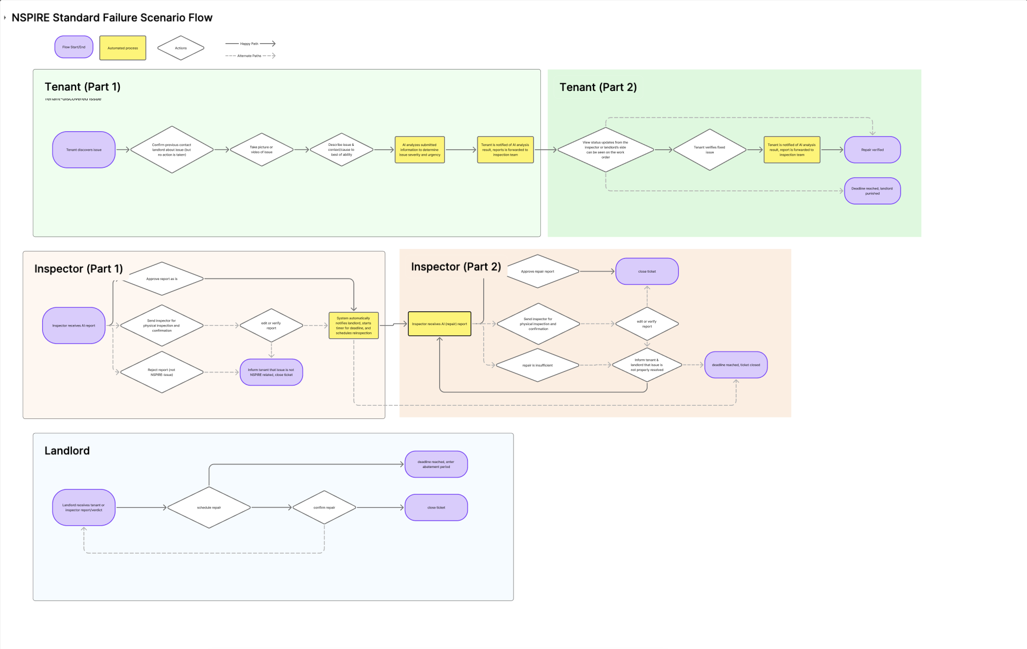
Designing the AI Layer
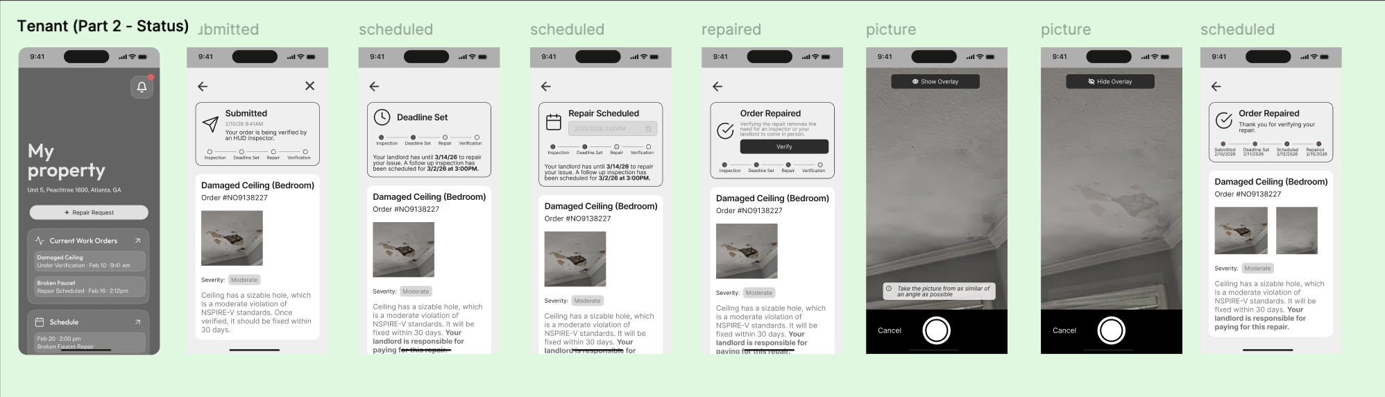
AI wasn't a feature, it was an architectural decision. I defined three core AI functions: a Documentation Assistant that guides photo capture with real-time angle and lighting feedback, a Metric Interpreter that translates regulatory language into plain terms, and a Compliance Decision Support system that predicts violations from historical patterns. The key principle: AI advises, humans decide. Every AI output is subject to inspector confirmation.
Initial Flow, v1 (before usability testing)
- 01Open app
- 02Request report
- 03Select area of house
- 04Select main category
- 05Write short description
- 06 · AIAI analyzes input
- 07 · AIAI analyzes all data
- 08 · AIAI creates inspector-ready report
- 09Accept & send to inspector + landlord
- 10Wait for resolution
Final Flow, v2 (simplified after testing)
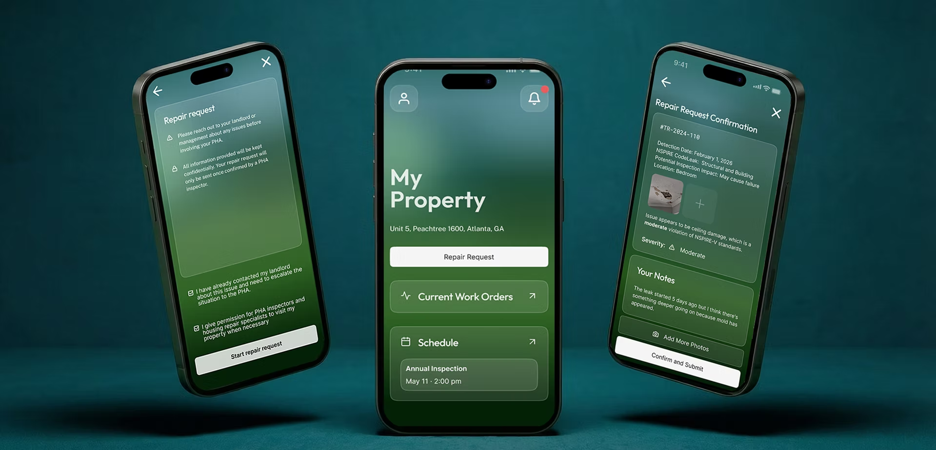
- 01Open app
- 02Request report
- 03Take photo
- 04Add notes
- 05 · AIAI analyzes photo
- 06 · AIAI generates report
- 07Accept & send
Before
"User controls, AI validates after the fact"
After, from usability testing
"AI guides in real-time, user confirms"
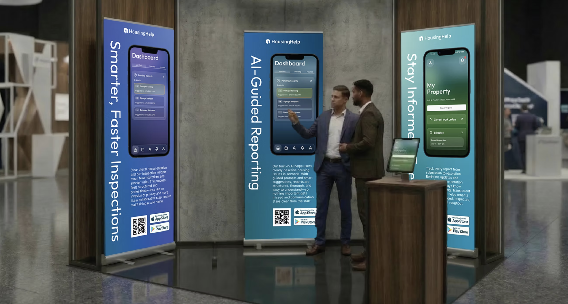
Section 05, Design System
Building for Scale and Complexity
A modular design system built from day one, before branding existed
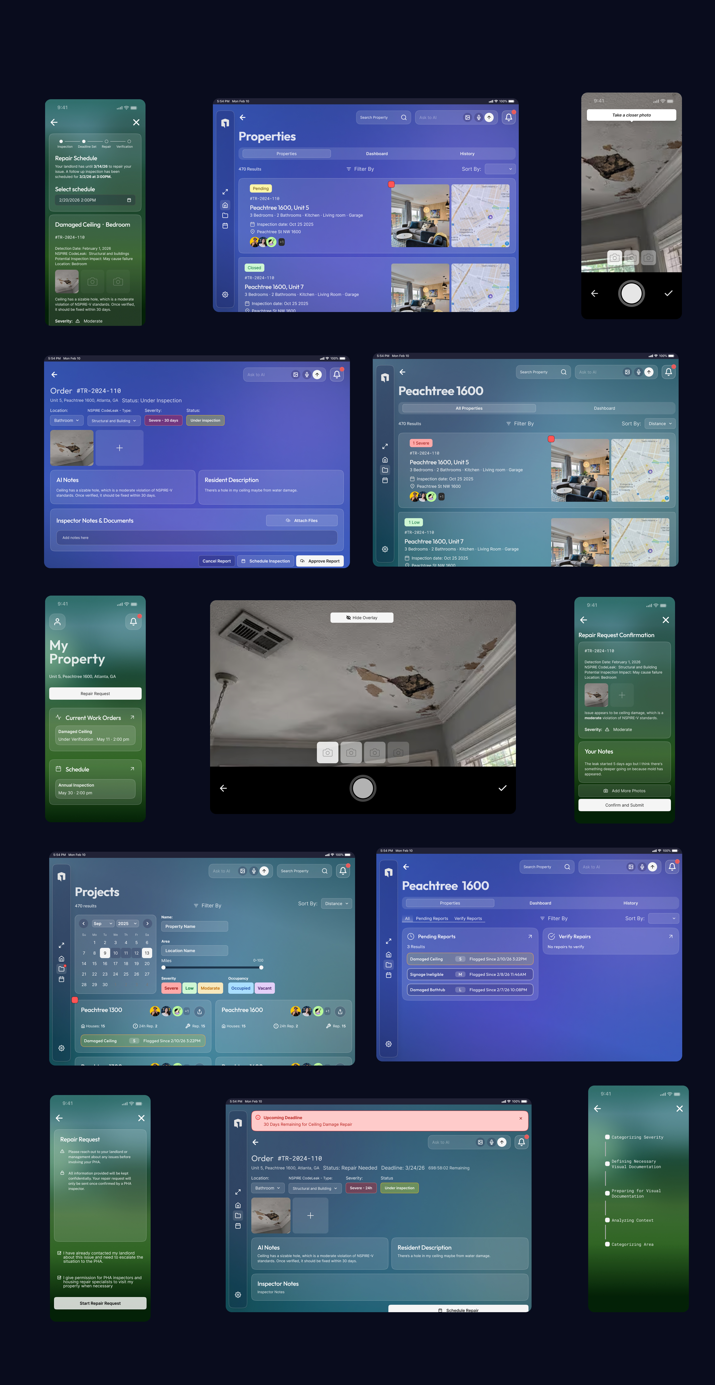
We (I and my teammate, Catelynn Kai) started the design system on the first day of the project, intentionally decoupled from final branding. This decision saved weeks of rework later. The system was architected for three user roles, a glass morphism visual language, and national-scale deployment with jurisdiction-level customization.
The Branding Crisis
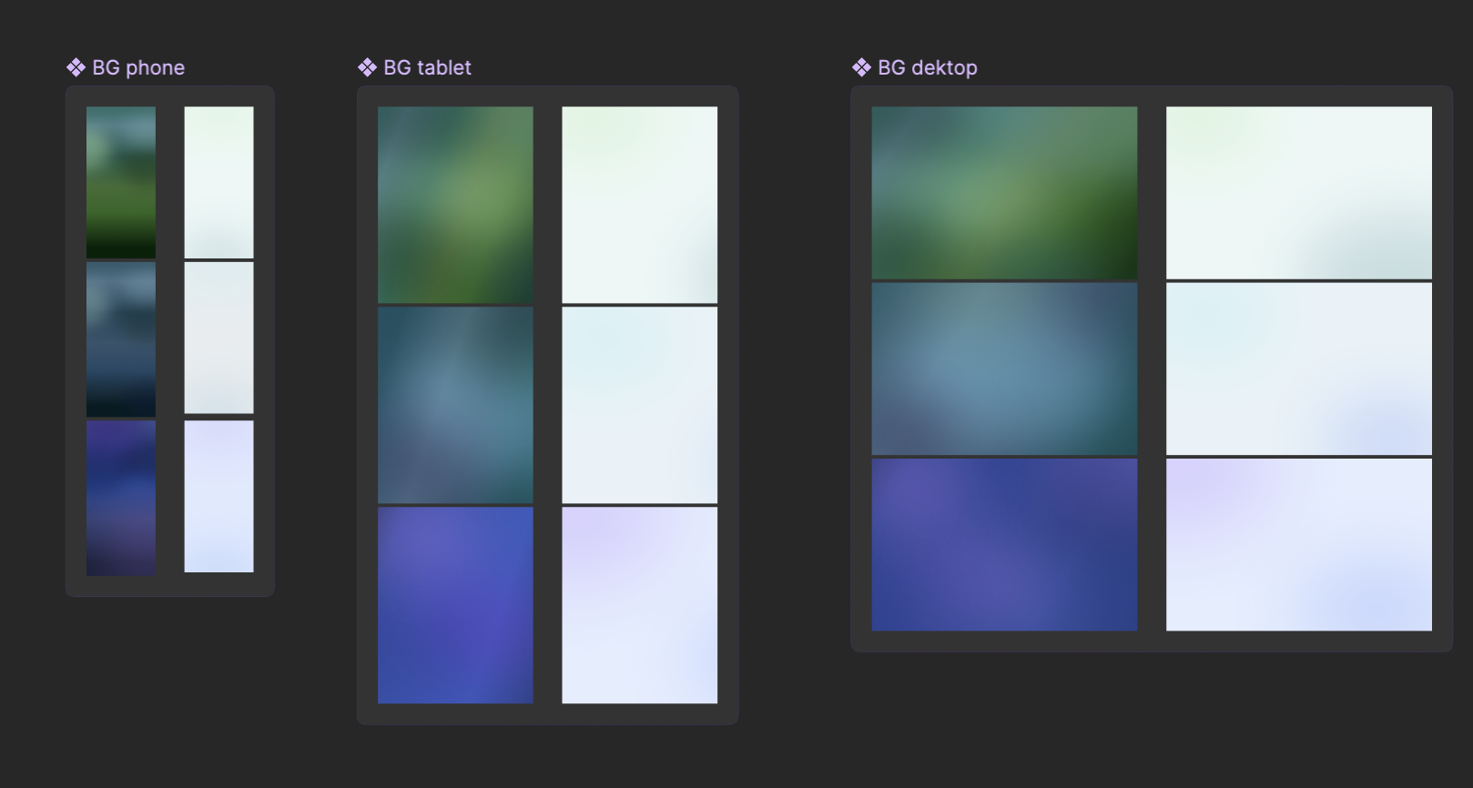
Mid-project, the branding team hit a deadlock. Stakeholders were split between a purple-turquoise palette and a green-dominant direction. No consensus was possible. I proposed a role-based color strategy: green for tenants (trust, accessibility), teal-blue for landlords (professional, compliance), and blue-purple for inspectors (authority, expertise). Same components, different color theming. The branding team adopted this framework and built the complete visual identity on top of it.
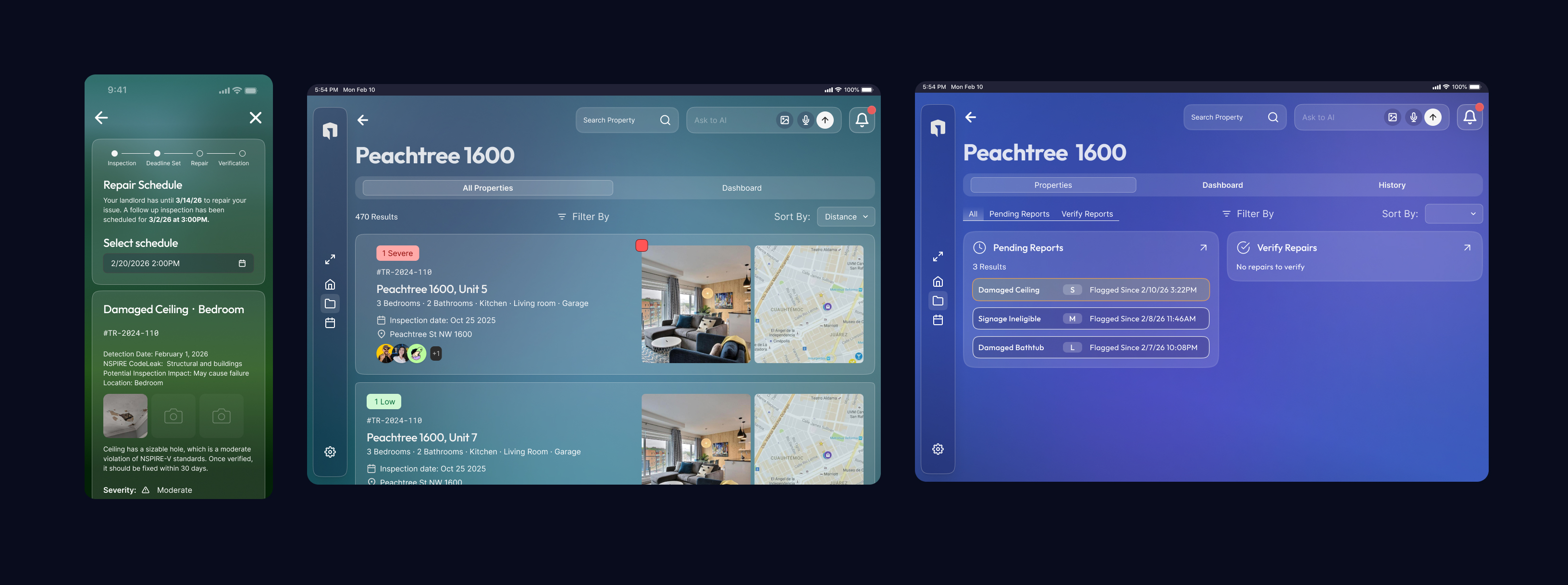
Device-First by Role
A parallel research study revealed that each role had a clear device preference: tenants reach for the phone, inspectors work on the tablet in the field, and landlords split between tablet and desktop when managing portfolios. Instead of designing every flow for every screen size, we focused our effort on each profile's dominant device, a phone-first, one-handed flow for tenants; tablet-scale photo capture and annotation for inspectors; larger-canvas portfolio management for landlords.
Why Glass Morphism
Client feedback on early flat designs was direct: "It feels soulless." I implemented a glass morphism aesthetic inspired by Apple's design language, but adapted for a compliance context, reduced blur for focus, increased font weights for readability, and semi-transparent surfaces that work across all three color profiles. Accessibility verified across every theme.
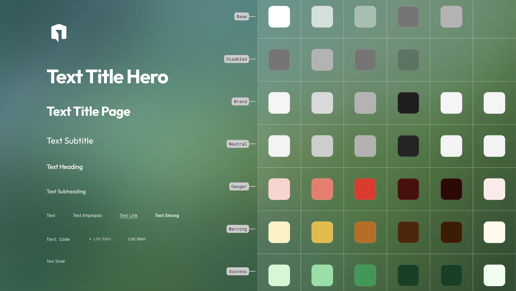
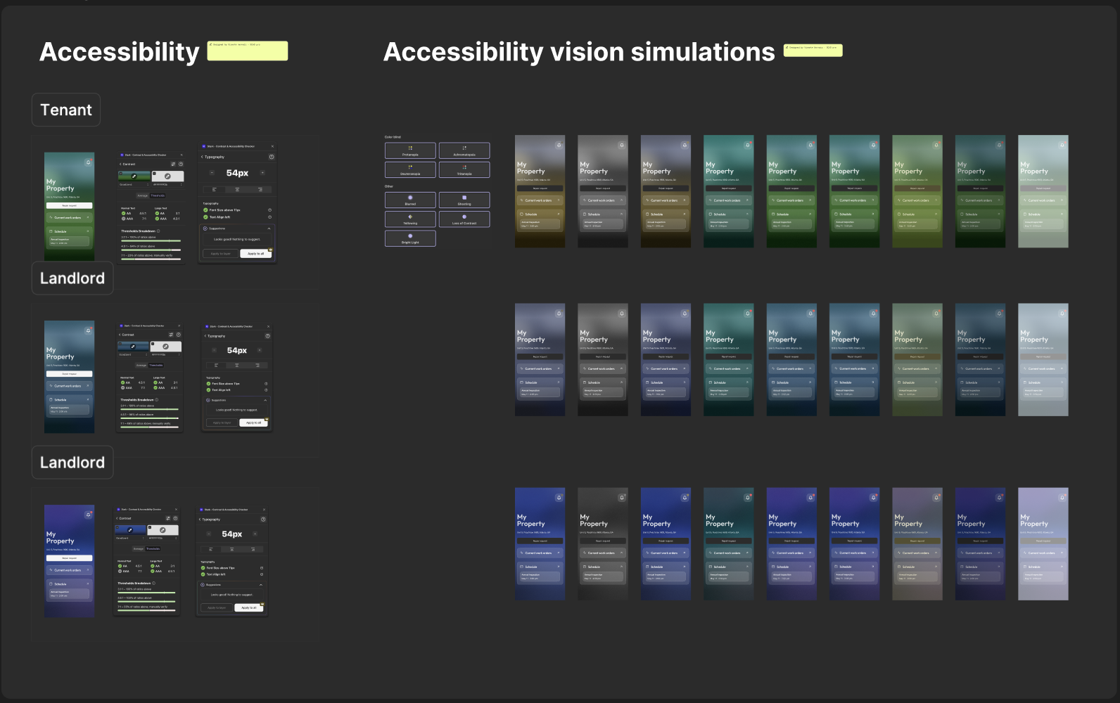
Accessibility as a Federal Requirement
Any website or digital product built for a U.S. government function must meet WCAG AAA accessibility, the strictest federal tier. We audited every color combination, verified contrast across all three role palettes, and simulated low-vision and color-blindness conditions (protanopia, deuteranopia, tritanopia) against the live UI. Every screen was validated against AAA before it shipped.
Section 06, Wireframes & Information Architecture
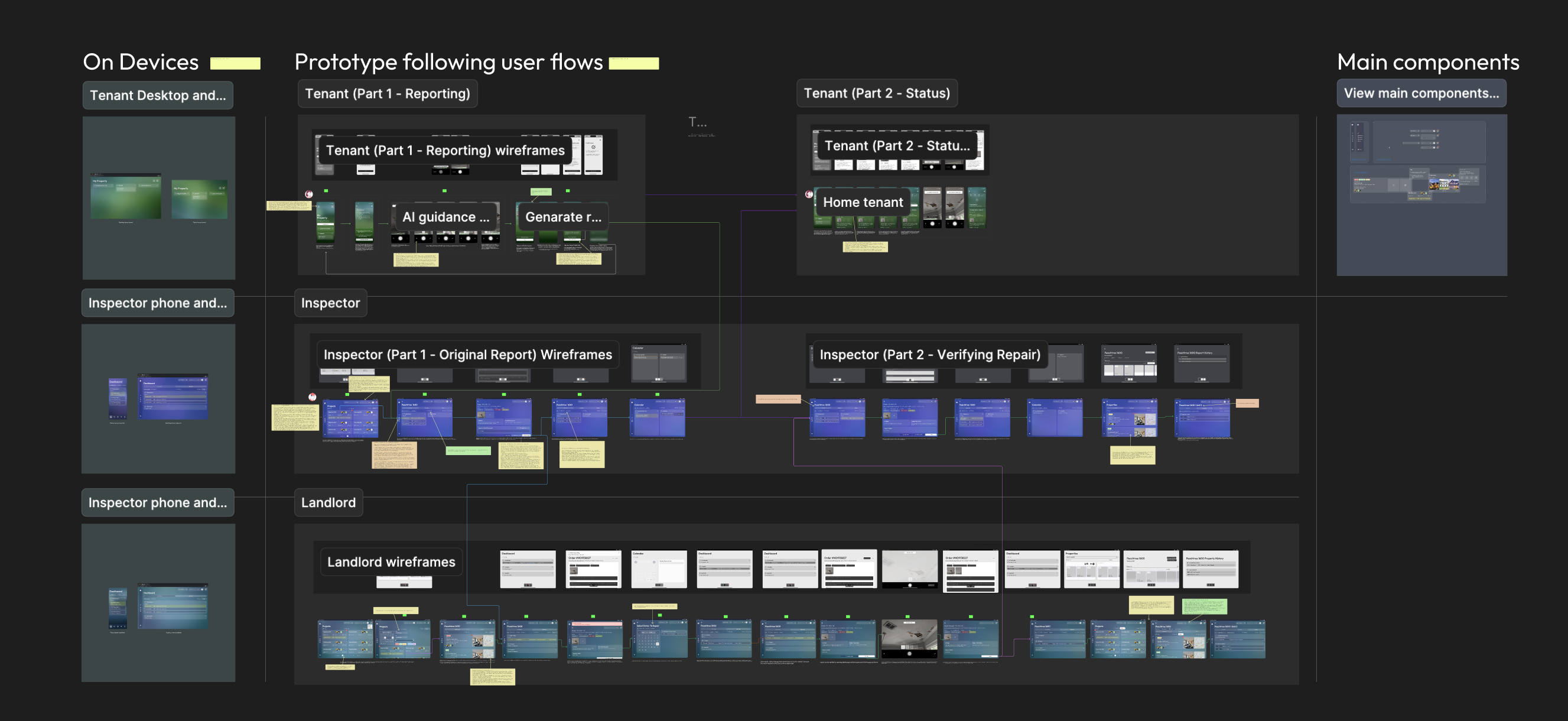
Structuring Three Experiences in One App
The app is organized into five modules: Inspection, Remediation, Role-Based Dashboards, AI Assistant Layer, and Analytics. The team designed mid-fidelity wireframes for all three user flows before committing to visual design, validating structure with Google Design experts and Deloitte stakeholders before investing in pixels.
Section 07, Usability Testing & Iteration
Testing Assumptions, Fixing What Broke
We tested mid-to-high fidelity prototypes with a mix of landlords, tenants, and limited inspector access. Three critical issues surfaced that reshaped the product.
Issue 01, AI Documentation Confusion
Users couldn't tell if the AI had what it needed
Finding: Users expected real-time feedback during photo capture. The AI felt invisible.
"I don't know if the AI is happy with the photo."
Fix: Overlaid AI guidance directly on the camera view, angle prompts, lighting checks, real-time requirement checklists.
Issue 02, Photo Visibility Gap
Captured photos disappeared with no confirmation
Finding: Captured photos disappeared into the system with no preview or confirmation.
"Where did my photo go?"
Fix: Added live preview + explicit confirmation checkpoint before submission.
Issue 03, Missing Confidence Signals
No clear signal that documentation was sufficient
Finding: Users couldn't tell if AI was assisting or if their documentation was sufficient.
Fix: Added checkmarks for approved captures, clear warnings for insufficient ones, and plain-language explanations for rejections.
Section 08, Final Design
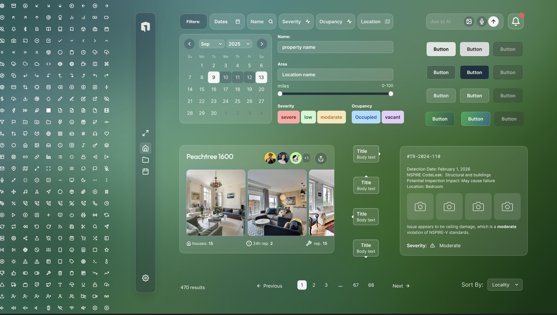
The Product
Three role-based experiences unified under one design system. Glass morphism surfaces, AI-guided workflows, and a component architecture built for national deployment.
Section 09, Brand & Marketing System
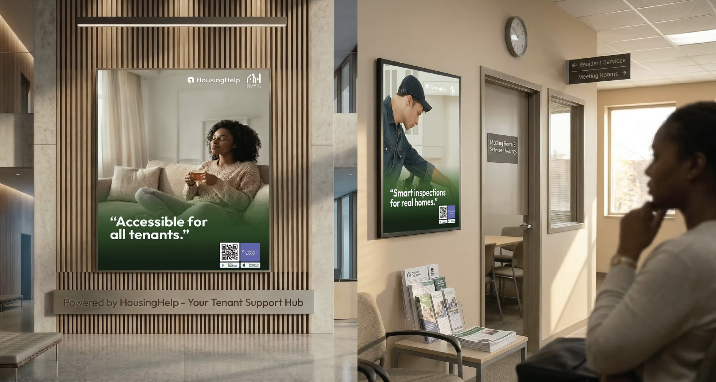
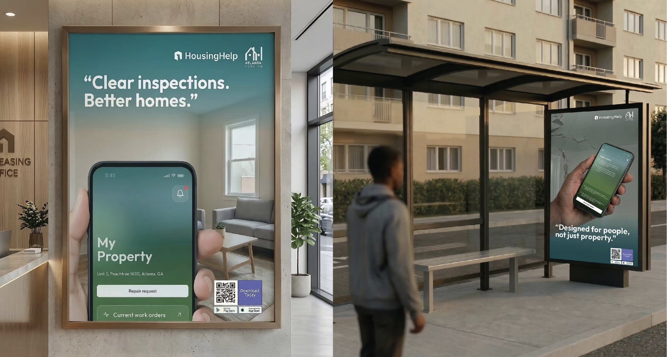
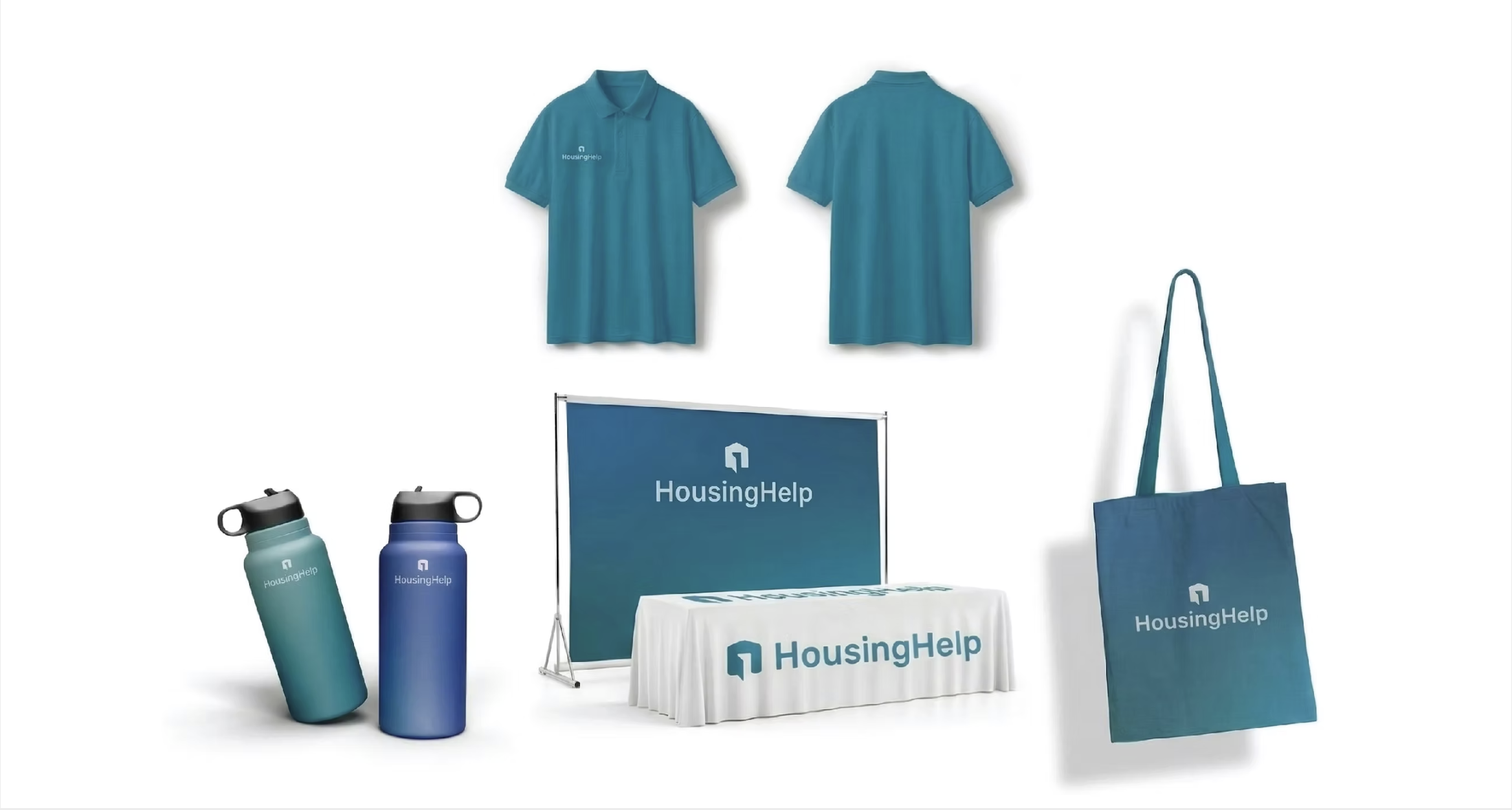
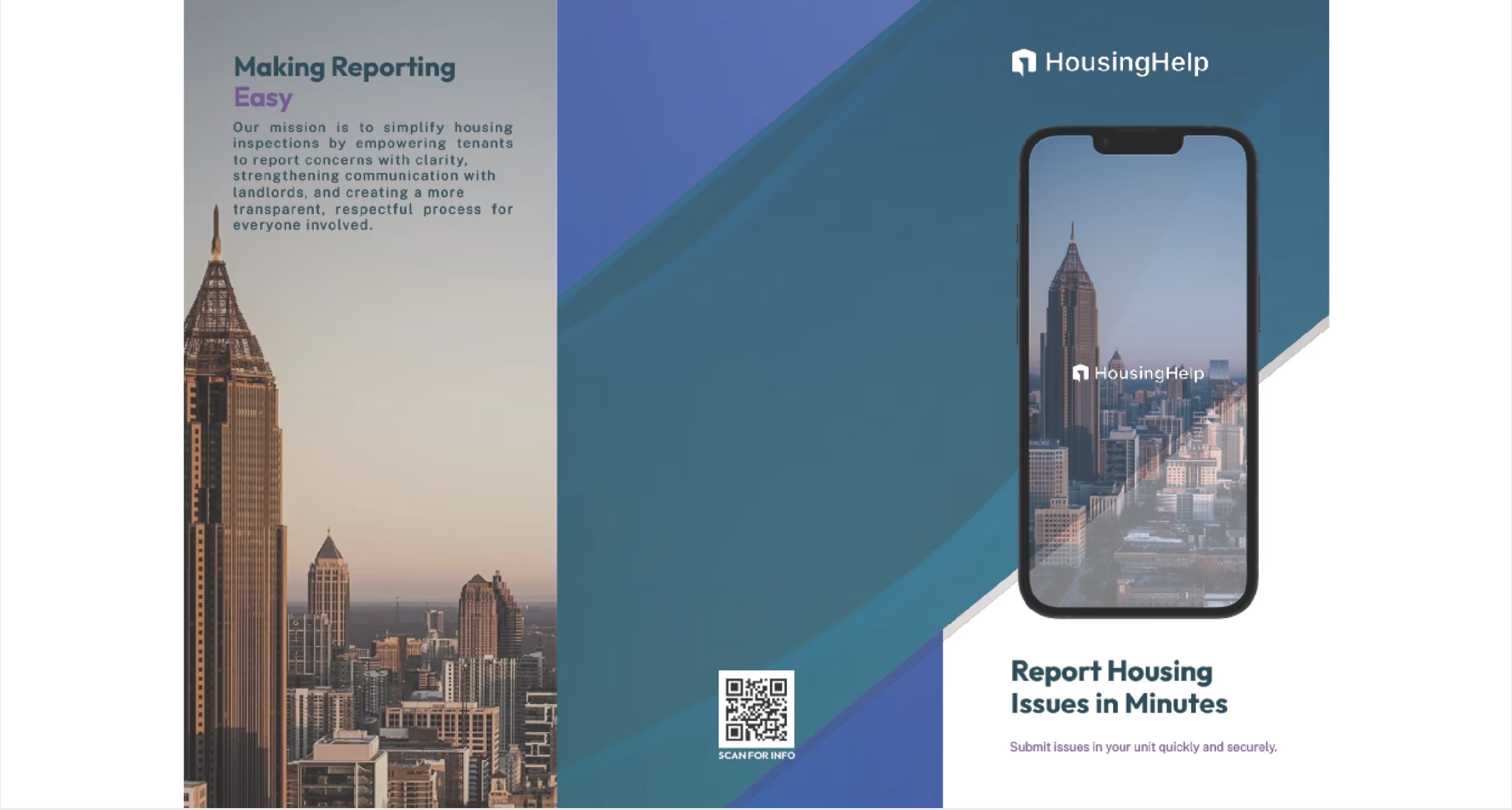
Beyond the Screen
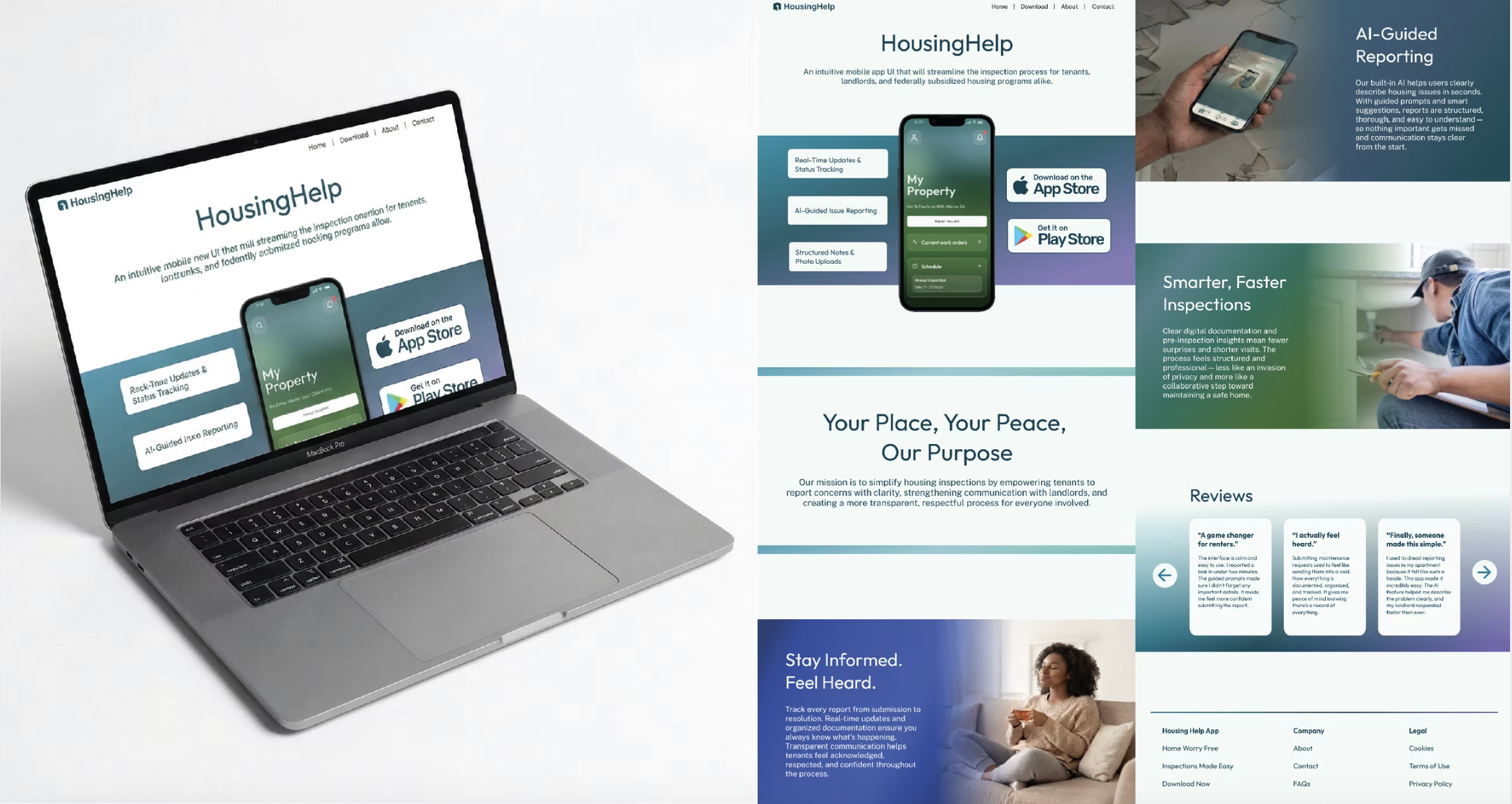
The role-based color strategy extended beyond the app into a complete brand and marketing system, convention materials, street advertising, office collateral, and promotional products. This demonstrated how a design system decision can scale from UI components to physical brand presence.
Section 10, Leadership & Stakeholder Management
Navigating Complexity
Deloitte's organizational structure meant multiple decision-making bodies with competing priorities. Scope creep from housing authorities' wish lists constantly pulled against the need for a focused MVP. I learned to navigate this by presenting design decisions as strategic trade-offs, not aesthetic preferences, which built trust and accelerated consensus.
The component structure is exceptionally well-organized. The information flow between components is intuitive for developers. This level of structure is uncommon in designer-developer handoffs.
, Deloitte Development Lead, during prototype review
Section 11, Key Learnings
What This Project Taught Me
01
Client Management at Enterprise Scale
Working with Deloitte meant navigating multiple stakeholders with competing visions. I learned that design decisions must be framed as business trade-offs to build alignment across complex organizations.
02
Cross-Team Coordination
Leading design systems work while syncing with research, branding, marketing, and operations teams taught me how to maintain system coherence when dozens of people are making parallel decisions.
03
Scalable Design Systems with High Visual Complexity
Building a modular system that supports three color profiles, glass morphism aesthetics, and jurisdiction-level customization, without breaking, was the hardest technical challenge. The key was radical modularity from day one.
04
Product Iteration Under Constraints
Limited inspector access forced creative validation strategies. I learned to maximize signal from the data available rather than waiting for ideal research conditions.
05
Usability Testing with Stakeholders and Experts
Combining expert review (Google design leads) with real user testing created a powerful feedback loop. Expert reviews caught structural issues; user testing caught experiential ones.
06
Final Client Interaction & Presentation
Delivering interactive prototypes to Deloitte executives and housing authority officials taught me how to present design work as business value, not design artifacts.
Section 12, Project Deliverables
View the Work
The complete process book and final presentation deck are available below.
Section 13, Outcomes & Impact
What Changed
Completed January – April 2026 · 15 weeks
Housing Help shipped as a validated design system and interaction model within a 15-week internship, not a product measured against live tenant or inspector traffic. Where I have a real before/after number, it's labeled measured below. Where the outcome is expert or stakeholder validation rather than a metric, it's labeled qualitative, so the distinction stays honest.
10 → 7 steps
30% fewer steps in the tenant reporting flow, and the branching photo-vs-description decision was collapsed into a single linear path.
AAA × 3 profiles
WCAG AAA contrast validated across all three role-based color themes, plus protanopia, deuteranopia, and tritanopia simulation on the live UI.
3 Google design leads
Structure and wireframes reviewed and validated by Russell Matsuo, Roque Silva, and Mike Buzzard before we invested in visual design.
1 dev-lead endorsement
"The component structure is exceptionally well-organized... this level of structure is uncommon in designer-developer handoffs," Deloitte Development Lead.
Tenant Reporting Flow — What Testing Changed
Tenants made three form selections before they could act, then hit a fork that asked them to classify their own problem.
The photo became the input: the AI now reads from the image what the form used to ask, and the fork disappeared.
The AI-guidance model went through the same measured iteration. v1 shipped as "user controls, AI validates after the fact." Testing surfaced the confusion directly, "I don't know if the AI is happy with the photo," and v2 shipped as "AI guides in real-time, user confirms." That's a validated design iteration, not a hypothesis, it changed shape because of what a real test participant said.