The VELOQUE brand is built on three values: scarcity, exclusivity, and belonging. Every visual decision, from the wordmark to the photography direction, is a direct expression of this foundation.
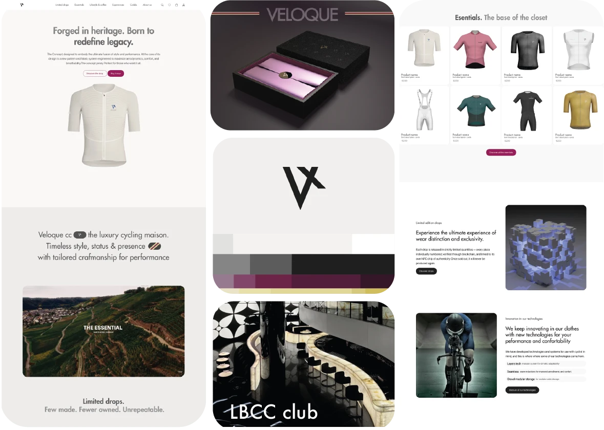
VELOQUE is a luxury cycling apparel maison, the first brand to bring the language of haute couture to the peloton. It is not a sportswear brand with premium positioning. It is a luxury brand that happens to make performance clothing for cyclists.
This distinction drives every brand decision: the choice of a confident editorial sans, the use of "drop" language borrowed from streetwear luxury, the packaging that references fashion houses rather than sports brands, and the community model that creates belonging through selective access rather than mass availability.
"The cyclist who wears VELOQUE does not want to look like a cyclist. They want to look like someone who cycles."
Brand Manifesto · 01
Naming
Why VELOQUE
Velo, French for bicycle. The language of cycling, the sport's heartland, the Parisian heritage of road racing.
Loque, French slang for a garment, a piece of clothing. Elevated in the brand context to connote couture craftsmanship rather than its colloquial origin.
The compound reads as a French word, deliberately unfamiliar but pronounceable. It is short, memorable, and trademarkable across categories. The French etymology positions the brand within the heritage of European cycling culture while the invented construction signals modernity.
VeloFrench for bicycle
+Compound construction
LoqueFrench for garment
Brand Strategy
Three strategic pillars
The brand strategy is built on three interlocking mechanics borrowed from the luxury fashion and streetwear worlds, proven models for creating desire in premium apparel markets.
I
Scarcity
Limited numbered production runs for each drop. When a colourway sells out, it does not return. Scarcity is enforced by design, not manufactured through artificial launch windows, creating genuine secondary market value and anticipation for future drops.
II
Exclusivity
Access before release is gated through the club membership. Members receive drop notifications 24 hours before the public. The blockchain closet authenticates ownership and enables verified resale, so exclusivity extends beyond the point of purchase into the garment's lifetime.
III
Belonging
VELOQUE club members are not customers, they are the brand's community. Club rides, athlete collaborations, and member-only content create identity attachment that transcends the garment. Belonging is the durable value that survives the wash cycle.
The Brand Book
Every rule, every surface.
The brand book defines the visual rules that govern VELOQUE's expression across digital, print, and physical touchpoints. From the historical reference that informs the wordmark, through the colorimetry, the patterns, the packaging system, the digital presence, and the club identity that carries the community.
01 / 09
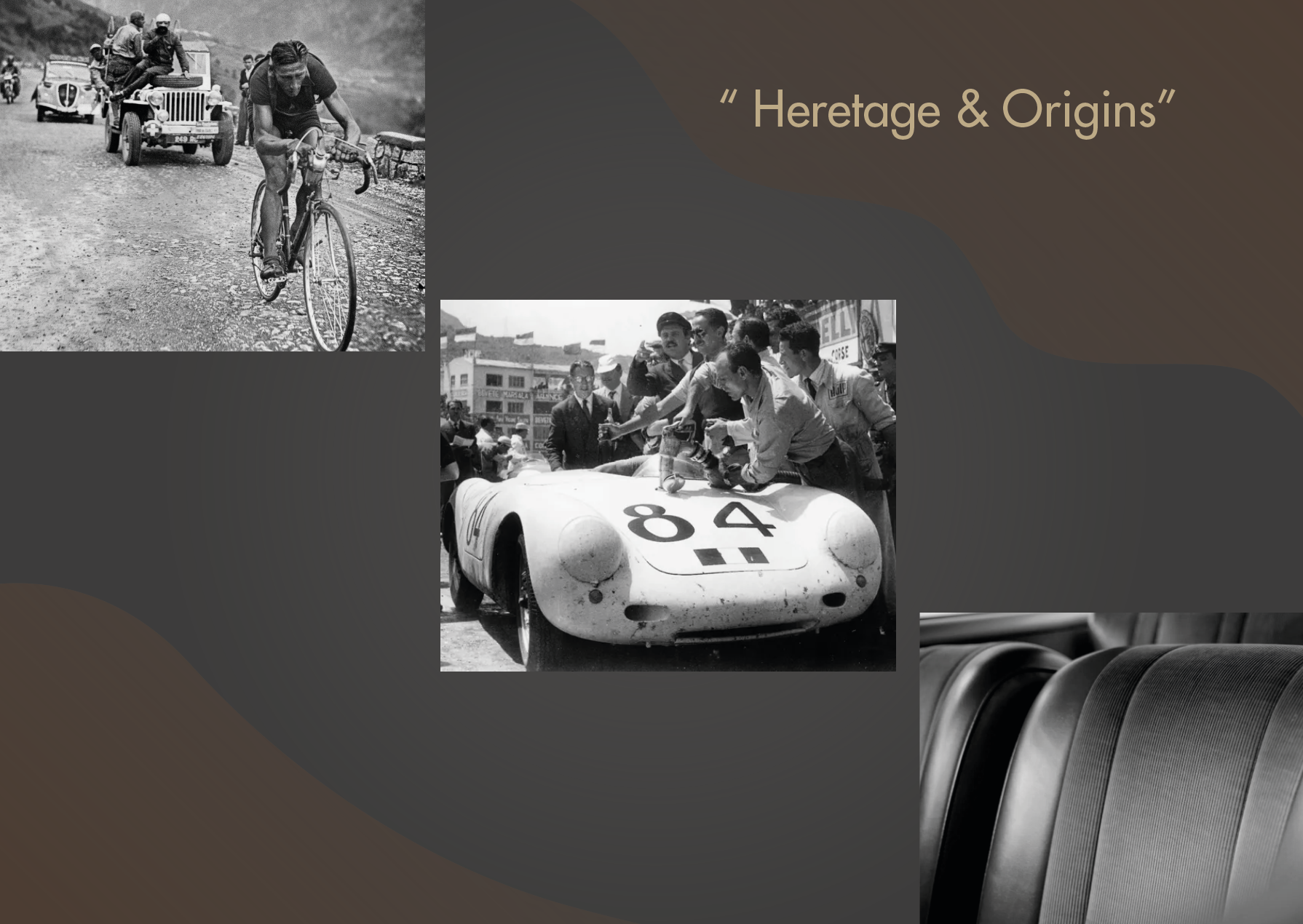
Historical reference
The visual world starts in the archive. Early-century European cycling posters, type specimens from Parisian print houses, and the editorial layouts of mid-century fashion publications. Three lineages condensed into one contemporary identity.
02 / 09
The wordmark
The primary VELOQUE wordmark anchors every brand surface. Geometric, evenly-weighted, drawn for high-contrast applications on garment labels, packaging foil-stamps, and the digital hero. Minimum size and exclusion zone are enforced across all touchpoints.
03 / 09
Three approved configurations
The wordmark has three approved configurations: the full wordmark for editorial and primary brand use, the stacked lockup with "The Luxury Cycling Maison" descriptor for institutional applications, and the monogram for garment labels and small-format applications.
04 / 09
The monogram
The V monogram condenses the maison into a single mark. It signs the inner garment label, the wax seal of the packaging, and the corner of every editorial layout. Small enough to disappear, recognisable enough to register.
05 / 09
Colorimetry
Four families make up the entire system: two neutrals, one imperial accent, and one metallic. Nothing is arbitrary, every hue is rationed to a fixed share of the palette, and every share is justified by centuries of how luxury has actually used color. Hover (or tap) each row below.
#F5F0EB / #1C1C1CNeutrals — 70%
01 — Neutrals · Off-White 45% + Void Black 25%
The restraint Chanel proved decades ago
A warm off-white and a near-black void carry 70% of every surface, so the eye rests on construction and craft, not color, the same restraint Chanel built its house code on.
Every accent below sits only against a neutral, never against another accent, the rule that keeps five hues from ever reading as loud.
#63103DBurdeos — 10%
02 — Imperial Purple · Burdeos 10%
Before it was a color, purple was a fortune
Tyrian purple came from the crushed mucus gland of the Murex sea snail, thousands of shells for one gram of pigment, once worth more than gold and reserved by Roman law for emperors.
VELOQUE rations it to 10% for the same reason: scarcity reads as imperial. It appears only on numbered drops and the club insignia, never beside the secondary green or blue.
#C9A96EMidas Gold — 12%
03 — Midas Gold · 12%
Two lineages of the same metal
Gold has signified rank since the Egyptian death mask, but cycling gave it its own myth: the maillot jaune, the Tour de France leader's jersey since 1919.
VELOQUE's gold carries both lineages, softened into straw and antique-brass tones, the only accent allowed to sit against Burdeos; everywhere else, it rests on the neutrals.
#2F4A3D / #1A1A2ESecondary — 8%
04 — Secondary · Racing Green & Deep Navy 8%
Borrowed from a century of quiet-luxury sport
A racing green, from British motorsport livery, and a deep navy, from sailing and equestrian wardrobes, sit outside the maison's three-color law, at just 8% combined.
Each is assigned to a single product line at a time and never appears alongside the other, always paired back to a neutral.
Off-White 45%Void Black 25%Midas Gold 12%Burdeos 10%Secondary 8%
White and black are VELOQUE's neutrals, together 70% of every surface (45% off-white, 25% void black), the restraint that luxury minimalism is built on. Burdeos, the imperial purple-garnet, is the rarest and historically most expensive color to reproduce, drawn once from crushed Murex sea snails and reserved by Roman law for emperors, so it is allowed only 10% of the palette. Midas Gold, referencing both ancient wealth and the Tour de France's leader jersey, takes 12%, softened into desaturated straw and khaki variants that sit quietly against it. The remaining 8% belongs to a racing green and a deep navy, secondary colors reserved for specific product lines rather than the core identity.
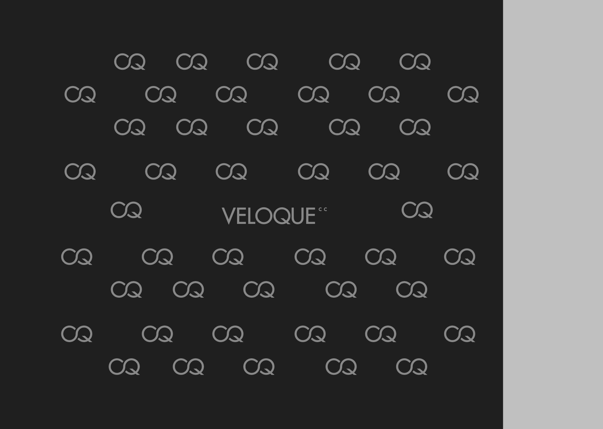
06 / 09 · Pattern system
Three patterns. One language.
Each Limited Drop receives a distinct pattern that runs across packaging interiors, the inner liner of garments, and the digital announcement campaign. The patterns are derived from the same geometric grid as the wordmark, three expressions of one underlying system.
Patterns are visual luxury. From Louis Vuitton's monogram to Gucci's GG canvas, the repeat is how a maison stays recognizable without showing a logo — which is why each VELOQUE drop carries its own.
Pattern 01Linear monogramPrimary repeat for packaging interiors and the inaugural drop liner.
Pattern 02Diagonal weaveSecondary repeat for the second drop, a denser geometric variant.
Pattern 03Editorial gridReserved for editorial moments and the brand book itself.
07 / 09
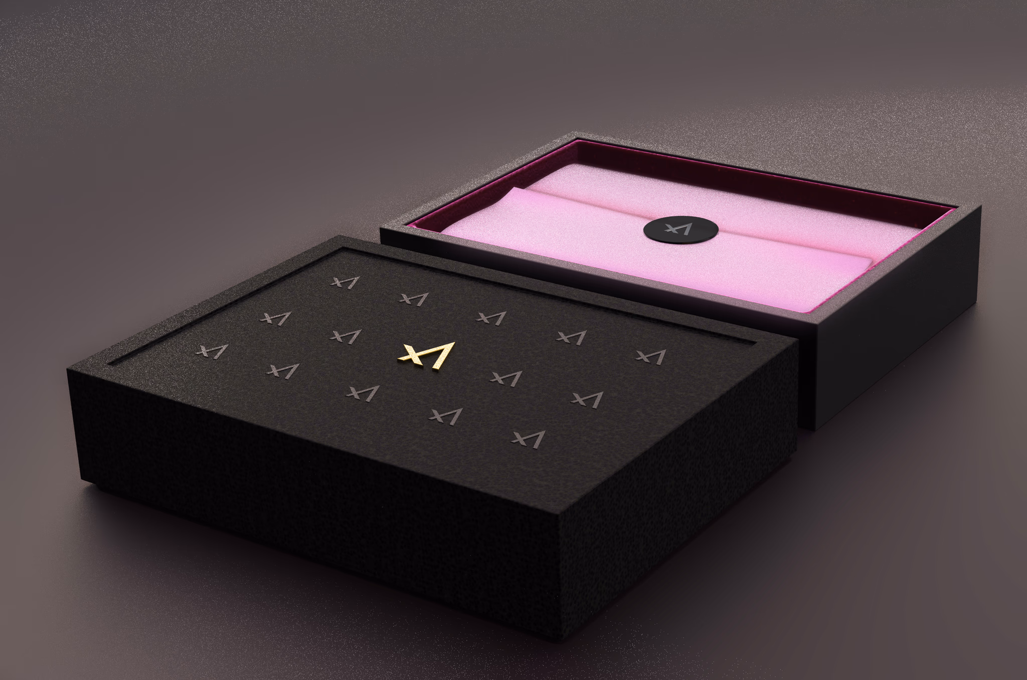
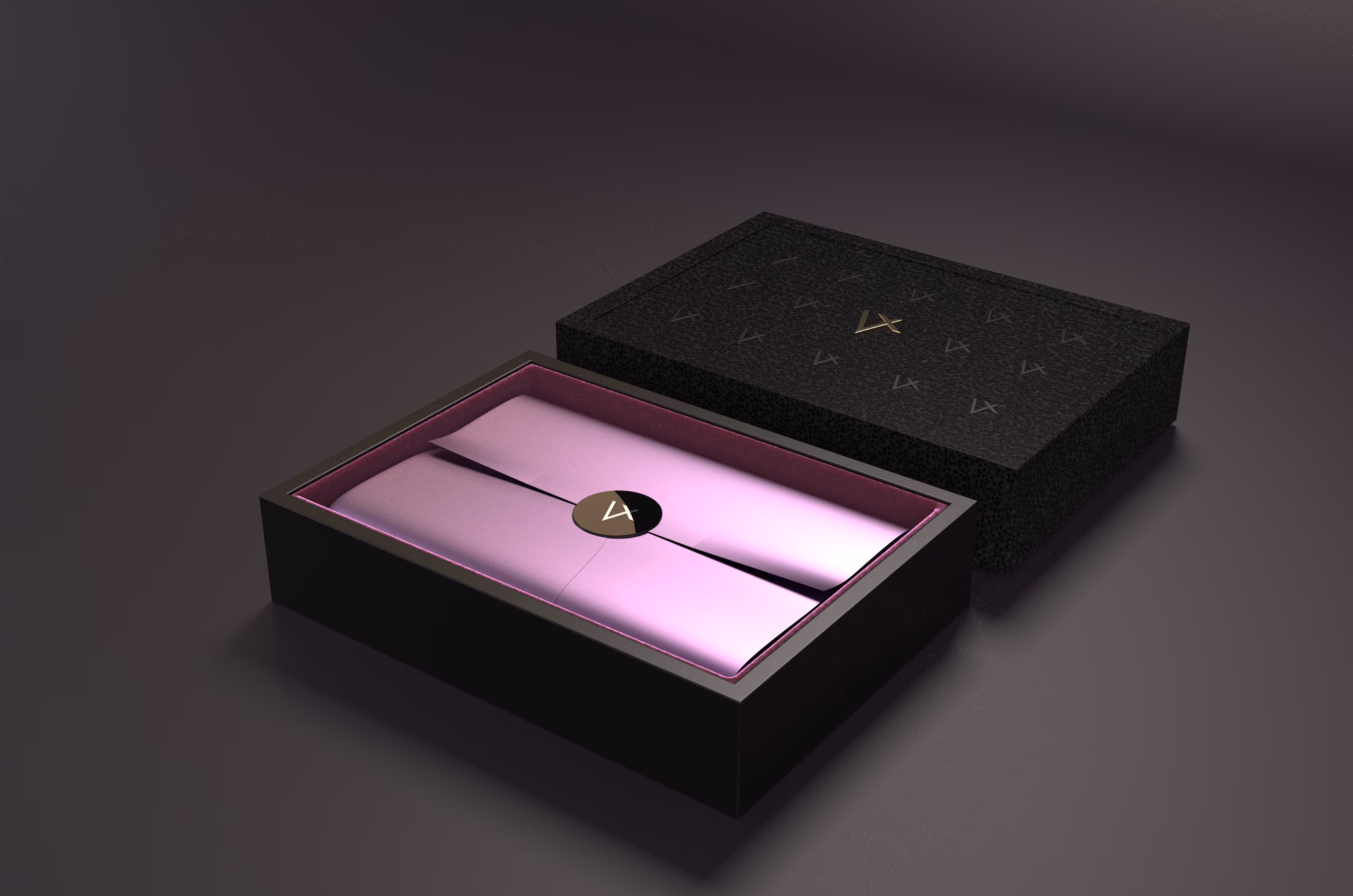
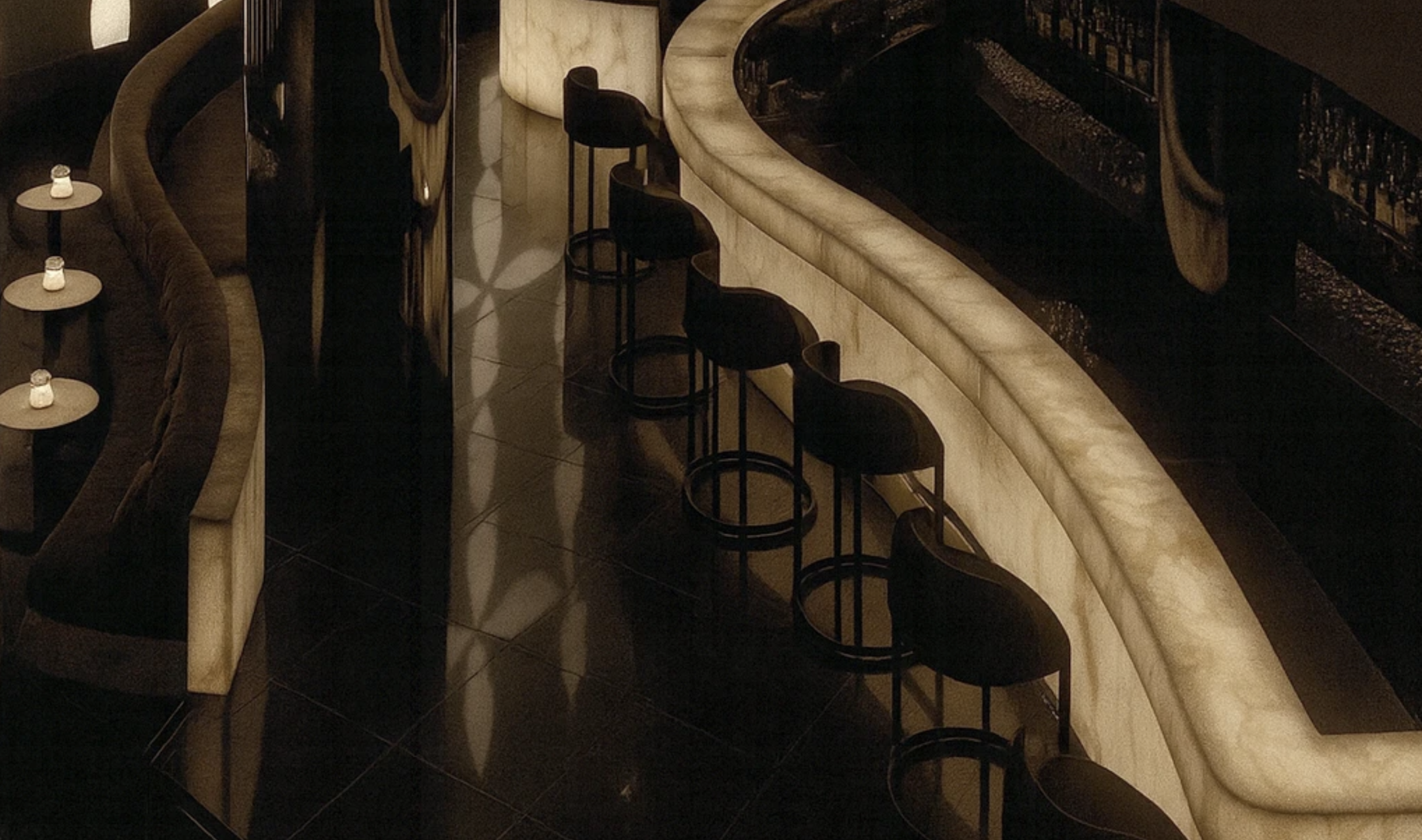
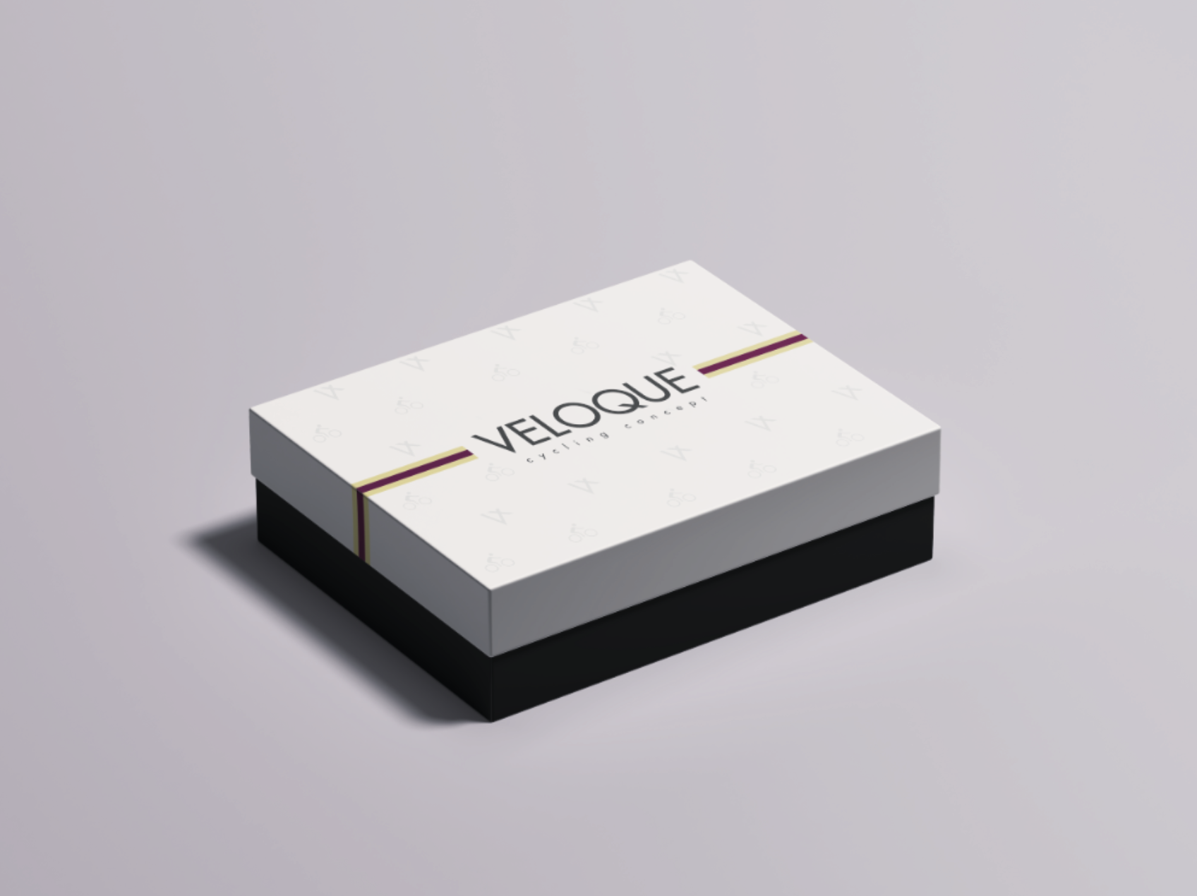
Packaging, the first contact
Matte black board, debossed wordmark, soft rice-paper interior, sealed with the V monogram. The packaging is engineered to be opened slowly. The first physical encounter with the maison is calibrated as a ritual, not a transaction.
Detail 01The boxMatte black board with the debossed wordmark, modelled in Rhino and rendered in KeyShot.
Detail 02InteriorRice-paper liner, hand-folded, embossed with the linear monogram.
Detail 03Secondary formatCompact format for accessories and single-garment shipments.
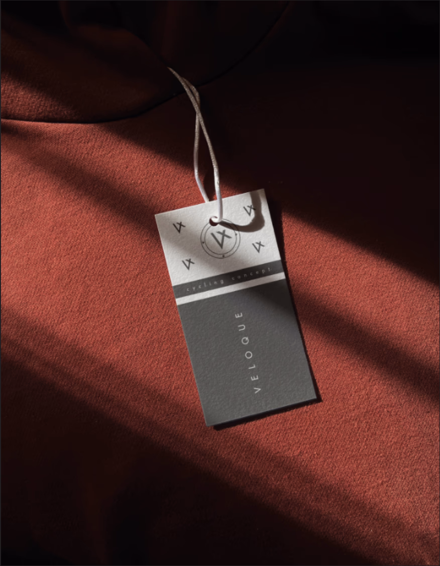
Detail 04Garment labelWoven labels carry the V monogram, drop name, colourway code, and production number. Mono type for data, the wordmark for the signature.
08 / 09 · Community
Community & LBCC.
The brand does not end at checkout. La Belle Cycling Club, LBCC, is the maison's membership layer: its own mark, a warmer visual treatment, and privileges that deepen the longer you stay inside.
The Club
La Belle Cycling Club
The Club has its own identity layer, with a member mark, exclusive communication templates, and a warmer treatment that signals insider status. It reflects the belonging pillar: human, hand-rendered, and reserved for the people inside the maison — conceived to live beyond the screen, in club spaces, rides, and rituals.
Membership tiers
Levels of belonging
Membership is earned, not bought. Every registered garment builds the member's closet and moves them up the club's tiers — and each level unlocks a deeper layer of the maison, from early access to drops, to atelier services and invitations reserved for the inner circle.
Argentum
VELOQUE
La Belle Cycling ClubNº 042
Tier 01ArgentumEntry membership — access to the club calendar and open rides.
Aurum
VELOQUE
La Belle Cycling ClubNº 017
Tier 02AurumEstablished members — early access to Limited Drops and atelier services.
Platinum
VELOQUE
La Belle Cycling ClubNº 003
Tier 03PlatinumInner circle — member-only drops, Tailor-Made program, and club journeys.
Limited drops · Tailor-Made
Access as the ultimate luxury
Limited Drops are seasonal, numbered releases — and some never reach the public store: selected drops open only to members above a given tier, turning access itself into the reward. At the very top sits the Tailor-Made program: made-to-measure garments, personal colourways, and one-of-one commissions reserved for the club's most exclusive clients.
Content & experiences
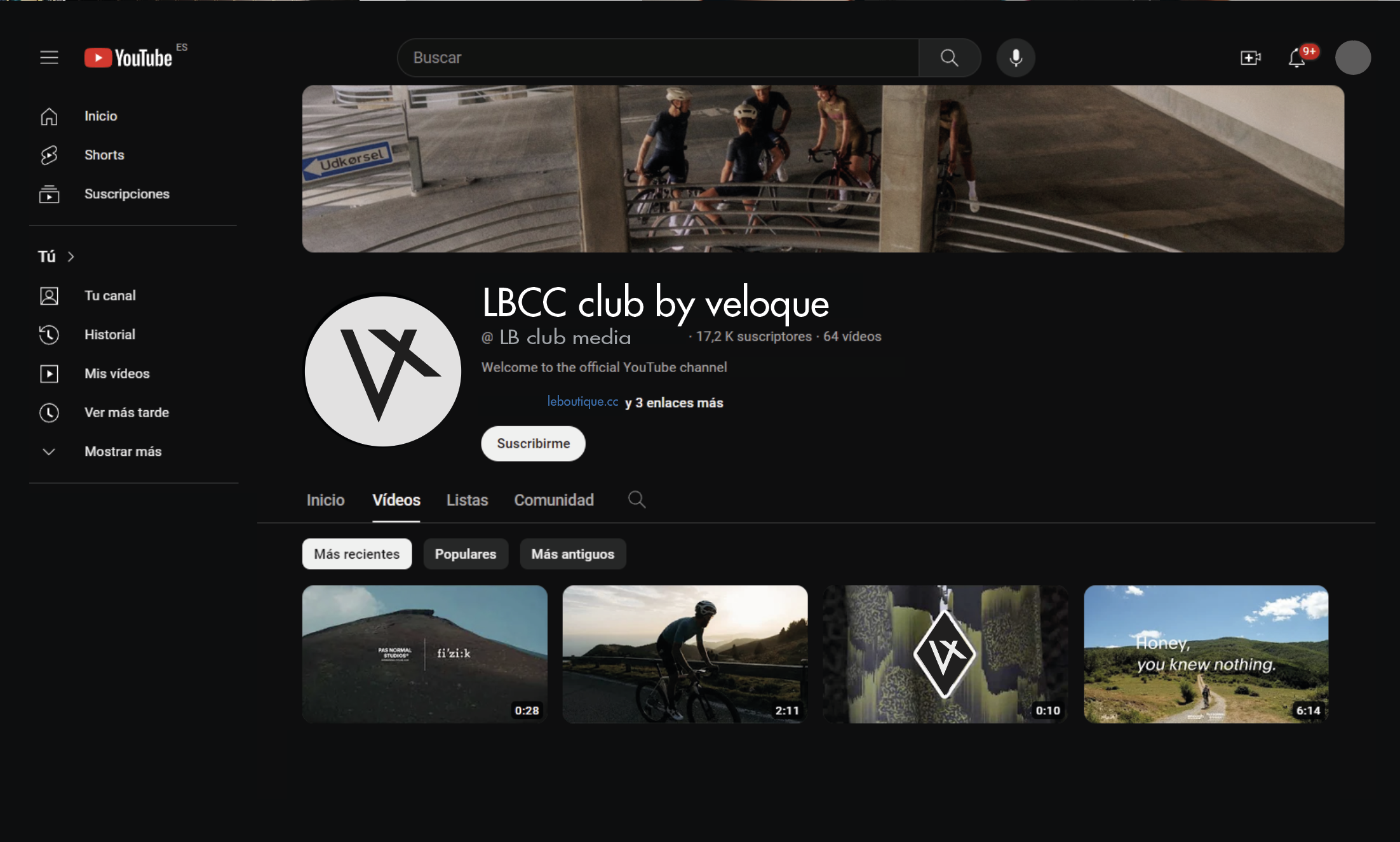
Films, events, and journeys
LBCC runs its own YouTube channel: long-form drop films, athlete portraits, and club stories framed inside the brand grid. Beyond the screen, membership means the calendar — club events, hosted rides, and special trips designed for members. The maison is something you live, not just wear.
09 / 09
In motion
A wind-tunnel film of the La Couture Blanc skinsuit. The brand identity ends where the product begins, on the body, in motion, against air. The brand book is a system; the garment is the subject.
VELOQUE
The Luxury Cycling Maison
Continue to Industrial Design
27 technical garments, material strategy, and hardware. How the maison takes physical form.