01 Introduction
From research to architecture to interface.
The UX-UI process was not a separate phase. It was the direct output of nine months of research. Every structural, visual, and interaction decision in this section traces to a finding from 25 user interviews, 50 surveys, and a competitive teardown of eleven luxury and luxury-adjacent brands. This page documents how those findings became architecture, architecture became interface, and interface became a luxury digital experience that does not look, feel, or behave like the cycling category it competes in.
02 Research Takeaways Applied to UI
What luxury does right (and where cycling brands fail).
The benchmarking phase is documented in detail in the Research chapter. What follows is the distilled output: the eight UI-actionable takeaways that shaped every decision on this page. The point of this section is not to summarise research. It is to make the through-line from external evidence to internal decision visible.
Benchmark
VELOQUE
Eight takeaways. Eight decisions.
Selling is the product, not the goal.
Apple's web experience is engineered as a product moment, not a transaction funnel. Customisation steps slow the user down by design, and that friction is what makes the purchase memorable.
A configured product page that walks the user through purpose → fabric story → fit → kit completion before the primary CTA. The checkout itself stays Shopify-native because that trust pattern is recognised; everything before checkout is editorial.
Online catalogue is brand presence, not volume retail.
LV's Shopify site uses monumental whitespace, near-zero corner radii, and soft white-to-grey gradients. It struggles when SKU volume gets too high, and navigation breaks down past a certain count.
VELOQUE applies the monumentality but solves the volume problem at the source: a deliberately small range, enforced by the Drops vs. Essentials split.
Storytelling per product, short range, high price.
Rolex, Riva, Pinarello-class brands pour disproportionate storytelling into a small range. Each product earns its own narrative.
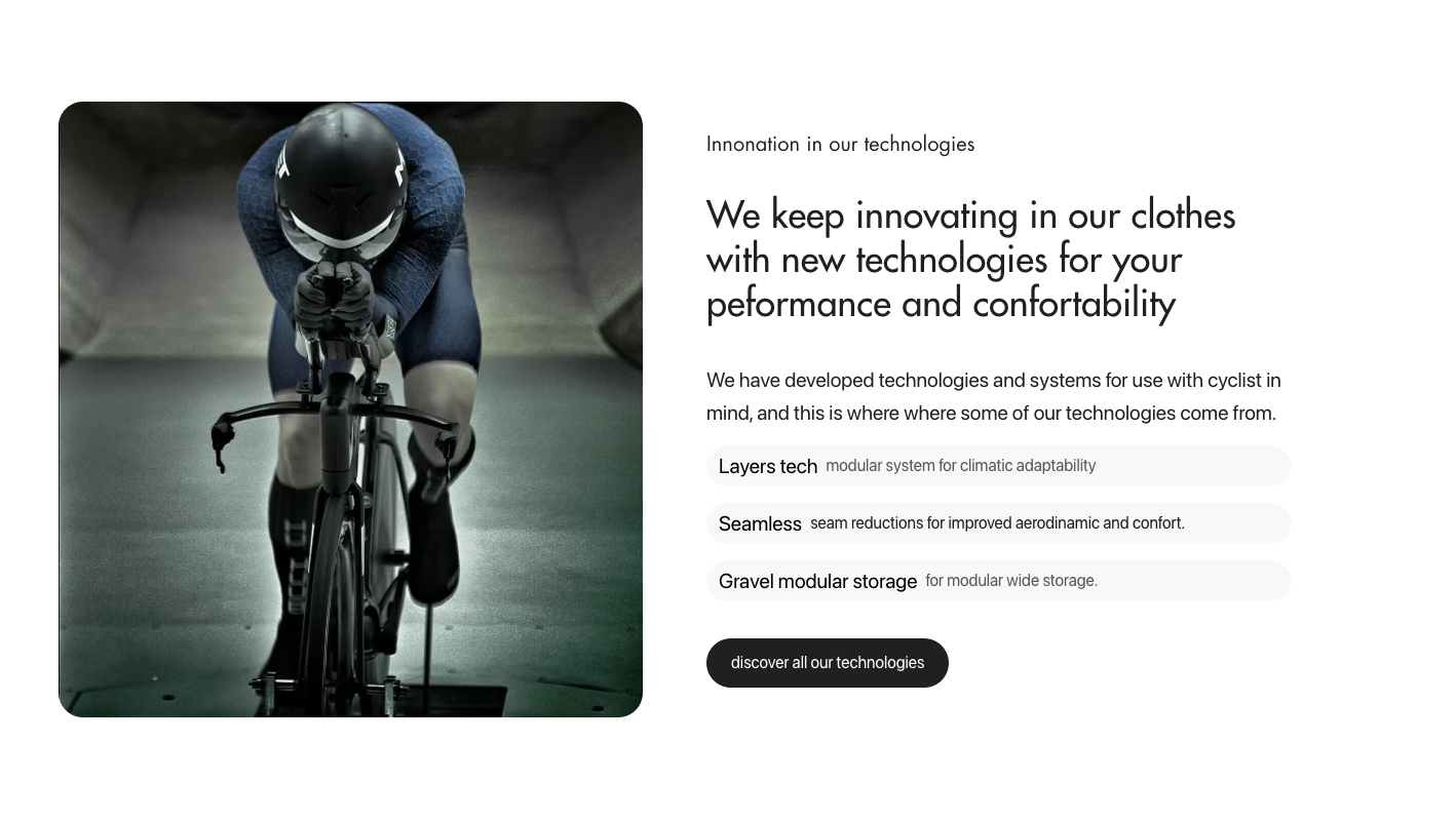
The product page is a CMS template that demands a per-product story: purpose statement, fabric origin, real-body fit, technology breakdown, not a spec sheet.
Spectacular aesthetic, broken navigation.
Tag-cloud dropdowns and unclear category labels create friction. Heavy seasonal discounting and large production volumes erode the luxury read despite the visual identity. The recent product-sitemap section on the homepage is widely loved.
Keep the editorial aesthetic, ship the homepage product-sitemap section (§09.7), and refuse category-cloud dropdowns. Navigation is SEO- and mental-model-led, not stylistic.
Cognitive overload and unclear use-case.
Storytelling imagery overwhelms product clarity. Users can't tell what each garment is for or how to combine pieces. Pricing leans aspirational without technical justification, so the brand polarises as a result.
Lead every product with the question "what is this for?" Treat kit completion as curatorial recommendation, not upsell. Never ask the user to do the combinatorial work themselves.
Strong tech, weak digital experience.
Both run on WordPress + WooCommerce. Users describe their sites as "good value, dated experience." The technology premium is undermined by the interface.
The technology section (§09.8) treats fabric and construction as a first-class story with the same editorial weight as the lookbook, closing the gap these brands leave open.
Range curation as a luxury signal.
Below a certain product count and above a certain price floor, a brand reads as luxury almost regardless of the digital interface.
Cap the visible range at 27 product models across drops and essentials. The "luxury threshold" was a deliberate output of the SEO and category research with Jorge Jiménez Rolo (§03).
Generic packaging, undifferentiated unboxing.
Even MAAP's packaging, well-designed but mass-produced, fails the luxury test on the doorstep.
Extend the experience to physical touchpoints: packaging is itself part of the product story (documented in Branding and Industrial Design).
The takeaway from a year of research is not "luxury is hard." It's that no cycling brand has fully translated luxury logic to a digital experience. That gap is the design opportunity.
03 SEO as Brand Presence
SEO as brand presence, not a traffic channel.
For VELOQUE, SEO isn't primarily about being found by strangers. It's about showing up correctly for the people already looking, and using that same research to make the site itself easier to shop. Four things had to reconcile: how the brand shows up in search, the words that guide the customer, the colours the customer is actually looking for, and a site structure and category set that matches how they already think.
3.1 Presence, not acquisition
VELOQUE's traffic strategy is brand-led, not keyword-led. Most high-intent users arrive already knowing the brand, so SEO was never going to be the acquisition engine. Its real job is presence: appearing correctly, consistently, and in the customer's own words wherever they search, which reinforces credibility before they ever land on the site. That same research doubles as the cheapest, most honest way to improve the customer experience, because it tells you exactly where today's category labels get in the customer's way.
I worked with an external SEO specialist, on a structured intent study to turn that presence into a working map of terminology, colour, and structure.
3.2 Terminology: the words that guide the customer
The study started with vocabulary, the actual words cyclists search, not the words the industry writes. Search volumes for "bib shorts" vs. "cuissard" vs. "culotte" vary by an order of magnitude across markets, and getting this wrong means the customer's own language never matches the site's.
-
01
The vocabulary cyclists actually use, which differs measurably from industry copy, so navigation labels and product titles match what the customer already types.
-
02
Competitor URL architecture and its mapping to search-intent volume, showing which category slugs convert intent into clicks and which dilute it.
SEO research is the cheapest, most honest user research you can do. Before we ran wireframe tests, we already knew what cyclists called things, and where the existing category labels were getting in their way.
3.3 Colorimetry: the colours the customer is searching for
Colour-family search clustering across men's and women's segments showed that black, navy, and camel dominate intent in the luxury cluster, while vivid colours only peak in narrow seasonal windows. We also mapped trends in range composition and seasonality, so drops launch inside the intent window instead of against it. The product range is structured around the colour families customers are demonstrably searching for, drop-specific palettes layered on top of a stable, neutral essentials core, rather than a palette chosen on instinct.
3.4 Structure: categories that match how the customer thinks
The output of all three (presence, terminology, colorimetry) was never a keyword list. It was a category map that let the site's structure mirror the customer's mental model instead of the brand's internal taxonomy. The range is organised by use-case (road / gravel / café / racing) crossed with the colour families above, collapsing what would otherwise be a long, confusing garment taxonomy into a navigable, gendered, use-led structure that improves how the customer actually shops.
3.5 The luxury threshold
That same category research surfaced a concrete structural constraint: above ~30 visible product models, the brand stops reading as luxury in the cyclist's perception (consistent with the MAAP and PNS findings in §02). VELOQUE's catalogue is capped at 27 active models, with seasonal drops rotating in and out rather than accumulating, keeping the structure itself part of the brand's luxury signal.
04 Low-Fidelity Wireframe Testing
Three variants. Ten users. One winner.
Before a single high-fidelity component was drawn, three sitemap-and-flow variants were prototyped as interactive Figma wireframes and tested with 10 moderated users drawn from the Progressive and Engaged personas. Users completed identical tasks across all three: "Find a jersey for a hot-weather gravel ride," "Buy a piece from the current limited drop," "Check what's included in the seasonal subscription."
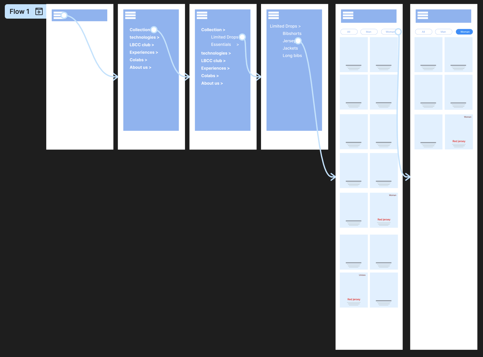
Variant A, Category-led
Single catalogue, filtered by category. The conventional Shopify pattern.
Preferred by 8/10 users
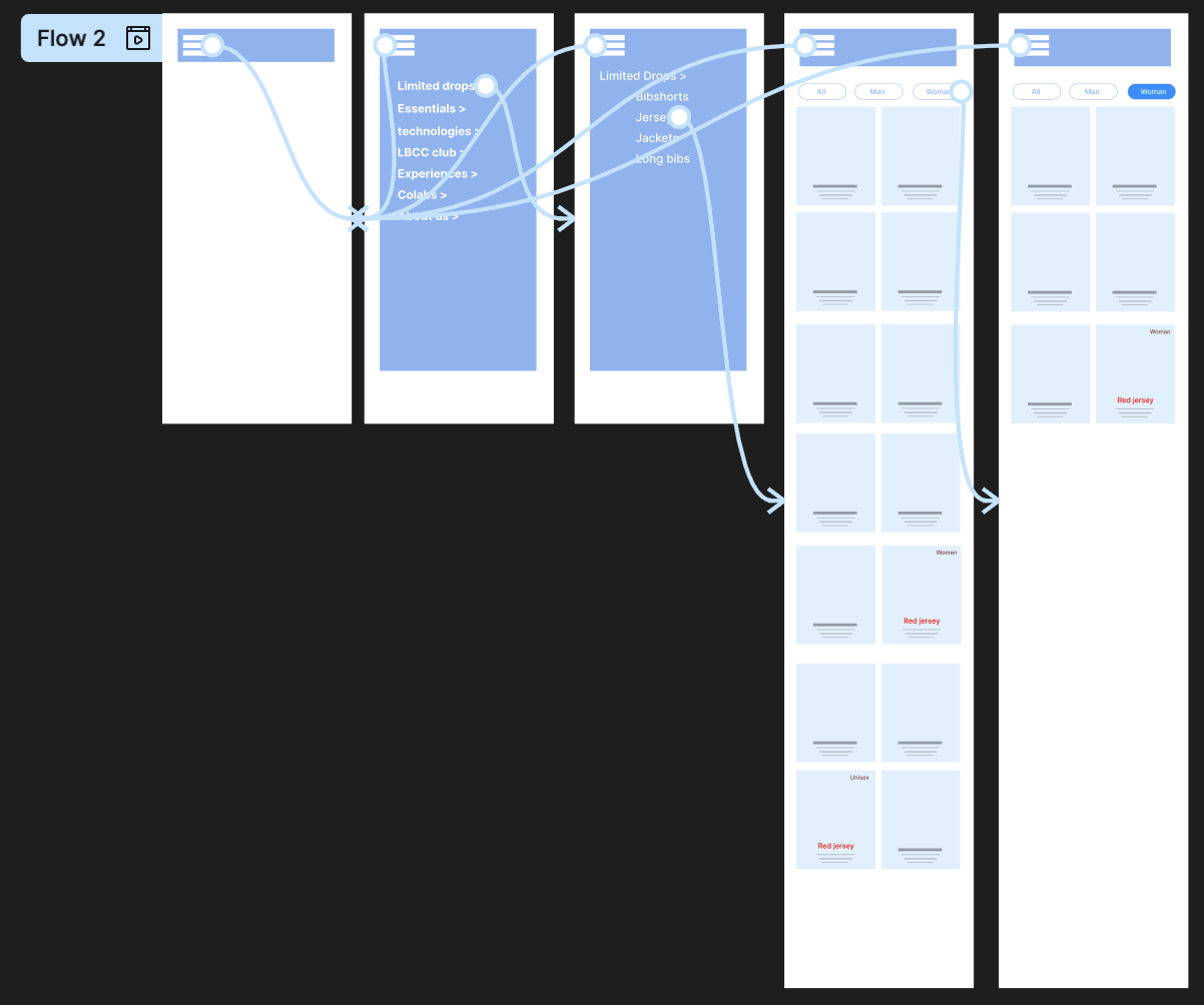
Variant B, Use-case-led
Navigation by riding context (road, gravel, café). Conceptually clean, but users overshot.
Preferred by 0 / 10
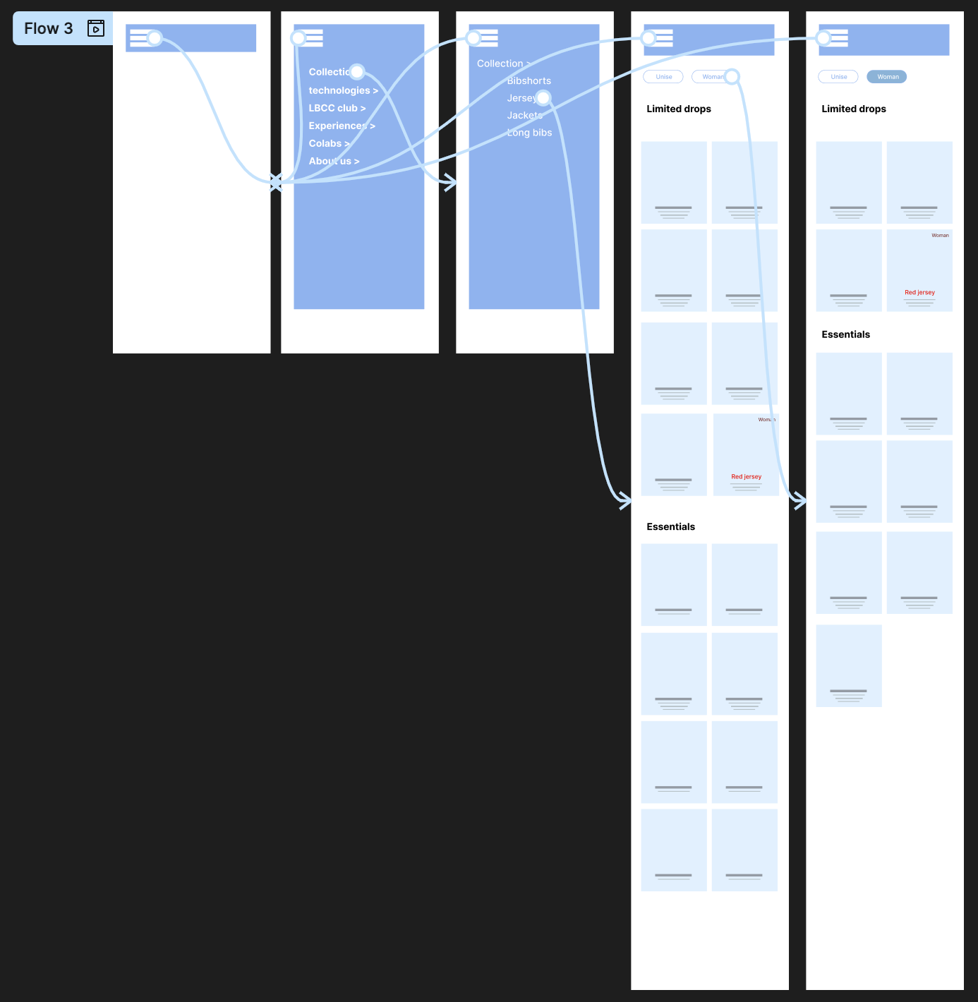
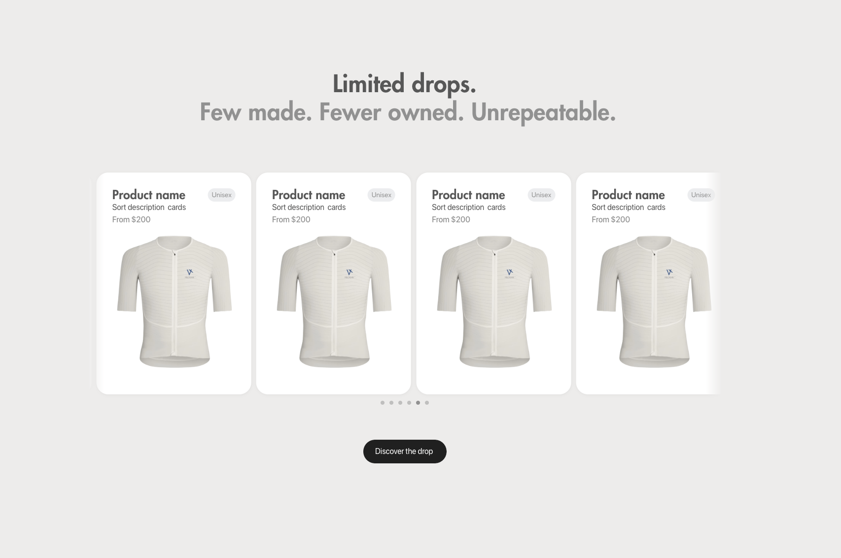
Variant C, Drops + Essentials
Top-level split between time-sensitive drops and the permanent essentials range.
Preferred by 9 / 10
Why C won.
-
01
/dropsroutes to all current limited products in a single page, filterable by category and colour but never split into sub-URLs. Drops are scarce, time-sensitive, desire-driven; subdividing them destroys the moment. -
02
/essentialsis segmented by garment type (Jersey, Bibs, Gilet, Skinsuits, Jackets, Baselayers, Accessories) with dedicated URLs for each, because essentials are compared category-by-category and SEO crawlability matters here. -
03
Filters live on the page, not as a separate step. Gender, breadcrumb, and "All [type]" links allow power users to move fast without disrupting the editorial pace for first-time visitors.
The decisive insight wasn't that users prefer drops over essentials. It was that they want the brand to acknowledge what kind of shopping moment they are in before showing them products.
05 Final Sitemap
The architecture, after testing.
Click any branch to expand. Hover a node to see why it exists. Home sits directly off the root, a level shallower than every other section, because it is the entry point, not a category. Everything else, the shopping moments, the club, the account, is indented one step to the right of home, and each sub-level indents further still, so depth in the tree always reads as depth in the site.
VELOQUE.COM
-
/ home Editorial entry with current drop, brand voice, range overview
- active drop highlightFirst viewport, scarcity is signalled, not screamed
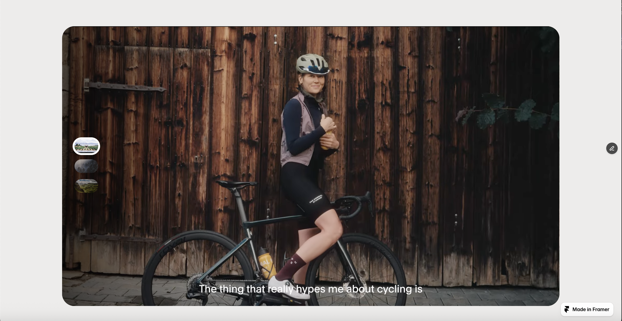
- storytelling videoBrand promise, visual evidence
- visual product mapHomepage sitemap moment that collapses the catalogue
- "Café Culture" conceptLifestyle anchor, non-product editorial
- essentials entry pointPermanent range, quiet, not headline
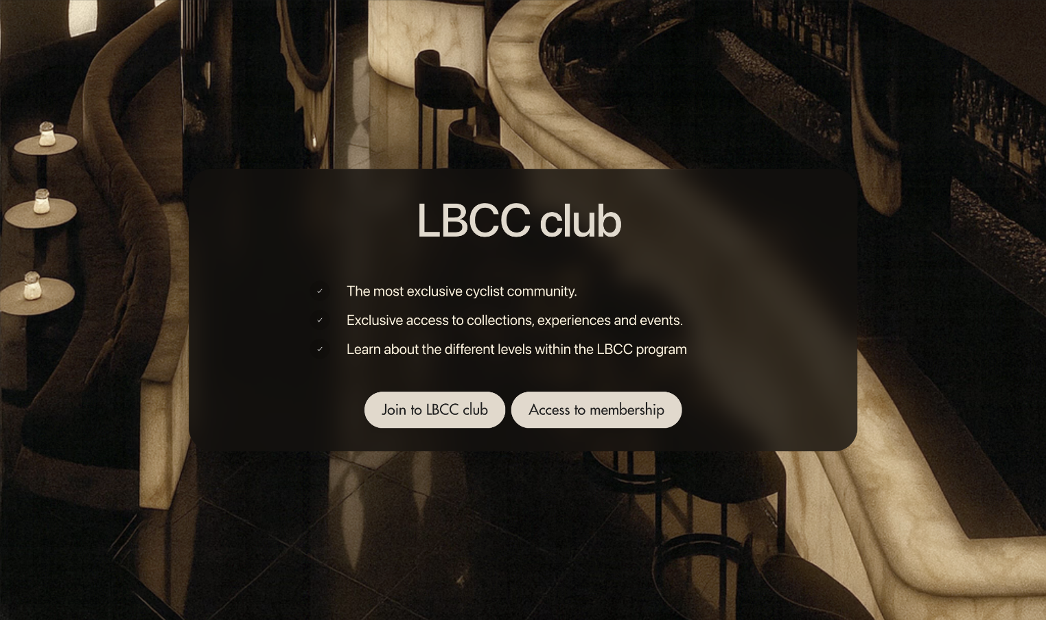
- community / club signalLBCC membership, belonging as durable value
-
/ drops Limited, time-sensitive, single page, filterable
- current drop · filterable by category & colourNever split into sub-URLs, preserves the moment
- archive · past dropsShown only if stock remains
- filters · gender, category, colourOn-page, not a separate step, keeps the desire-driven pace
-
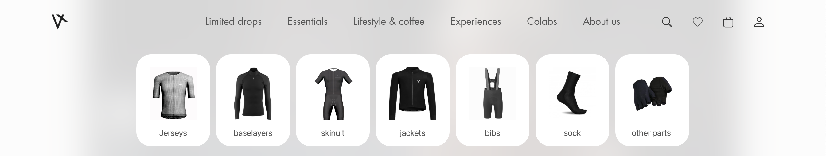
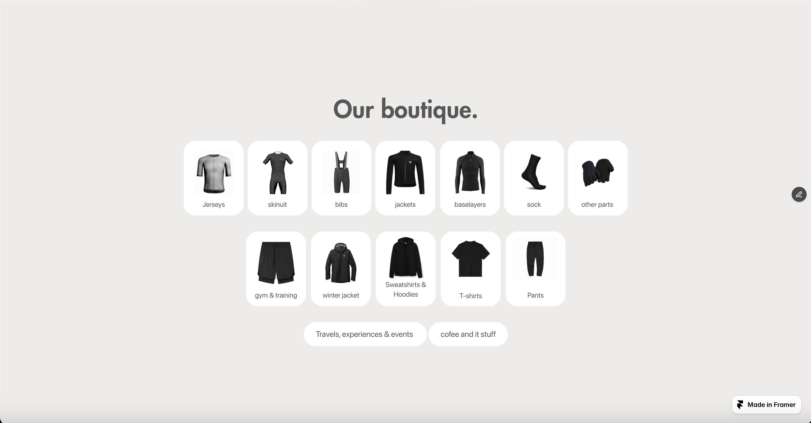
/ essentials Permanent range, garment-typed URLs for SEO
- /jersey
- /bibs
- /gilet
- /skinsuits
- /jackets
- /baselayers
- /triathlonTrisuits & tri-specific kit for the adjacent endurance audience
- /accessories
- /all-essentialsPower-user convenience, one place, every essential
- filters · gender, garment type, colourSame on-page pattern as /drops, category-by-category comparison
-
/ off-bike Lifestyle range, café culture extended off the bike
- /apparelTees, polos, sweatshirts, jersey DNA off the bike
- /outerwearOvershirts, knits, lifestyle jackets
- /accessoriesCaps, leather goods, café-culture pieces
- /all-off-bikeOne-screen view of the full lifestyle range
-
/ product / [slug] CMS template, identical structure per SKU
- hero + Drop / Essentials label
- purpose statement"What is this for?", the PNS counter-pattern
- technology & specs · progressive disclosure
- real-body fit guide
- material story
- complete the kit · cross-sellCuratorial recommendation, not upsell
- community / social proof
-
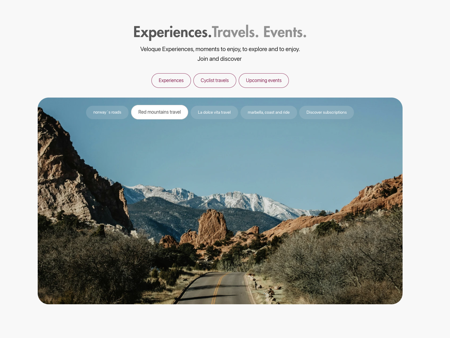
/ experiences Anti-discounting strategy, loyalty rewarded with access
- /exclusive-travelsCurated cycling travel, booked like a boutique agency package
- /veloque-eventsBrand activations, openings, demo days
- /ridesGroup rides, local & destination
- /cafe-ridesBookable café-ride product, the purchasable half of Café Culture
-
/ the-cafe-culture Lifestyle / community editorial
-
/ club · LBCC Club Landing page for the exclusivity layer; events live under /experiences, not here
- /my-lbccPersonal member area, deep-links into the authenticated account
- /levelsPublic membership tiers page, no login required
-
/ support Help, returns, contact
-
/ account Non-indexable, built on Next.js + Vercel (React)
- /profile
- /lbcc-status
- /closet · blockchain-tracked ownershipPhase 3, provenance, resale, LBCC progression
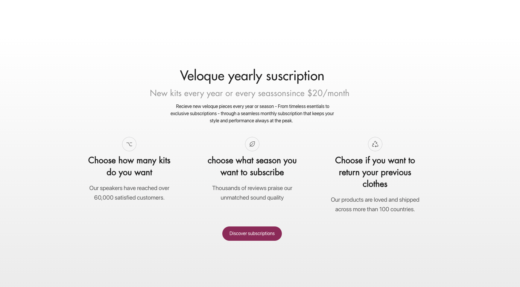
- /subscription
06 Fast Prototype
Validating storytelling before pixel polish.
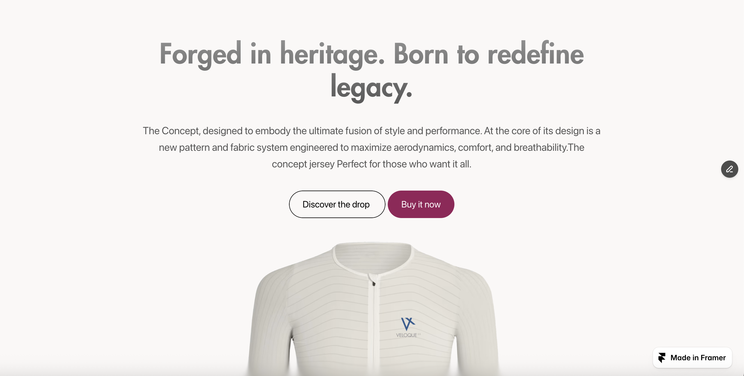
Once the sitemap was validated, the homepage flow was rebuilt in Framer as a fast-prototype, interactive, scrollable, and shareable as a public URL, before committing to the design system. The objective was fast validation of brand storytelling and scroll rhythm with internal stakeholders and a small group of cyclists, not pixel polish.
The scroll length is intentionally long. A luxury experience should build a mental model section-by-section, not compress it into a single viewport, and the prototype confirmed that users would scroll the full page if each section delivered a distinct, relevant payload.
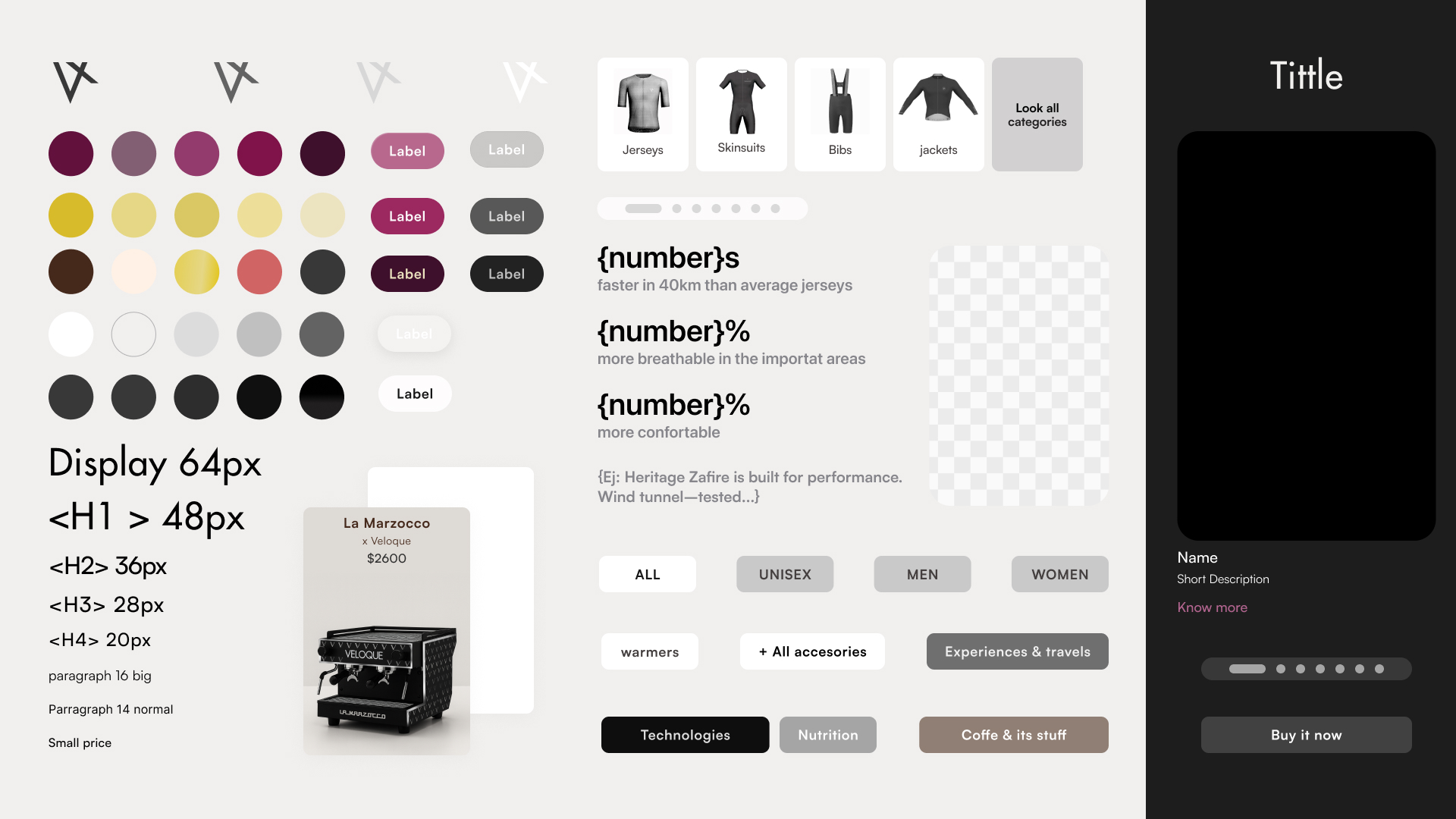
07 Design System
Modern luxury, not monumental sterility.
The design system reconciles two requirements that usually pull against each other: modernity (which leans soft, friendly, web-native) and luxury (which leans monumental, dense, traditional). The system commits to five explicit principles.