The objective was to assess the viability of the niche and identify what makes a luxury brand, what cyclists expect, and how they expect to purchase and interact.
Long-form research runs across luxury and cycling market data, growth reports, and competitor landscapes.
Claude Cowork
Collaborative synthesis
Working sessions to cluster findings, pressure-test hypotheses, and turn raw notes into research takeaways.
Claude Code · AI agent team
Agentic analysis & documentation
A multi-agent pipeline structured interview transcripts, survey data, and competitive research, cross-referencing everything into one corpus.
Figma
Research synthesis
Empathy maps, persona boards, and the FigJam user-flow diagrams that structured every research session.
Typeform
Screeners & surveys
Long-form questionnaires for cyclist personas: riding habits, spend patterns, and brand perception.
Google Forms
Quick-turn surveys
Lightweight polls distributed through cycling groups for fast, broad signal on early hypotheses.
Market Analysis
The Rising of Luxury and Cycling Markets
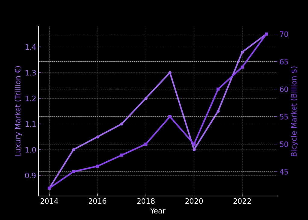
We identified a strategic opportunity at the intersection of the luxury market and cycling through deep research in ChatGPT and NotebookLM. The overall luxury market grew from roughly €1.0 trillion in 2014 to €1.5 trillion in 2023 (Bain–Altagamma), while the global bicycle market grew from about $26 billion to $62 billion in the same period — including a +42% surge in 2020, when luxury dipped and cycling boomed. Two growth curves that reveal how cycling is evolving from a sport to a symbol of status, style, and well-being.
7.5%Annual luxury market growth
8.1%Annual cycling market growth
0True luxury cycling maisons
Market Research
Two growing markets, one unserved intersection
Both the luxury and cycling sectors are on parallel growth trajectories. The overlap, a luxury brand built specifically for cyclists, remains an open white space with no dominant player.
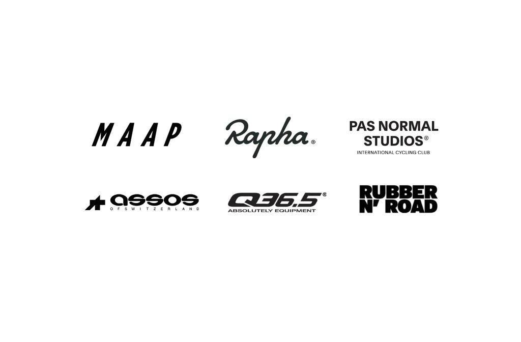
We analysed the leading brands in the sector: MAAP, Pas Normal Studios, Assos, Q36.5, Rapha, and Rubber N' Road NYC. While they stand out for their visual identity, their websites are confusing and display too many options, leading to user frustration.
"I don't understand the difference between one jersey and another," said in a moderate usability test.
The common failure pattern across all competitors: aesthetic ambition without UX rigour. Premium pricing paired with confusing information architecture destroys the luxury experience before the product is even seen.
What makes a curated web experience
During research we mapped the elements that turn a website into a curated experience, closer to a product than a sales floor. Three reference categories from outside cycling shaped our standard.
Reference I
Apple
A premium-tech web that performs as a product experience, not a sales pipeline. Many users feel that even reaching checkout is hard, and that resistance is part of the desirability. The buying process is memorable, individualised per product, and offers deep customisation along the way.
Reference II
Louis Vuitton + traditional luxury
Built on Shopify. Online sales aren't the core: the site reads as brand presence and catalogue. Strains under high product volume and deep internal navigation. Monumental UI: white background, soft white-to-grey gradients, no border-radius. Gucci, Hermès and other heritage houses follow the same pattern, varying only by inventory size.
Reference III
Automotive & Performance Luxury
Luxury automotive brands invest in individual model storytelling, much shorter ranges and significantly higher price tiers. Each product earns its own narrative, a benchmark for VELOQUE's per-garment editorial pages.
Cycling brands with a perception of luxury
Within cycling, the brands carrying any luxury perception are MAAP, Pas Normal Studios, Pinarello (frames), Assos, Rapha and Q36.5. Below, the four most relevant to our positioning, broken down one by one. MAAP and Pas Normal both run on customised Shopify templates, which already secures a baseline UI quality, but each still surfaces friction.
MAAPBrand 01
Design
Quality-for-Price
Community
Luxury Perception
Comfort
01
Spectacular aesthetics undermined by complex navigation and sensorial overload.
02
Strong community and flagship presence, but volume and heavy discounting erode luxury perception.
Inter-category navigation is complex, and several UI choices create friction (confirmed in our user surveys). Dropdowns showing tag clouds of product names confuse users; product categorisation reads as ambiguous. Aesthetically MAAP is spectacular, but the lack of white space leads to sensorial overload for some users. A recently introduced sitemap section on the home page has been very well received.
Brand perception (interviews + surveys): premium, avant-garde design, strong community focus, with flagship stores in major capitals. Some users find it overpriced for the quality and comfort delivered, asking for more refined details and better durability. Loses luxury perception due to the wide range, production volume, and end-of-season heavy discounts, which point at a clear demand-management problem. Packaging is perceived as generic but well designed (logo shipping bags, vivid colours). Designed and manufactured in Australia.
Pas Normal StudiosBrand 02
Design
Quality-for-Price
Community
Luxury Perception
Comfort
01
Scandinavian minimalism reads as mid-tier luxury, but dense imagery causes cognitive overload.
02
Highest pricing in the category without matching innovation, value sits in the brand itself.
Navigation is even more complex. Cognitive overload sets in, with large amounts of imagery and graphic elements layered to build storytelling but distracting from the product itself. The catalogue is too large and stays online too long. Aesthetic is a Scandinavian / Danish minimalism that aligns with mid-tier luxury but never reaches the very top. Pops of vivid colour, bold lettering and the logo are the only standout graphic elements.
Pricing is the highest of the cycling field, without justifying it on real innovation or technical quality, positioning the brand as aspirational, with value residing largely in the brand itself. The site struggles to communicate optimal use per garment and how to combine pieces into versatile outfits. The brand polarises: perceived as posh or pretentious by some, deeply desired by others. Notable upside: gravel and influencer sponsorship campaigns fuel a clear storytelling thread visible across home, landings and social.
Assos & Q36.5Brand 03
Design
Quality-for-Price
Community
Luxury Perception
Comfort
01
Premium-technological positioning: Q36.5 on innovation, Assos on comfort, both praised on value.
02
Visual design and online experience have fallen behind, capped further by WordPress/WooCommerce.
Both sit as premium-technological, not aspirational. Q36.5 leans on innovation; Assos leans on comfort. Many of our interviewees praised the value but felt the visual design has fallen behind. Neither delivers a memorable online experience. Both are built on WordPress with plugins and WooCommerce, which limits how far the digital craft can go.
Every premium cycling brand has invested in visual identity. Almost none in digital craft. The opportunity for VELOQUE is structural, not just aesthetic.
From this research we extracted the takeaways, covering opportunities, decisions to copy, and decisions to avoid, then translated them directly into the UI principles you'll see in the next chapter.
Competitor Analysis
Strong visual identities, weak UX execution
Every established player in the premium cycling apparel space has invested in visual brand identity while underinvesting in digital experience. The opportunity is not just aesthetic, it is structural.
Strategic Opportunity
A Great Opportunity
VELOQUE's strategy is based on scarcity, exclusivity, and belonging. Inspired by luxury and streetwear brands, it seeks to generate desire and loyalty through limited drops, aspirational pricing, and an exclusive community.
Our research also revealed the importance of a subscription system, one of the greatest opportunities identified to foster loyalty and generate recurring revenue. This model allows users to receive seasonal kits for a monthly fee, strengthening their connection to the brand and ensuring a continuous and personalised experience.
The financial model projects gross margins of 40–75% per product sold, based on actual costs analysed. The strategy broadens the focus to include experiences, accessories, and lifestyle, consolidating VELOQUE as a complete and sustainable luxury ecosystem.
I
Scarcity
Limited numbered drops that sell out and do not return. Scarcity is enforced by design, not manufactured through artificial launch windows, creating genuine secondary market value and anticipation for future drops.
II
Exclusivity
Access before release gated through club membership. The blockchain closet authenticates ownership and enables verified resale, so exclusivity extends beyond the point of purchase into the garment's lifetime.
III
Belonging
Club rides, athlete collaborations, and member-only content create identity attachment that transcends the garment. Belonging is the durable value that survives the wash cycle.
User Research
Defining the Clients
To clearly define our users, the team (Jorge, the manufacturer, and I) conducted an empathy mapping exercise. This allowed us to categorise our audience into five distinct personas, each with different motivations, purchasing behaviours, and pain points.
The research behind these personas combined four methods. We ran 100+ interviews of 30 minutes each, structured around four recurring topics: online purchase experience, brand experience and perception, and garment fit, features and design. We complemented this with shadowing sessions inside cyclist groups, cycling cafés, and cycling shops, observing real behaviour rather than self-reported preference. In parallel, 50+ surveys covered the same four topics at scale. Every response was then categorised into behavioural clusters, which is how we arrived at the five personas below.
100+30-minute interviews
4Recurring research topics
50+Surveys, same topics at scale
Five Cyclist Personas
Five audiences, one brand.
Each persona maps to a distinct set of needs, motivations, and online purchasing behaviours. Understanding these differences shaped every UX and product decision.
Persona 01
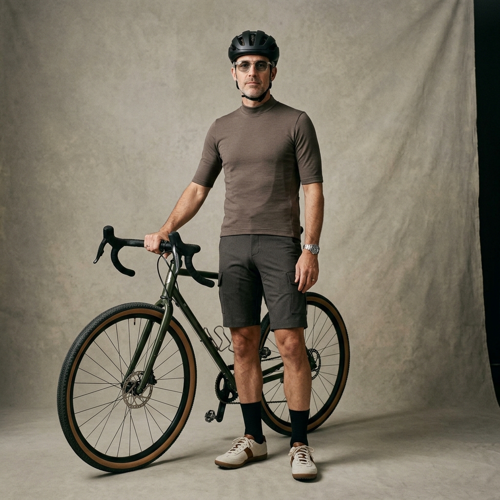
Enthusiasts
16–24 years
Javier Torres / Alex Reed. Young cyclists with a racing profile. They seek a bold yet functional streetwear style, dream of luxury but don't yet have much purchasing power.
Motivations: Competition · Social approval · Belonging · Visibility
Pain PointsDifficulty understanding sizing, product value, materials, and product differences. Need real-life examples to feel confident.Behavioural DetailsDrawn to bright colours, slim-fitting technical garments and skinsuits. Favour a fast-paced, visual shopping experience with influencer and lifestyle content, and need real-life references to feel confident before buying.
Persona 02
Progressives
25–35 years
Luis Ortega / Daniel Cooper. Young workers who view cycling as a lifestyle. Obsessed with extreme performance, aerodynamic garments, and a refined neo-old-money aesthetic.
Pain PointsFrustration with unclear descriptions, confusing sizing, excess of options, and difficulty visualising differences between product lines.Online Purchasing MotivationSeek a fluid digital experience with a strong sense of connection to the product. Prefer modern, minimalist design that reads as both luxury and performance, and want customisation with visual consistency across the range.
Persona 03
Engaged
36–50 years
Carlos Méndez / Michael Harris. Experienced cyclists with high purchasing power. Gravel and gran fondo style, prefer regular fit, modernised old-money style and minimalism.
Motivations: Comfort · Distinction · Community · Premium events
Pain PointsExcessive checkout steps, lack of visual coherence, poorly explained materials. Reject silicone. Prefer mid-sleeved garments with discreet style.Online Purchase MotivationValue clarity, personalised attention, and a secure purchase process. Respond to websites that convey trust and premium service over speed.
Persona 04
Experienced
51–63 years
José Antonio Ruiz / William Bennett. Veteran cyclists seeking comfort and quality. Rides of 2–4.5 hours, regular or loose cuts, visible seams, classic aesthetic of elegant luxury.
Motivations: Active ageing · Elegance · Tradition · Comfort
Pain PointsComplicated websites, excessive technical information, and lack of guidance for selecting the ideal garment balancing comfort and elegance.Online Shopping MotivationPrefer simple navigation and personalised service over feature-heavy interactions. Want product recommendations tailored to their riding style and climate.
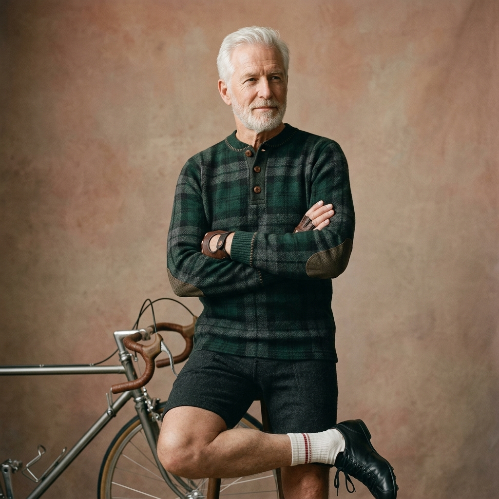
Persona 05
Cycling Sage
63+ years
Ricardo Gómez / George Campbell. Veterans who see cycling as pleasure and connection with their past stories. Seek heritage, comfort, classic style, and wide cuts above performance.
Motivations: Health · Heritage · Personal luxury reward · Artisanship
Pain PointsConfusing navigation, unclear payment steps, lack of accessible information, absence of visual guides to aid decision-making. Prefer direct contact options.Online Purchase MotivationPrefer simple checkout, large and clear text, and direct contact options. Value human interaction more than speed or self-service.
Research Output
Storyboard and User Flows
Once the research phase was completed, a detailed study of user interactions with both the brand and the website was conducted. This process led to the creation of comprehensive user flows and storyboards, essential tools to visualise every touchpoint of the VELOQUE experience.
The flows were built in FigJam, mapping five entry points: direct brand discovery, social media, search, referral, and club membership. Each flow terminates at a different conversion goal, from first purchase to recurring subscription.
Continue to UX-UI & E-Commerce
How the research shaped the sitemap, platform strategy, and conversion system for the digital boutique.